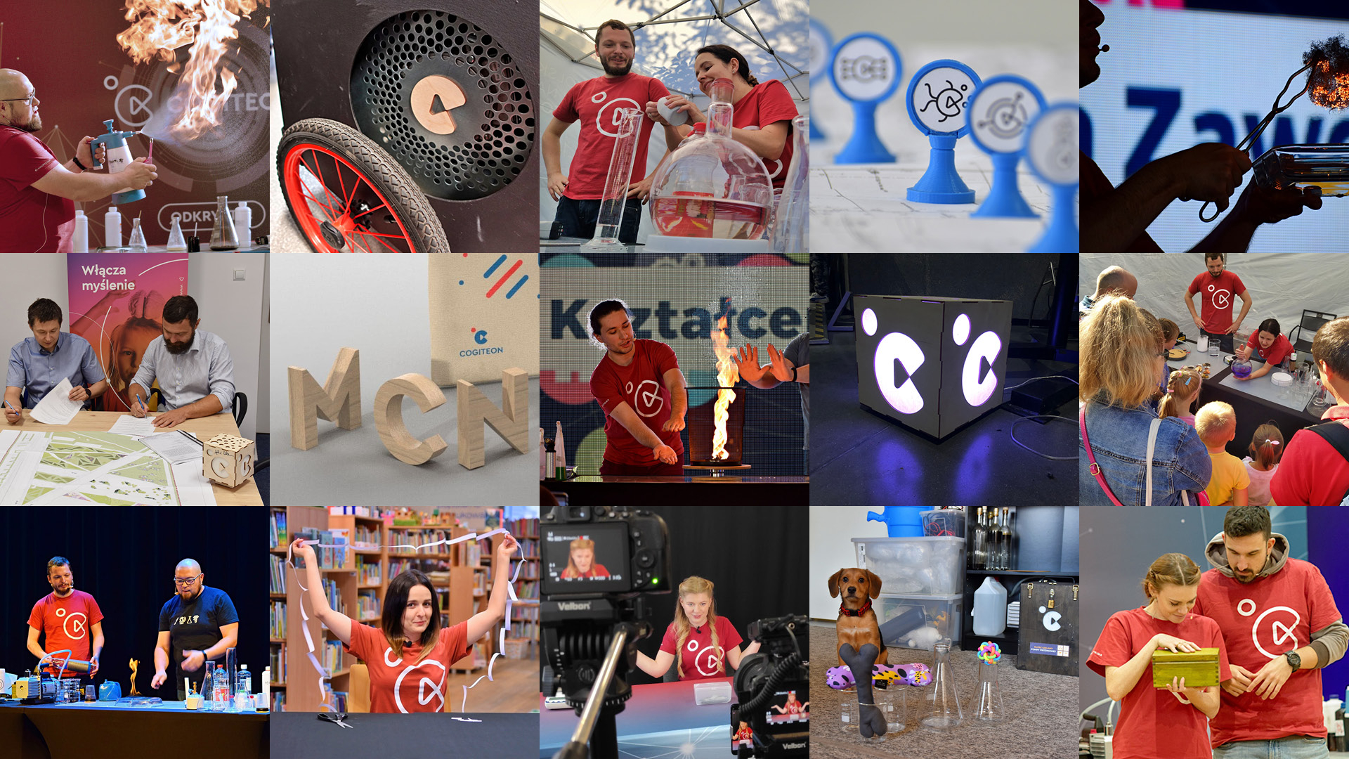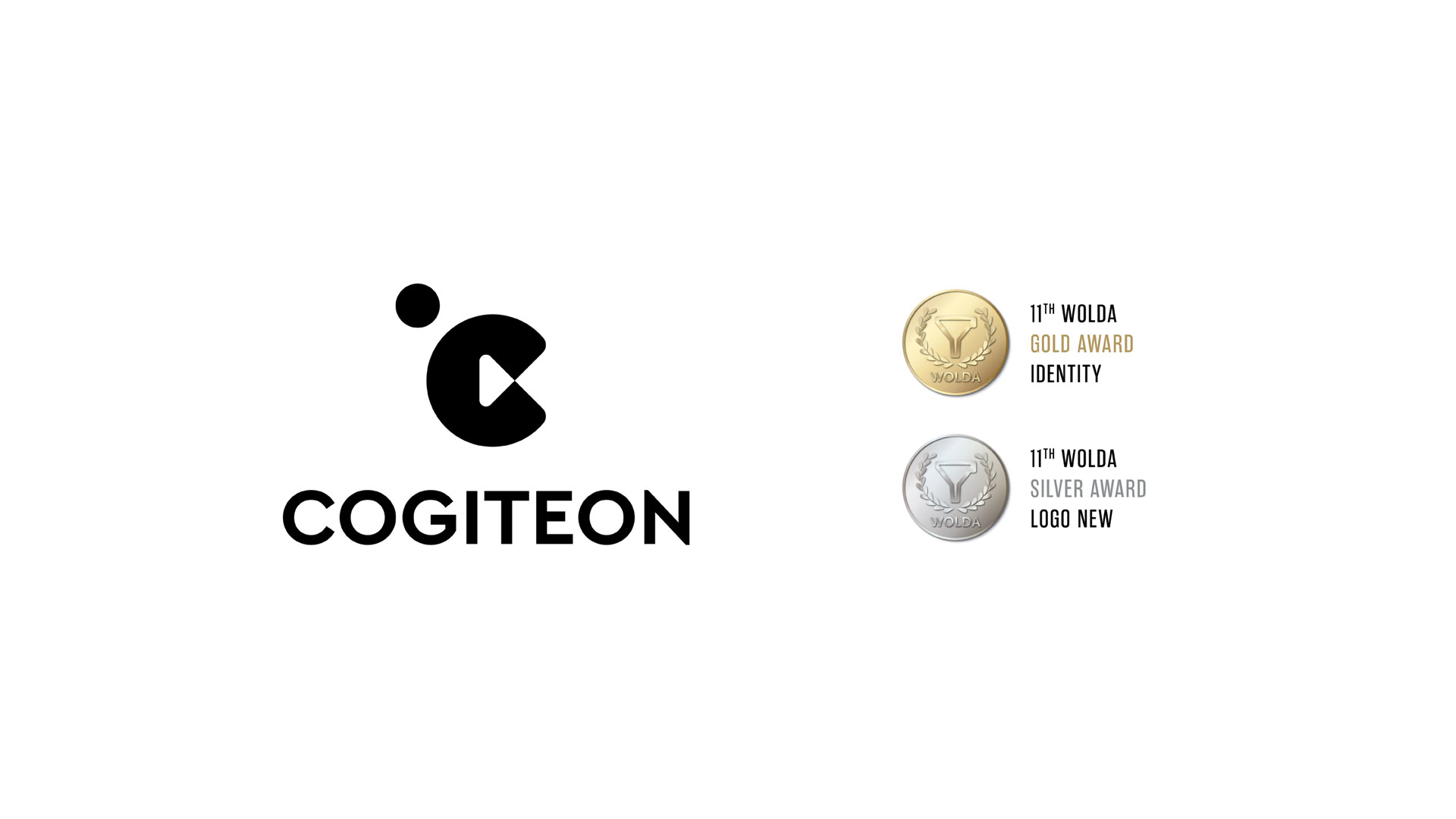
Cogiteon is a cultural institution of the Małopolska Region that popularises science through experimentation, shifts in perspective and independent discovery. The identity was created while the centre was running mobile educational activities and its permanent home in Kraków’s Czyżyny district was still being prepared. The concept was selected in a nationwide competition. The identity won gold and the logo silver at the international WOLDA competition.
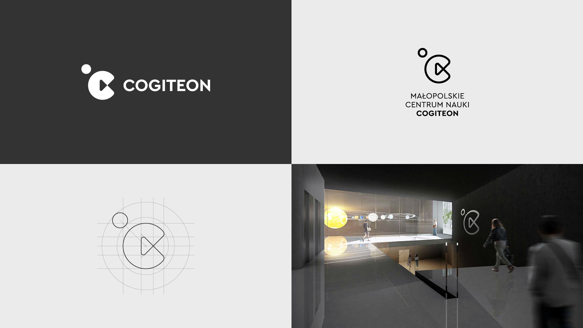
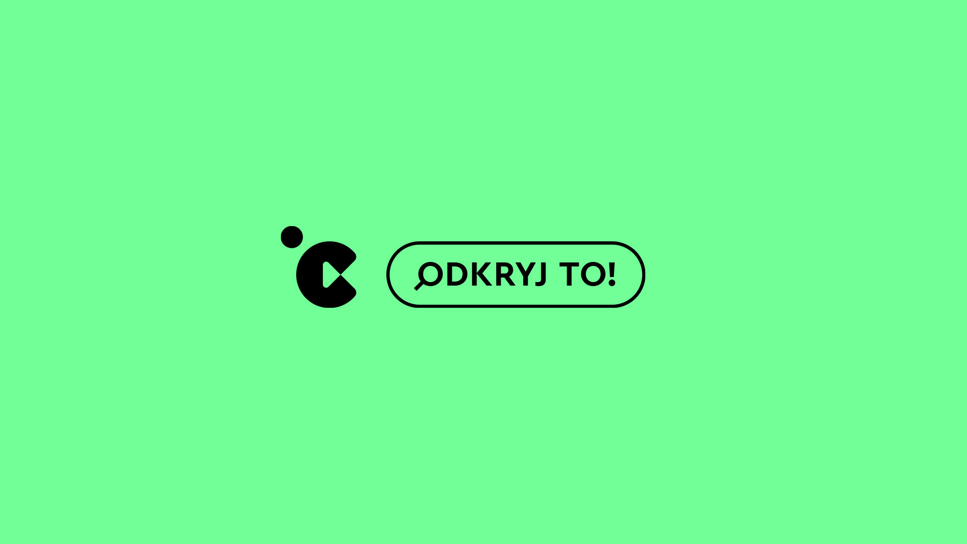
The symbol combines the letter C with the “play” symbol. It signifies the start of action – entering science through experience, trial and experimentation. The circle evokes a stage, a meeting place for knowledge, culture and the public. The sphere can be read as an atom, cell or planet, opening the symbol to different fields and scales of discovery.
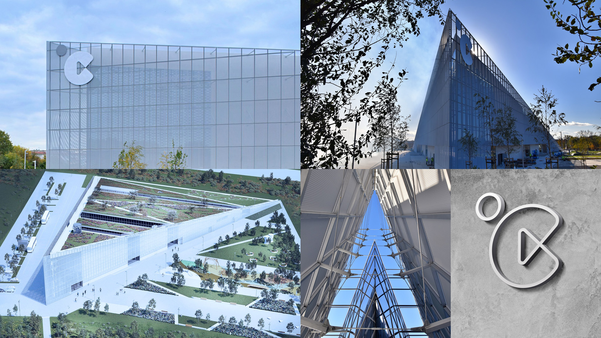
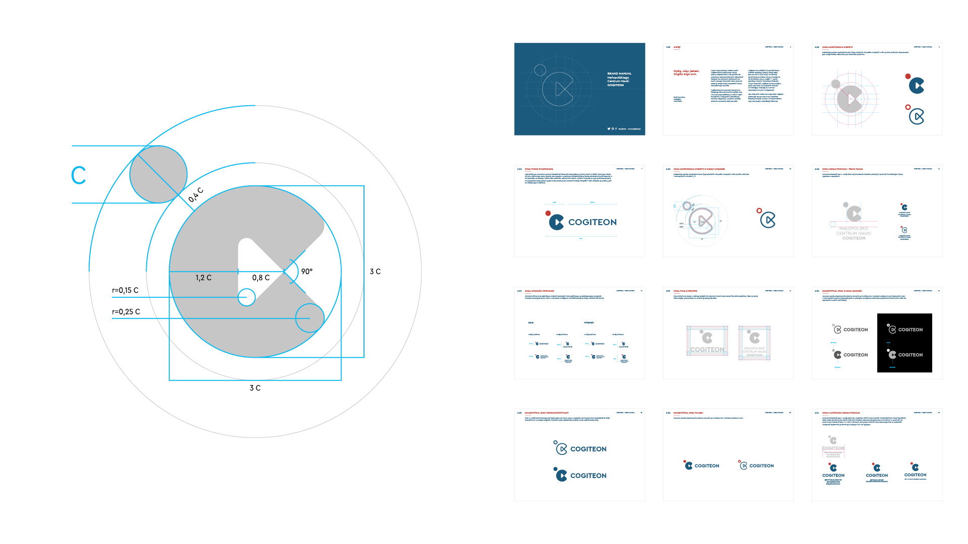
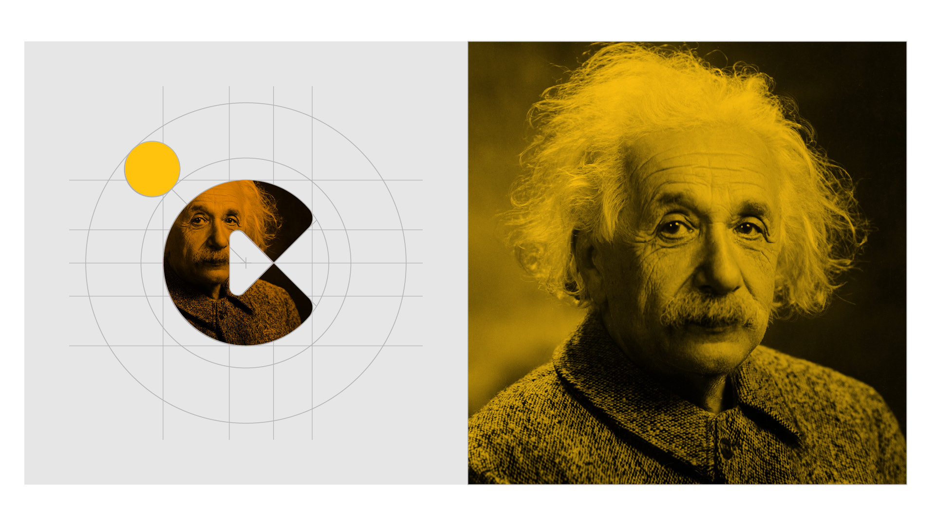
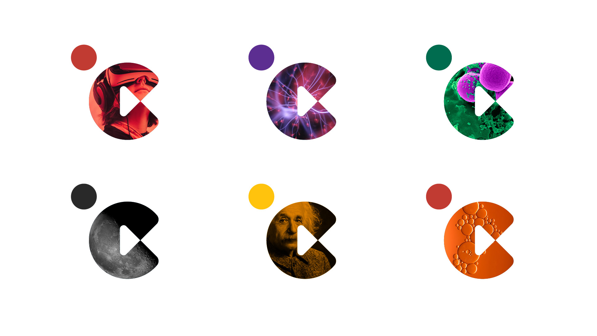
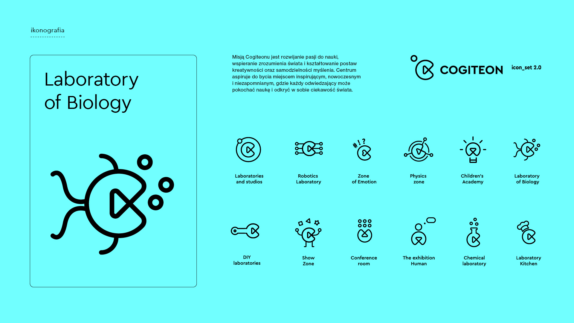
The fixed geometry of the symbol acts as a frame filled with images of biological structures, physical phenomena, technology, people and space. The same elements generated a family of icons for laboratories, workshops and programme zones. Their forms reflect the subject of each zone and its audience while retaining the shared arrangement of the letter C, the “play” symbol and the dot.
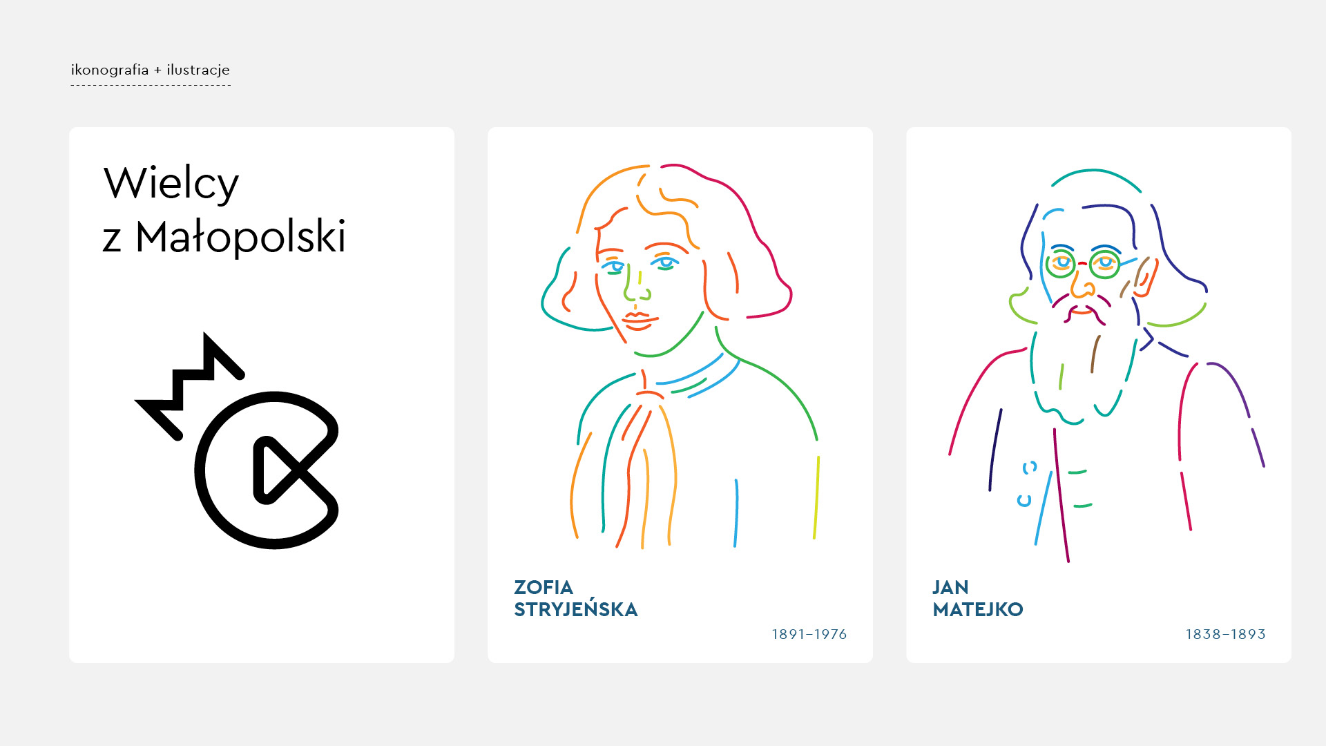
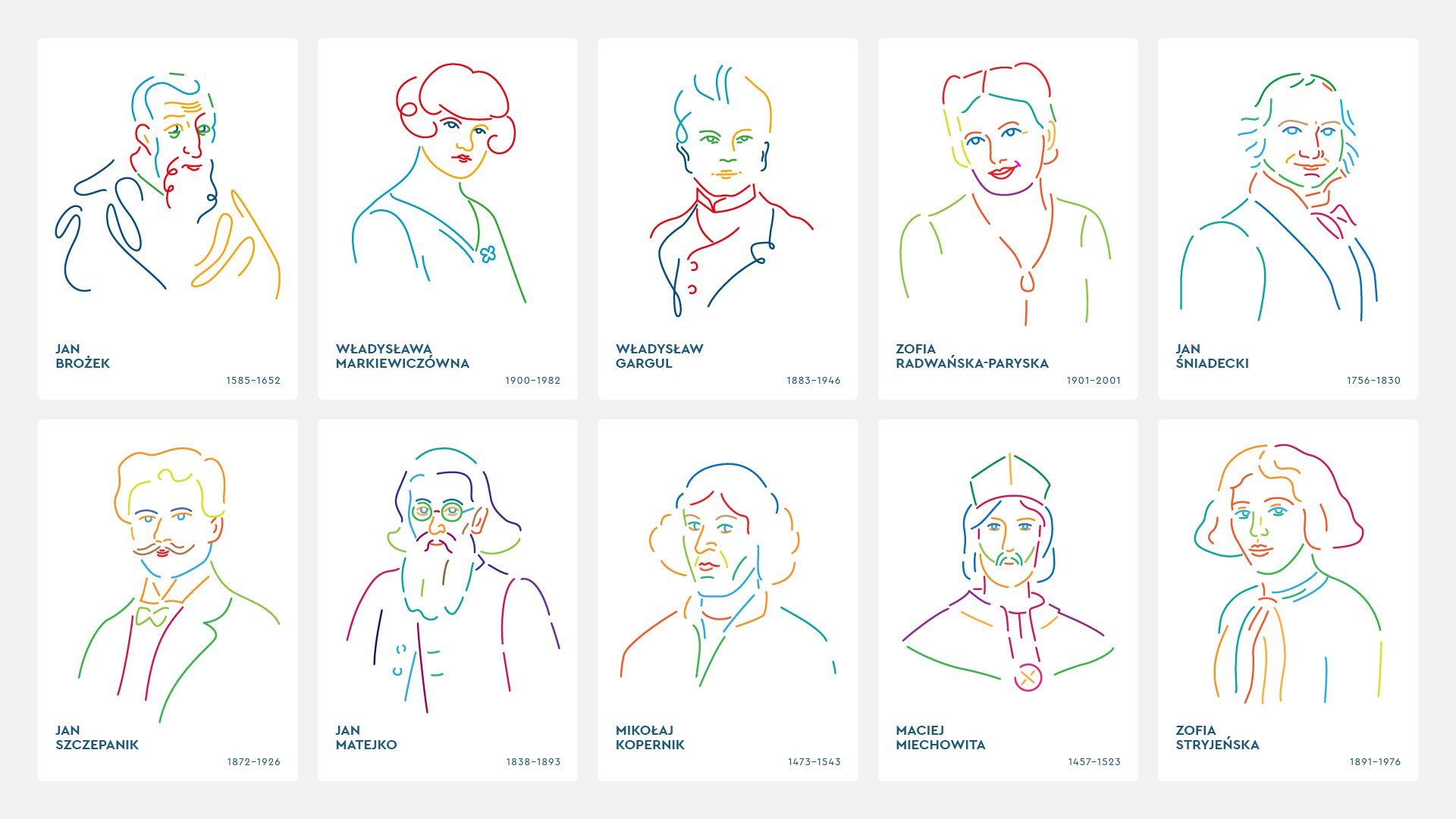
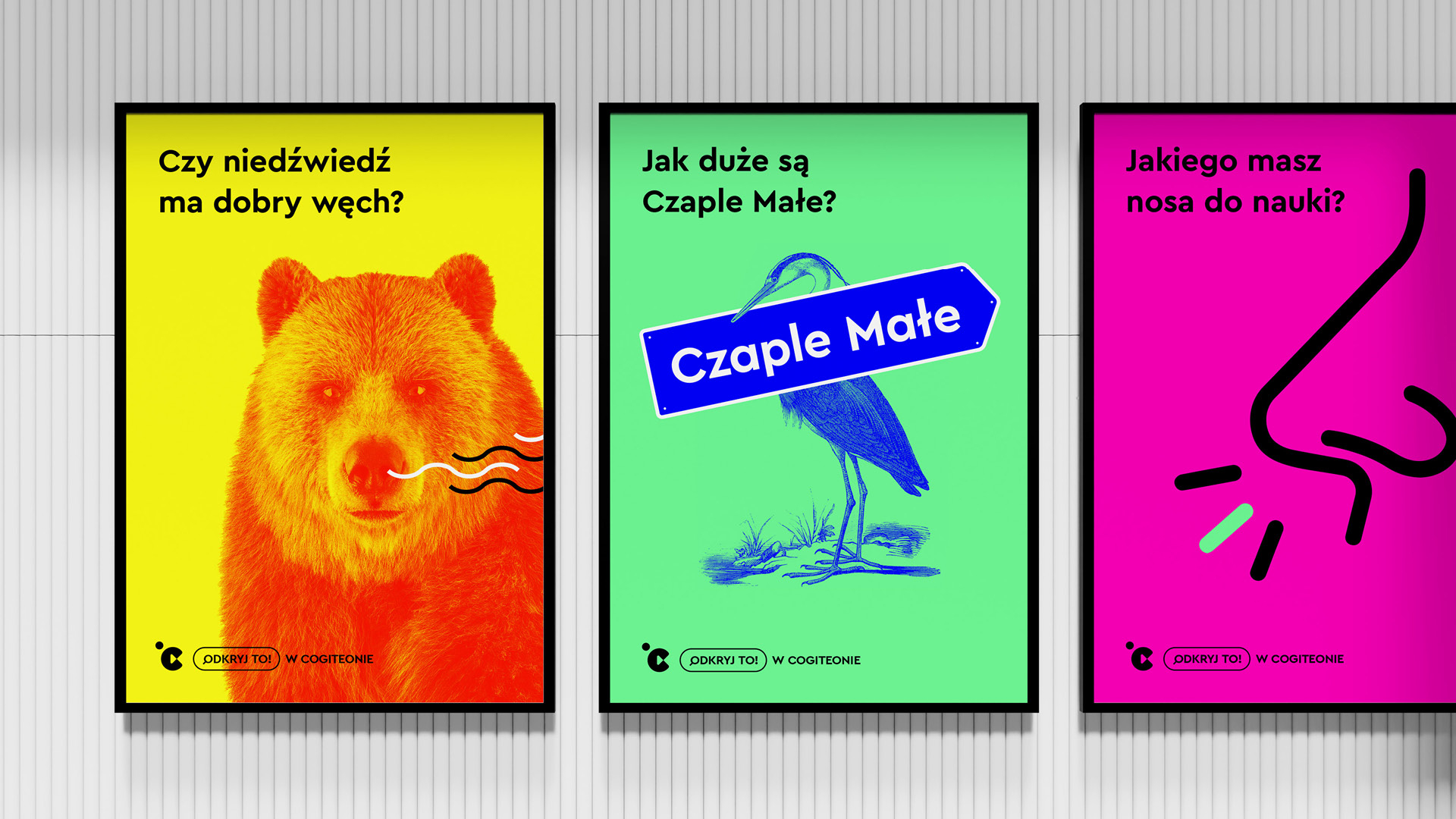
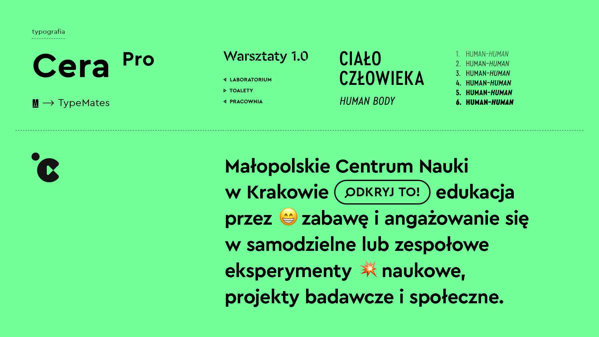
The visual identity project included the logo, brand guidelines, colour palette, typography, principles for working with photography, iconography and illustration. Multicoloured portraits, direct text layouts and variable versions of the symbol extend the science centre branding across topics spanning the sciences, people and culture.