(01) Project Definition
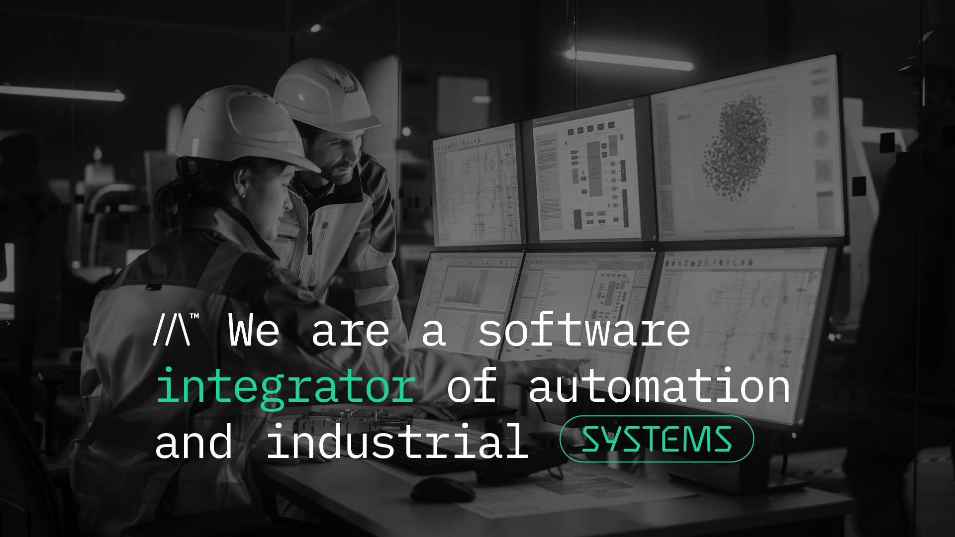
As ISCAS grew, its existing identity no longer reflected the scale of the business or the expectations of the clients it wanted to reach. The rebranding was intended to communicate the company’s specialisation more clearly: connecting industrial automation with software and IT systems for manufacturing.
(02) Visual Mechanism
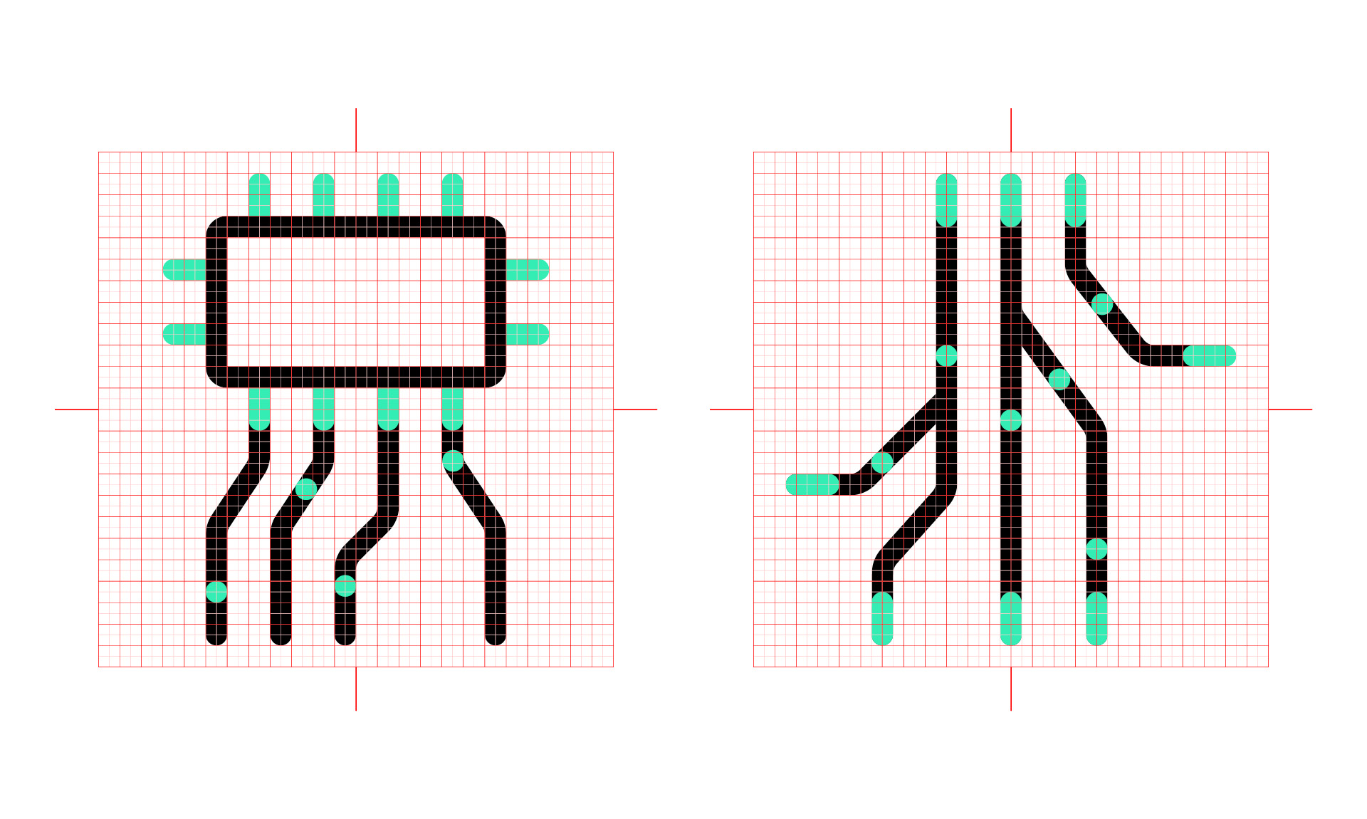
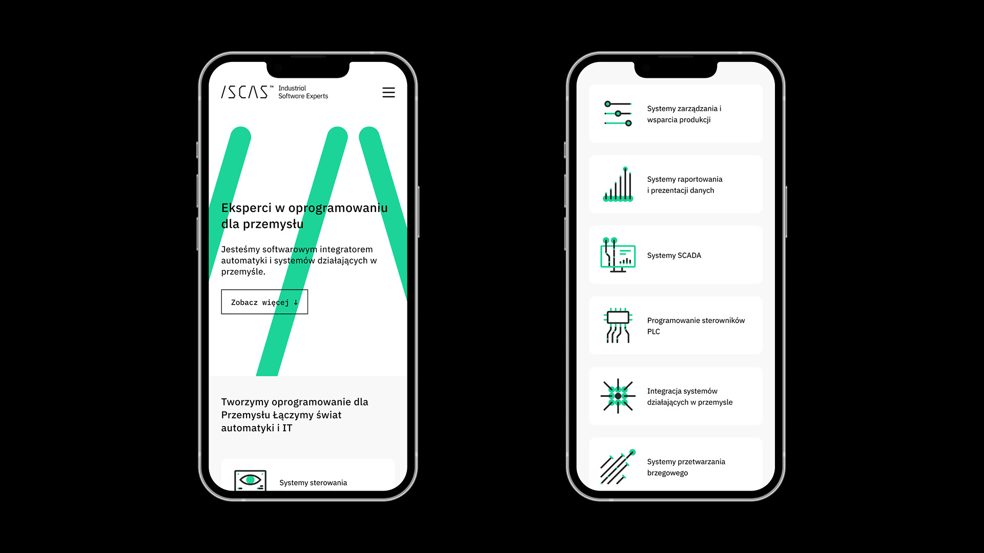
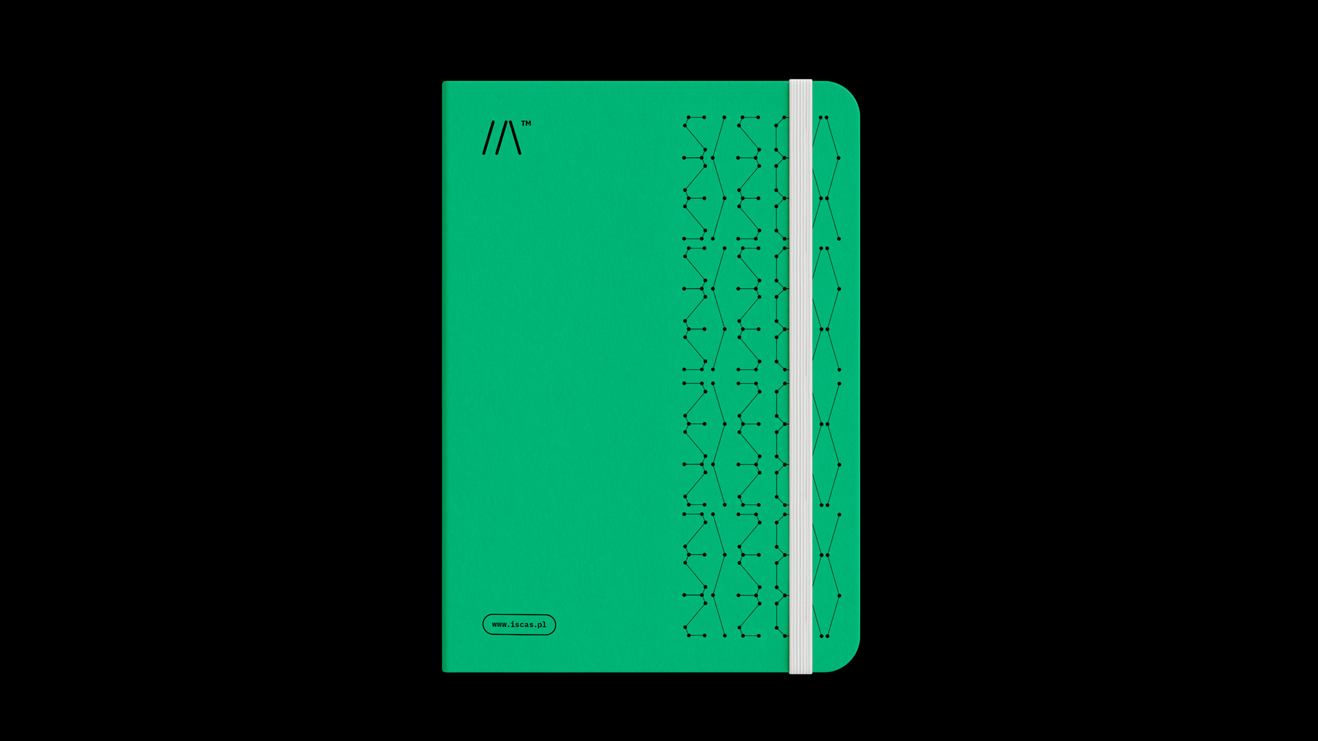
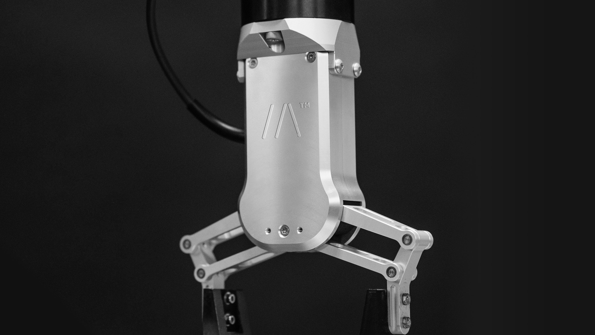
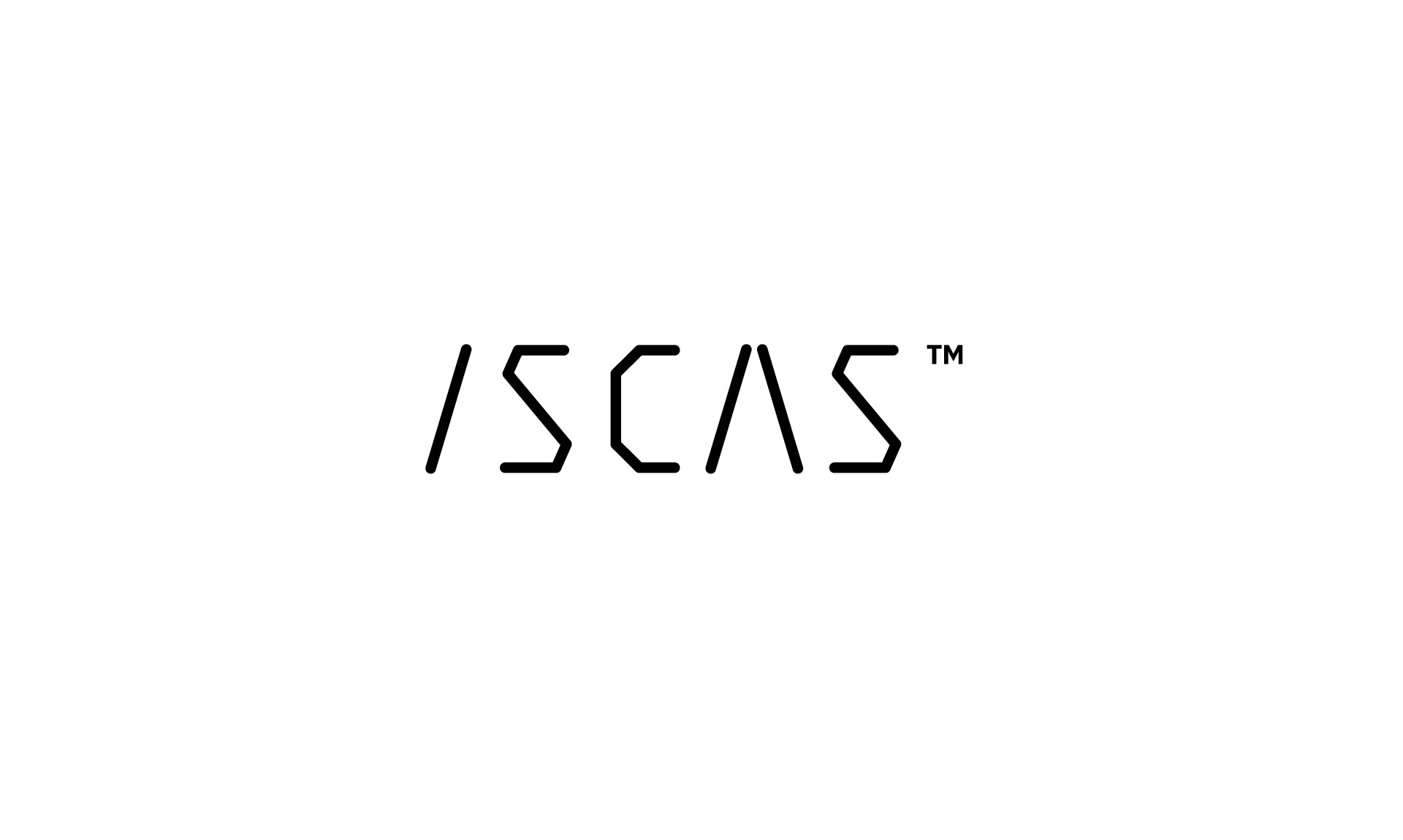
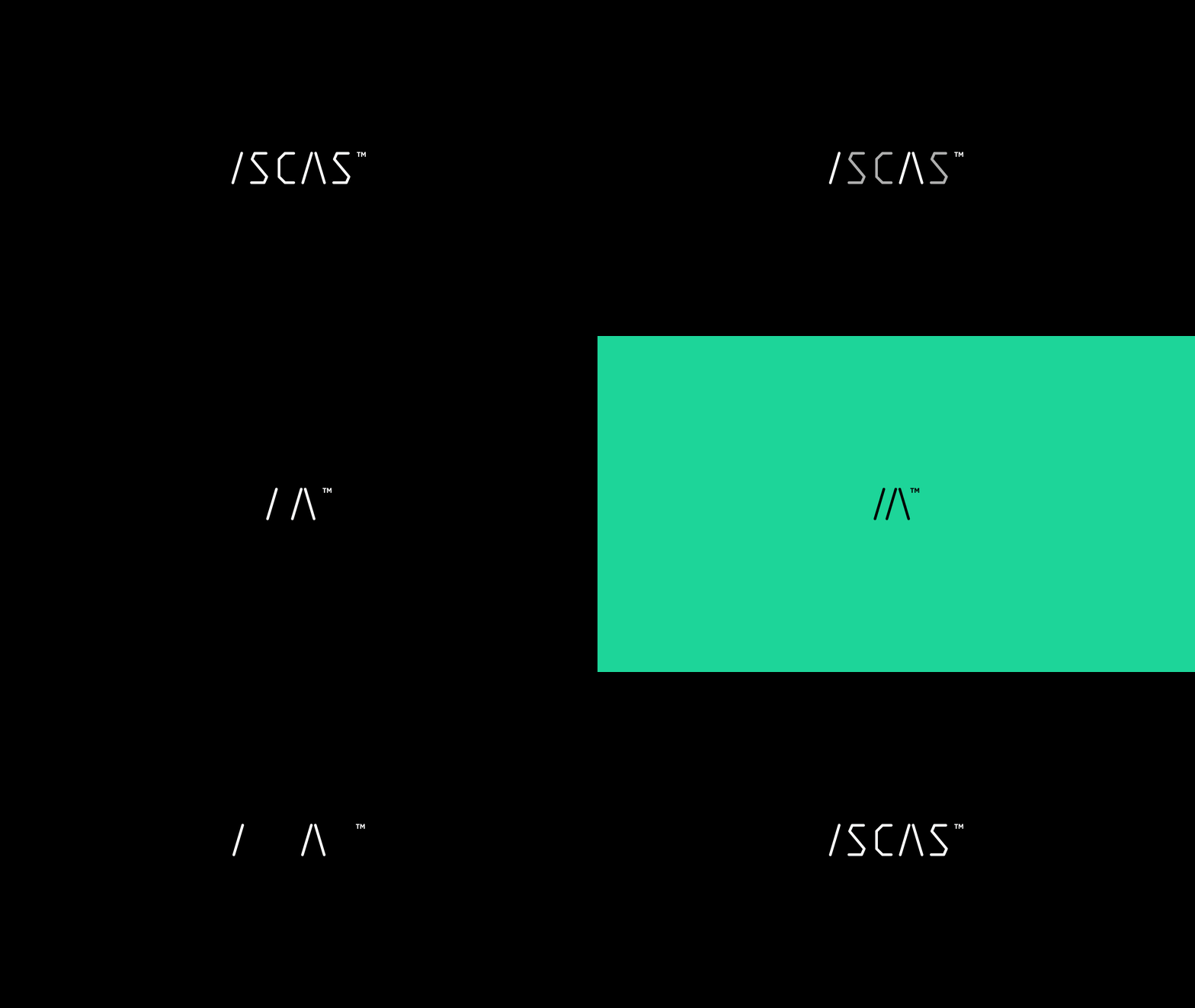
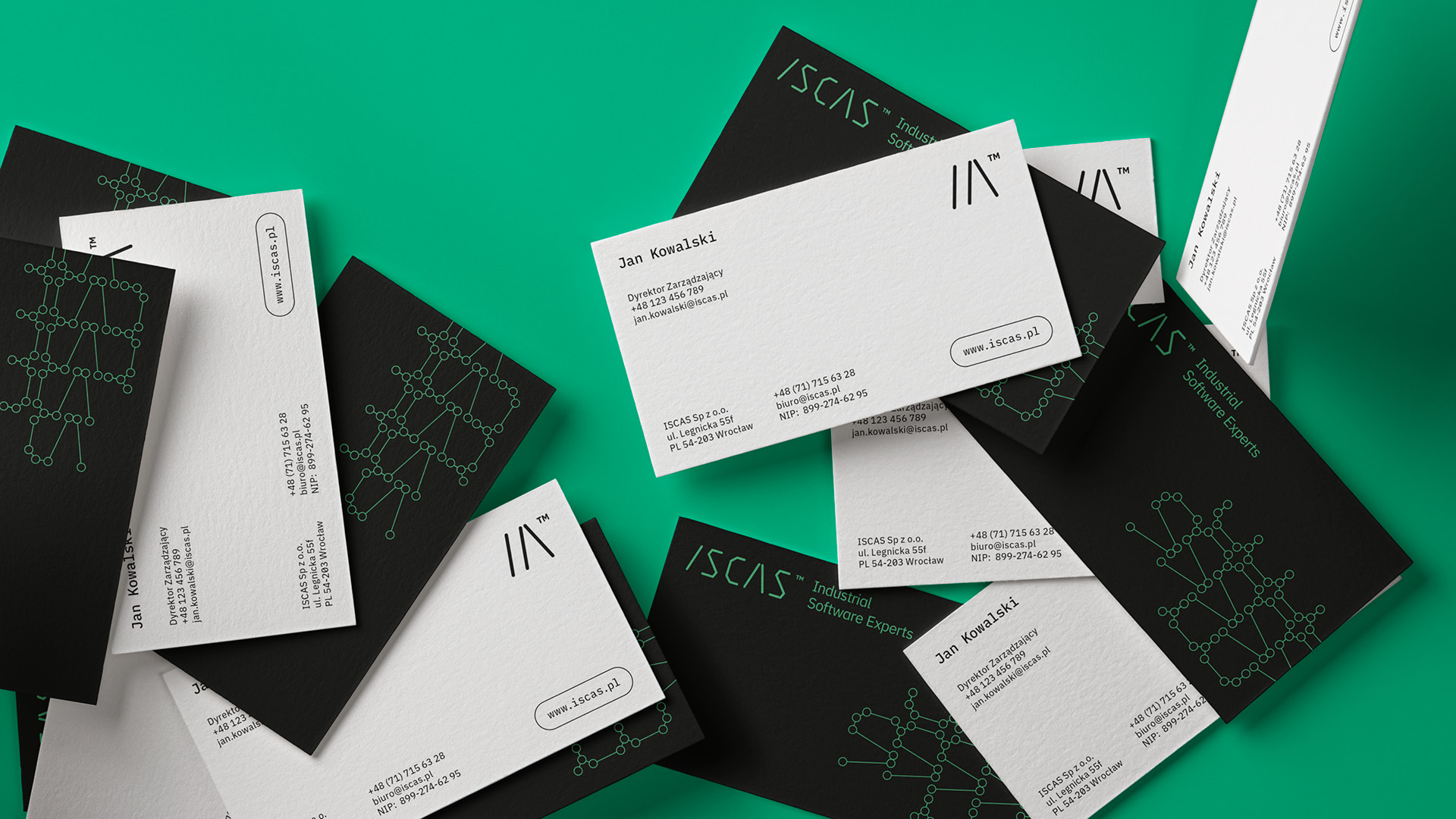
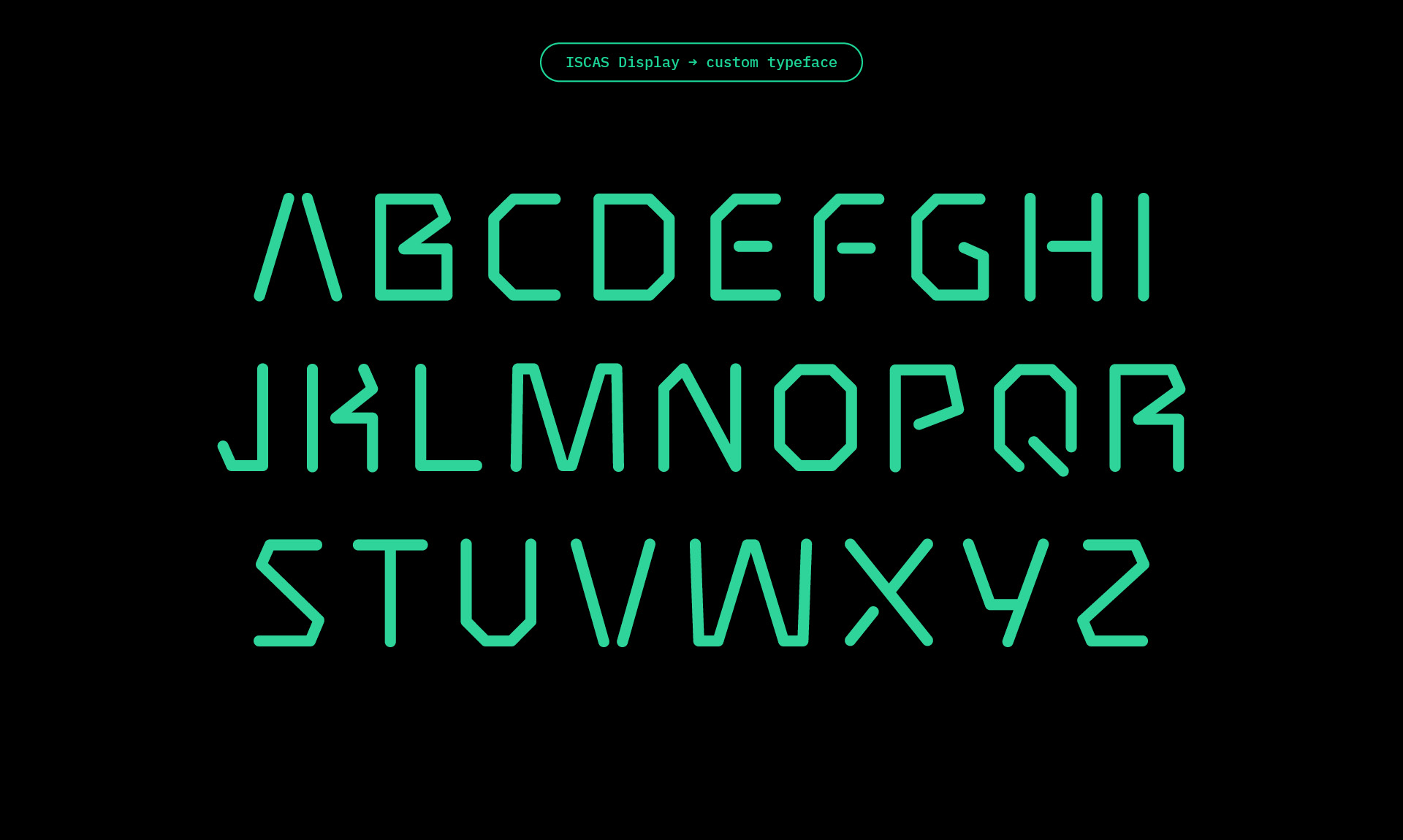
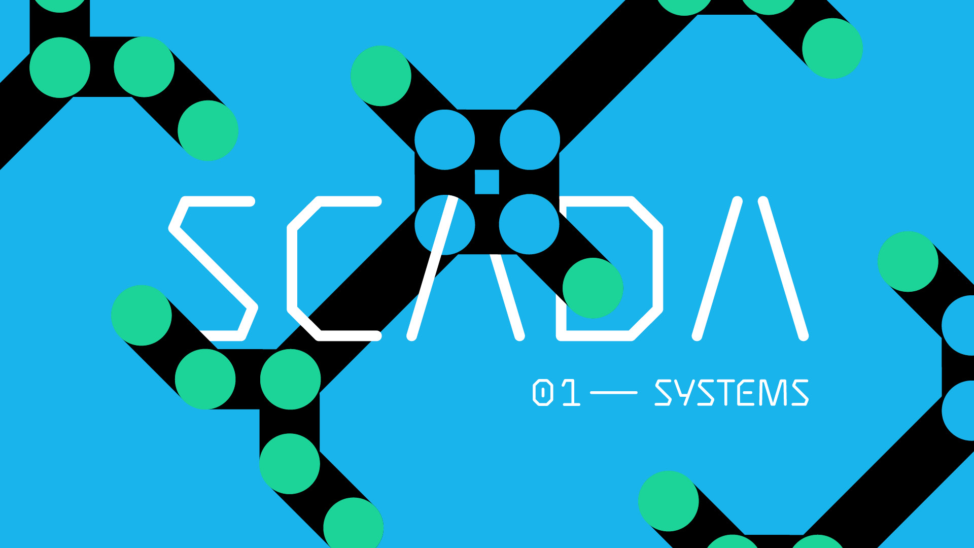
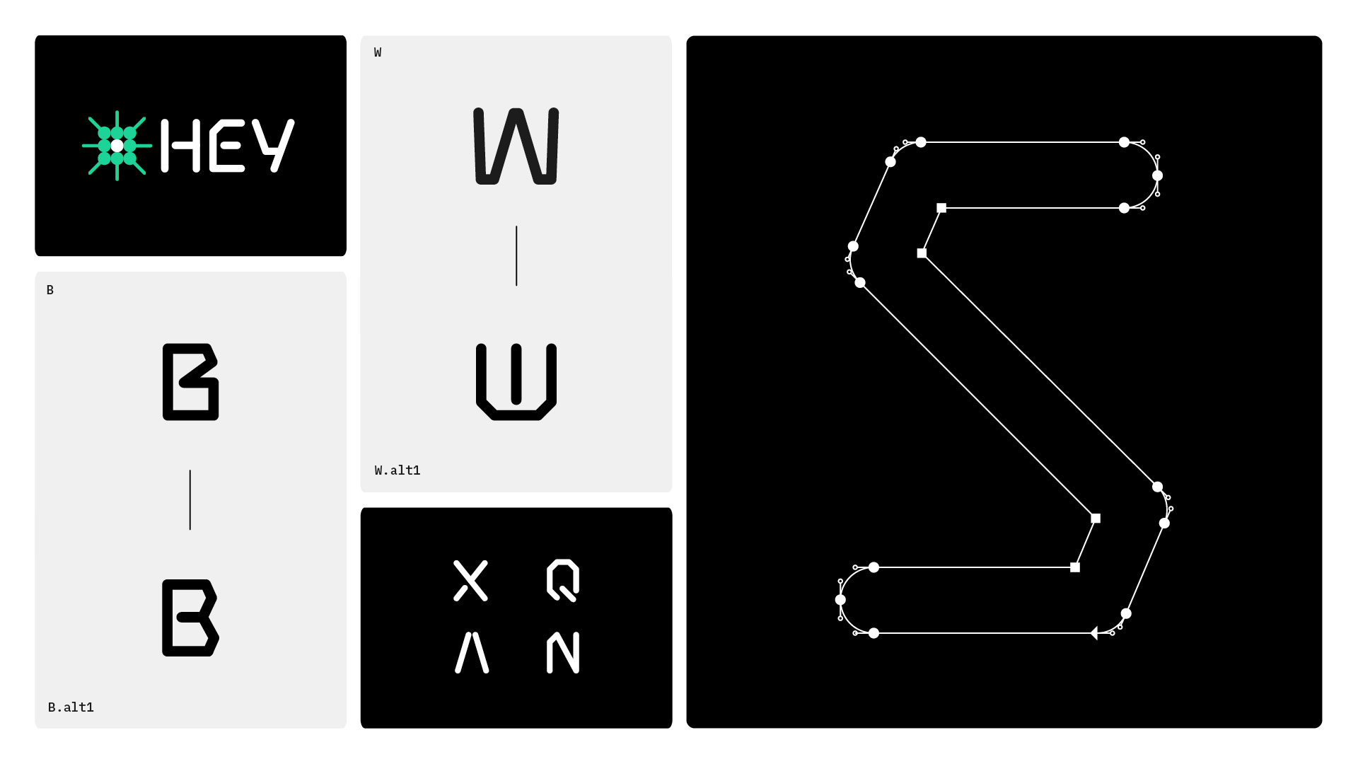
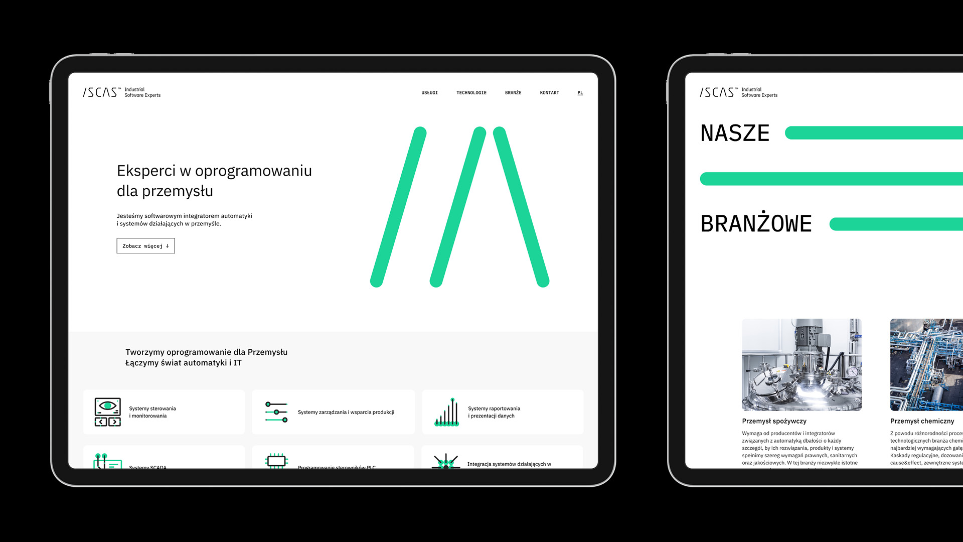
We based the new visual language on simple lines, points and connections inspired by automation diagrams. This geometry became the basis for the logo, key visual, typeface prototype, animations and iconography. The elements shift and form new configurations, reflecting the logic of the systems integrated by ISCAS.

(03) Activation
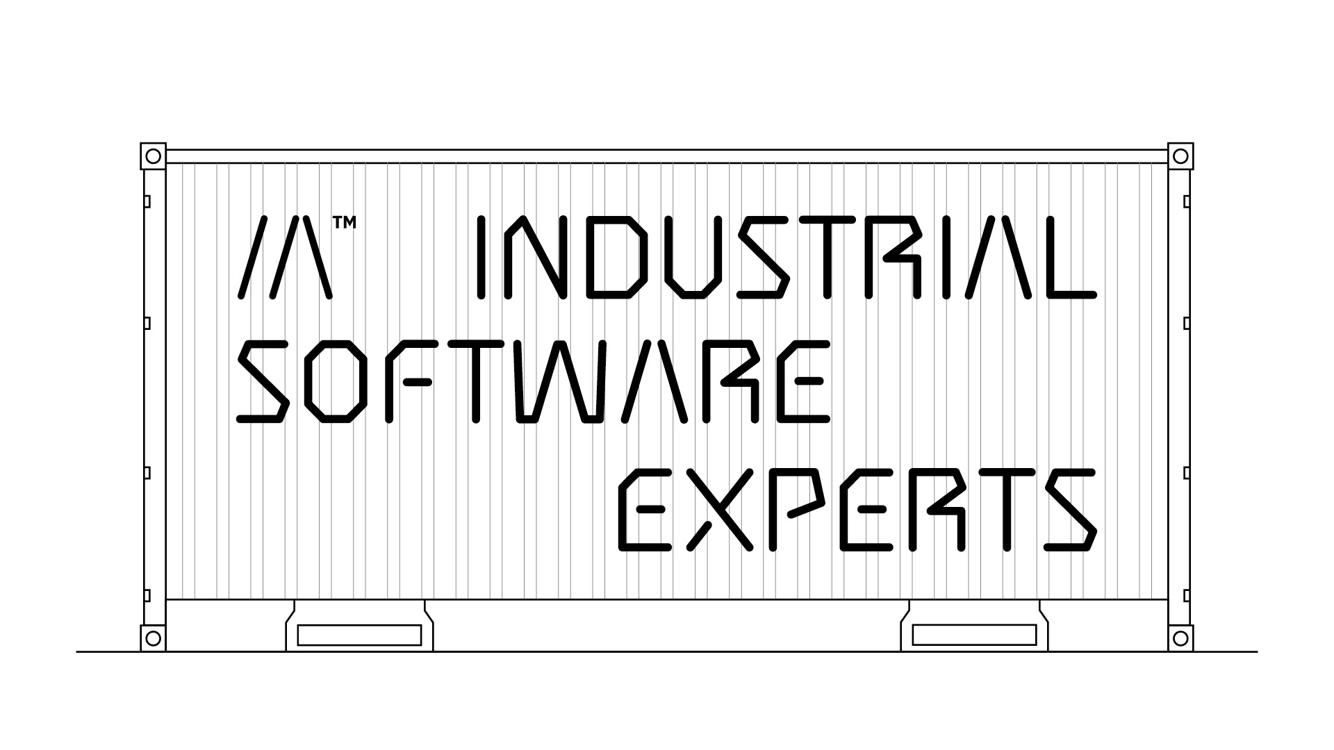
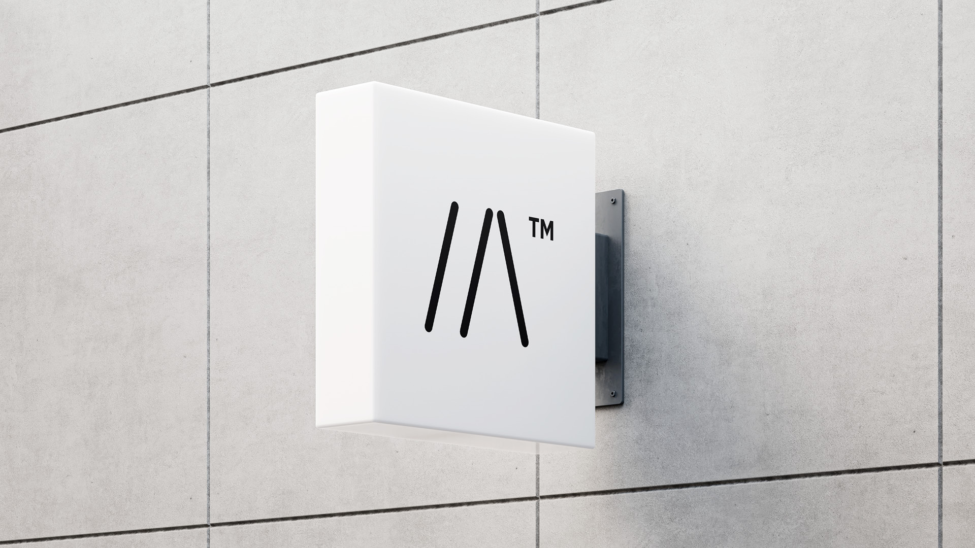
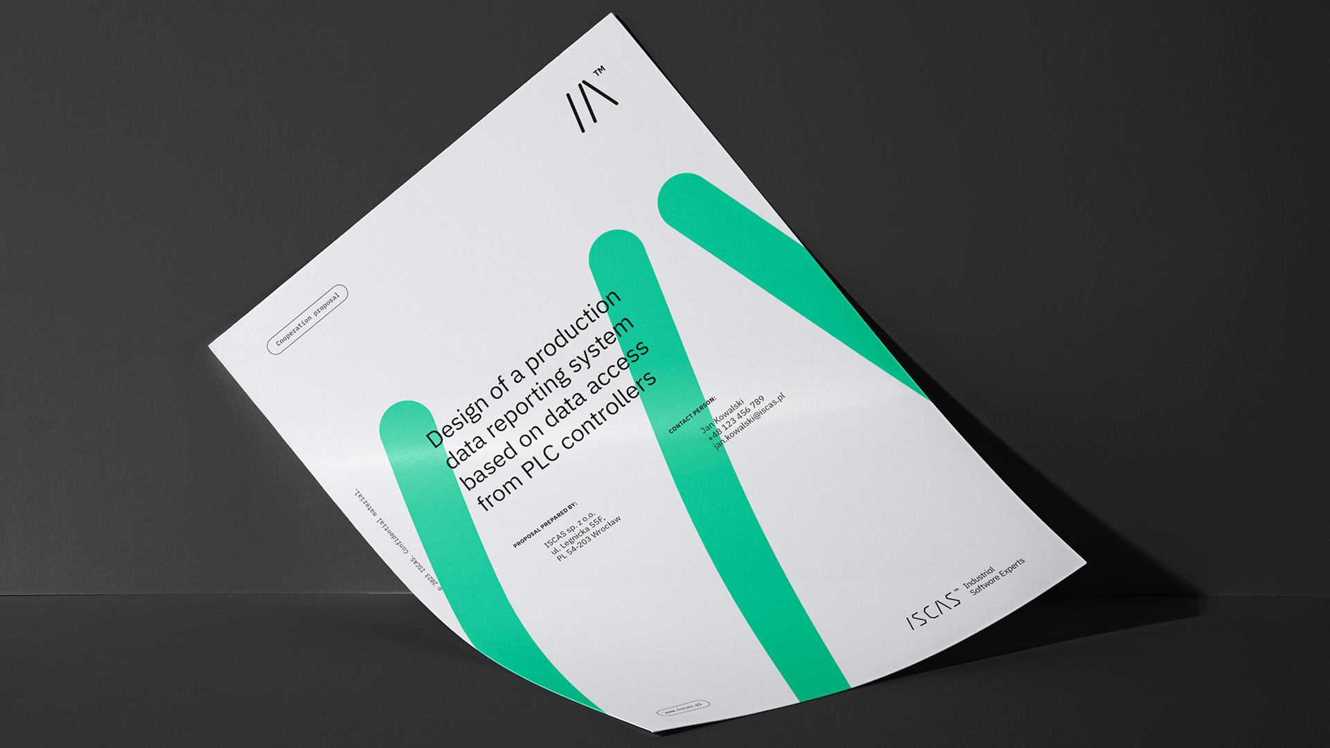
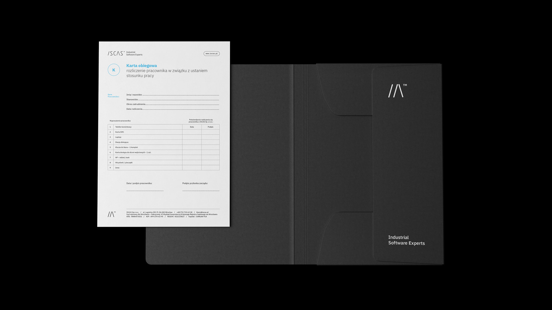
We developed the visual identity system across the website, social media and corporate materials. The iconography structures ISCAS’s offer and areas of expertise, while the brandbook defines the rules for using the logo, typography, iconography and key visual.