(01) Project Definition
ITCORNER brings together owners and leaders of technology companies who share knowledge, develop initiatives and build relationships based on trust. The organization grows through the activity of its members: they initiate events, lead projects and help shape the community. The previous identity did not reflect this member-driven model.
(02) Tactical Analysis
Industry organizations often lead with their offer, events, and member-company logos. ITCORNER starts with relationships between people. The identity therefore needed to foreground members, their knowledge, and their involvement while bringing structure to communications across the organization’s different initiatives.
(03) Strategy
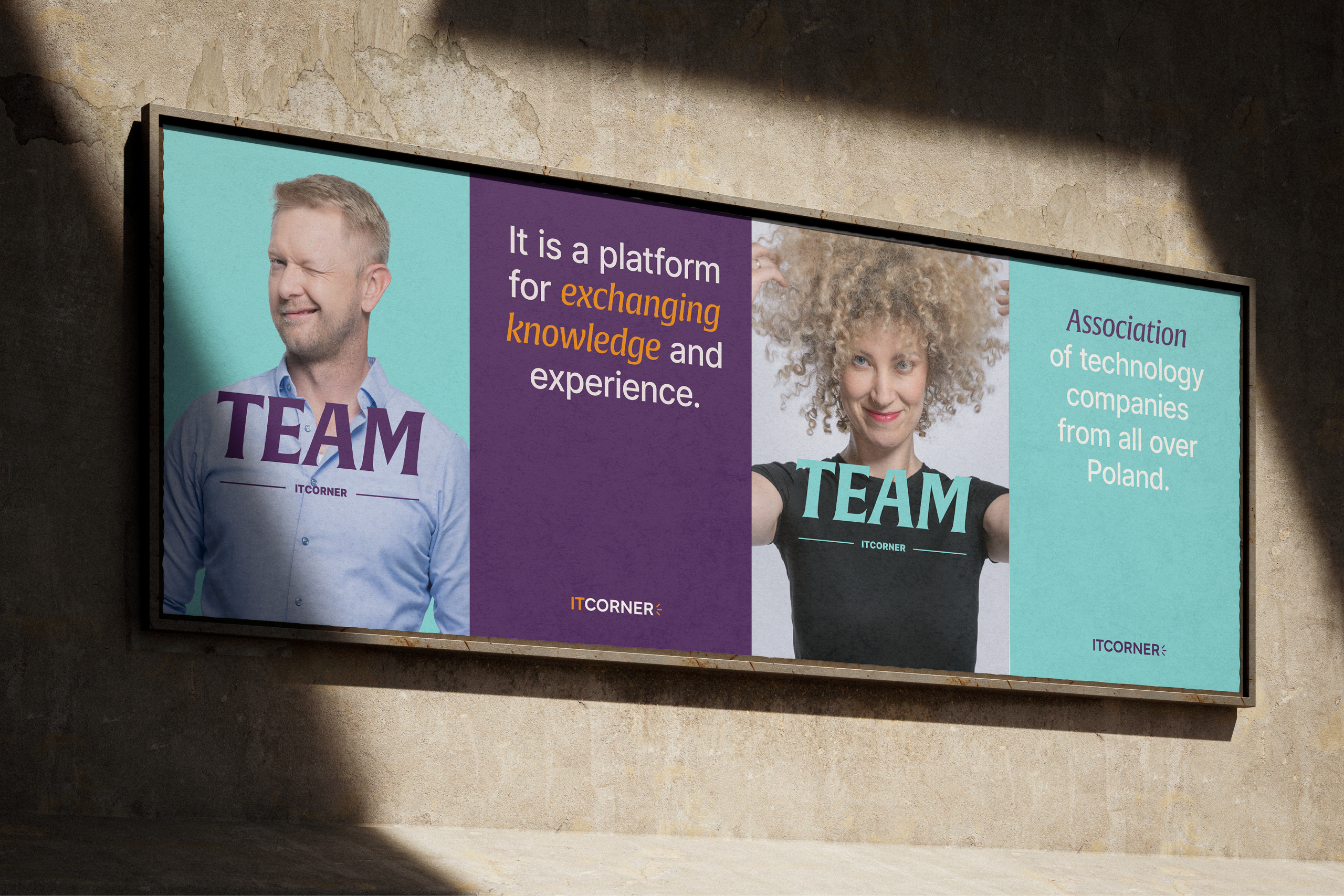
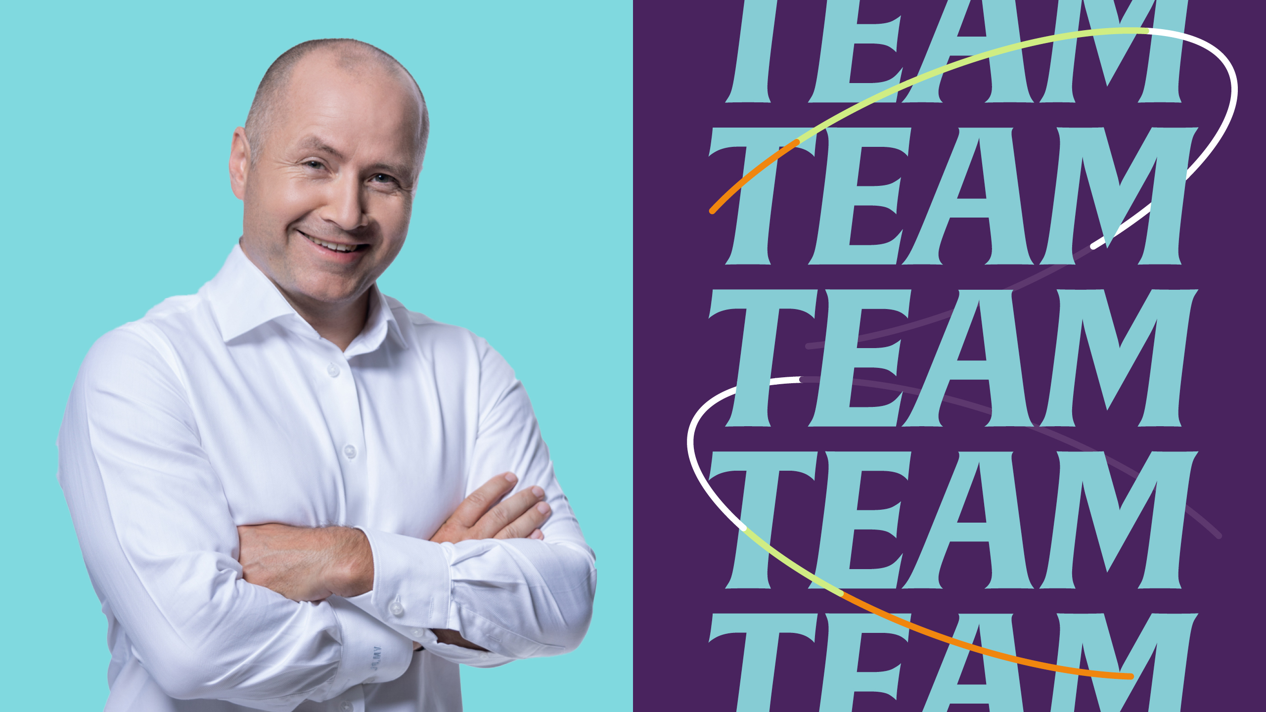
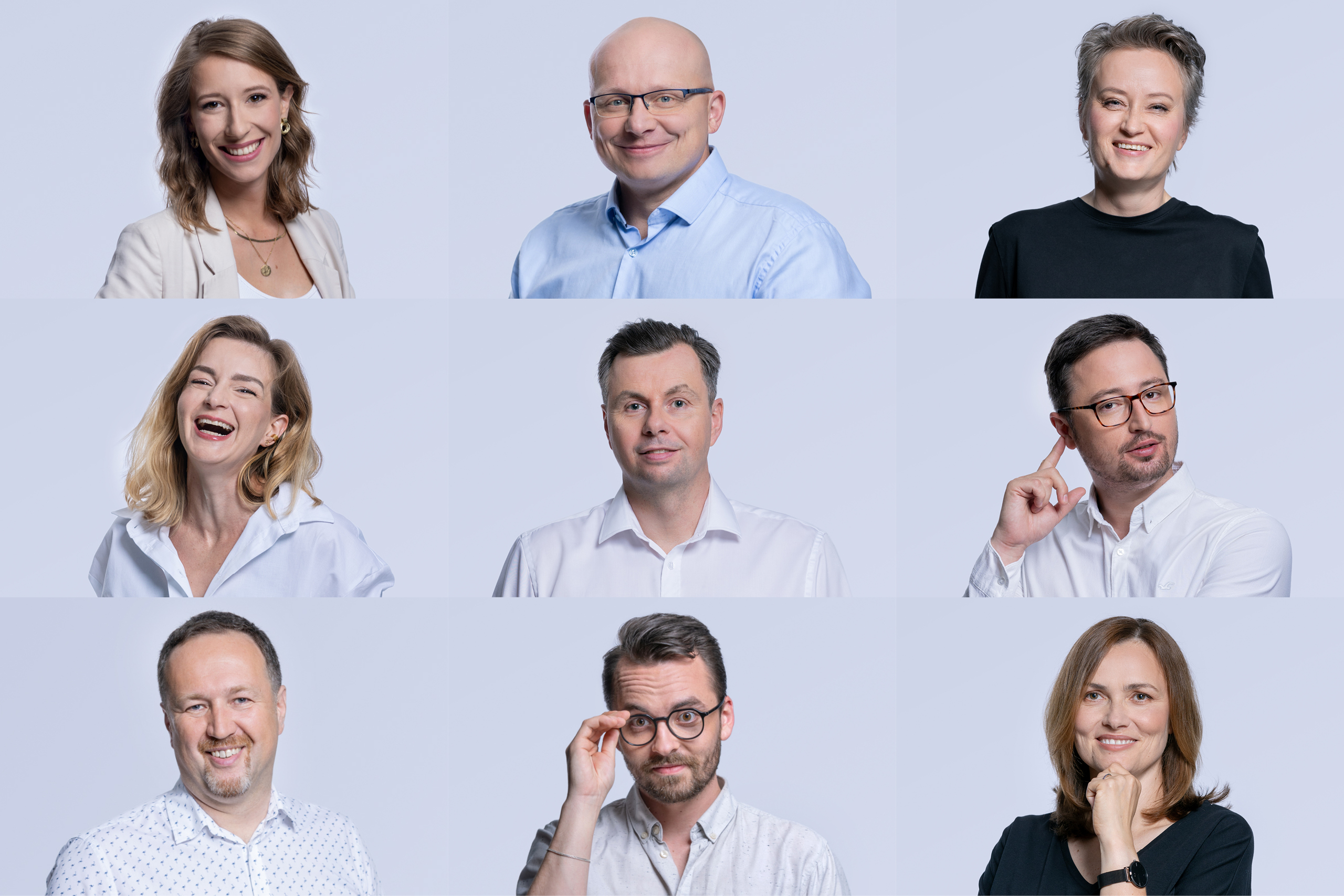
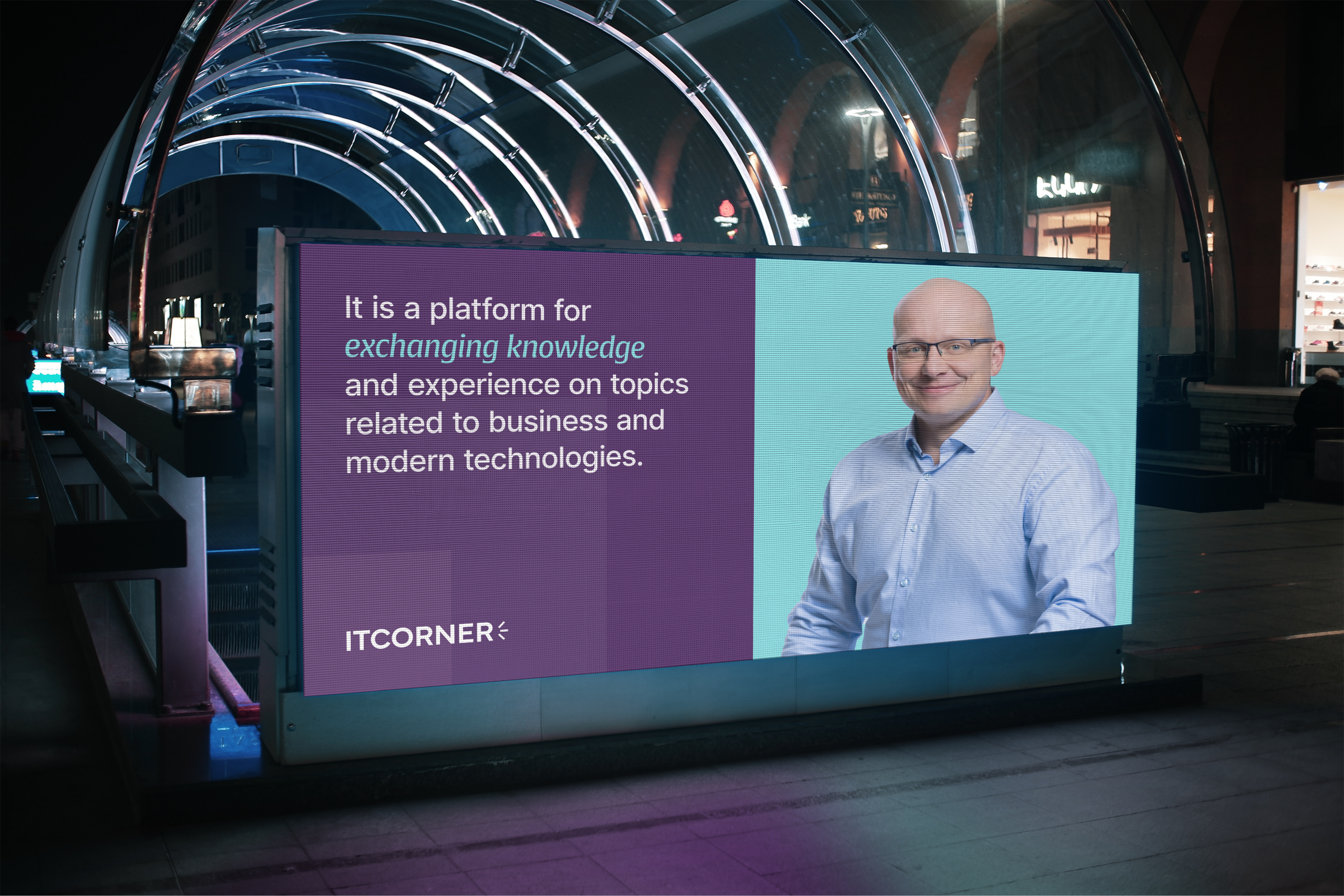
We built the brand around the principle of Member Driven. We put people at the center of communication - their knowledge, experience, and relationships. Members are hosts of events, creators of initiatives and sources of knowledge within the community. Names, faces and personal experiences became permanent elements of ITCORNER communication.

(04) Big Idea
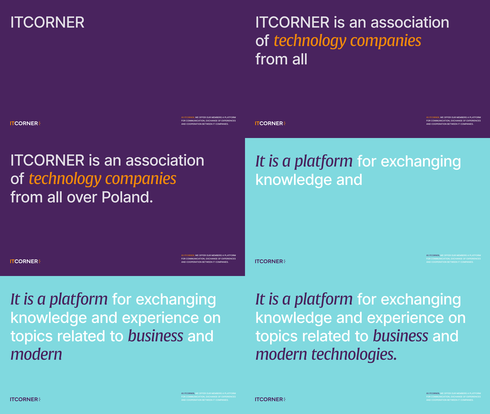
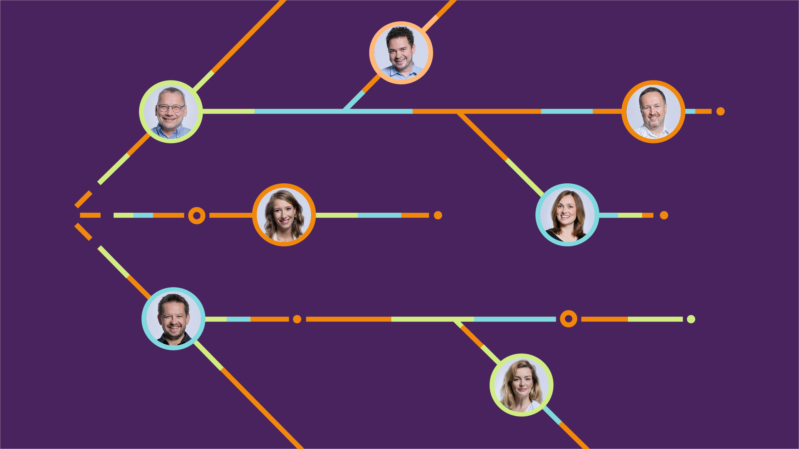
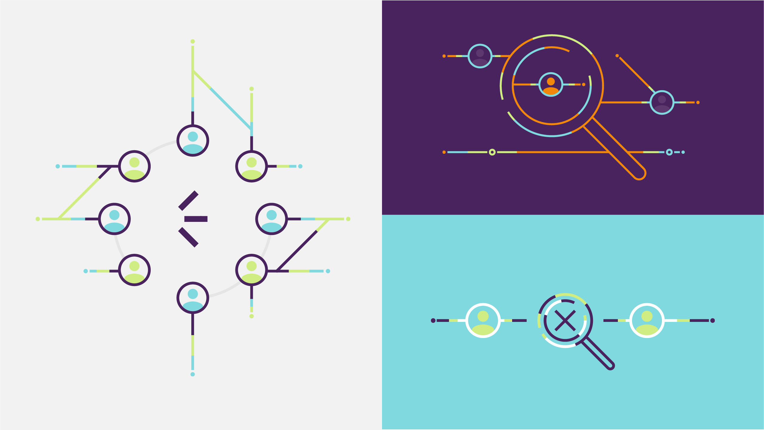
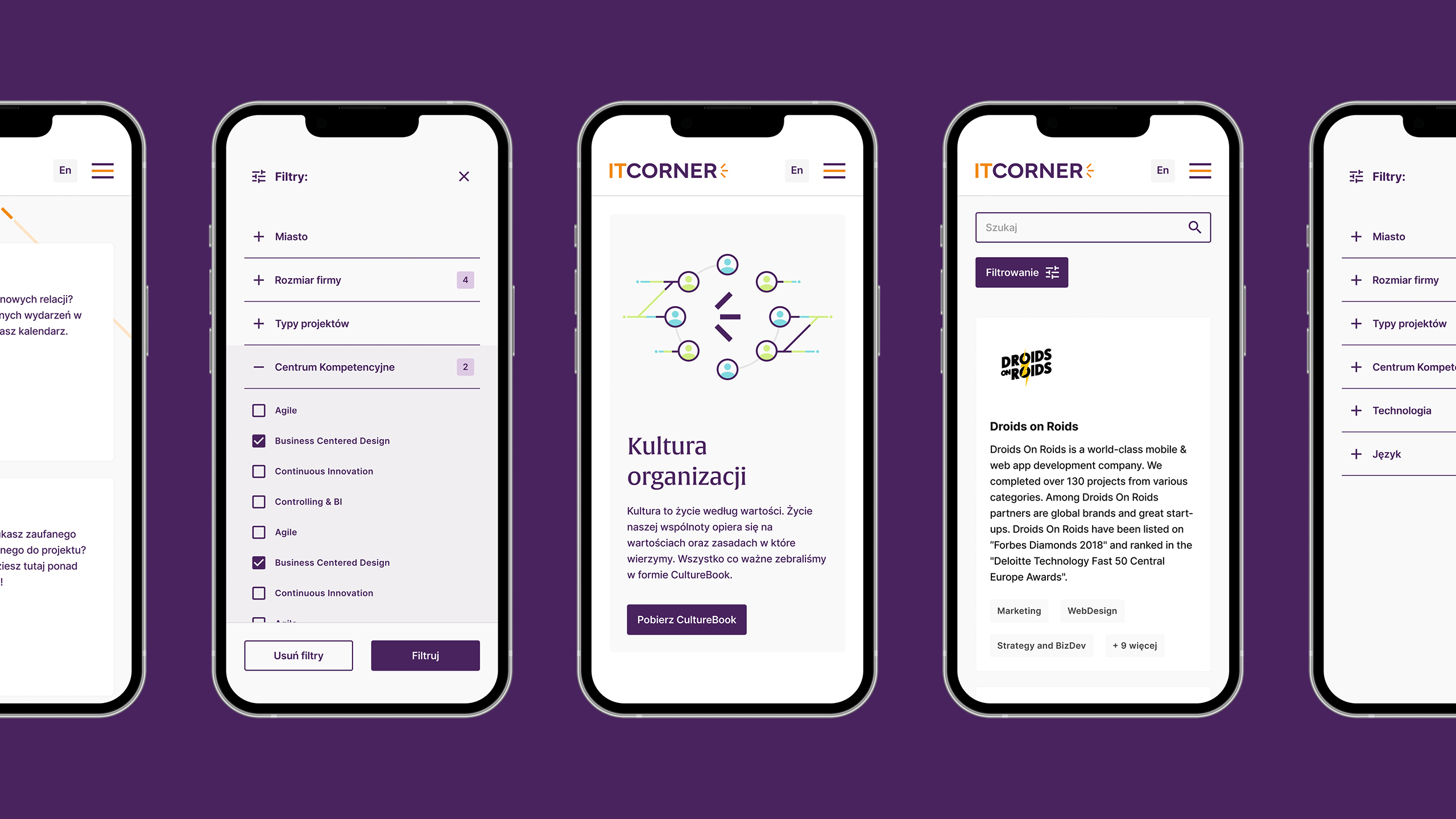
The graphic system grew from three lines derived from the ITCORNER symbol. They have different functions but a shared origin. They create connections between people and become carriers of knowledge, information and experience. The lines form changing configurations, respond to content and evolve through animation, emphasizing the proactive character of the organization. In photography, they interact with ITCORNER members, highlighting knowledge exchange and collaboration.
(05) Activation
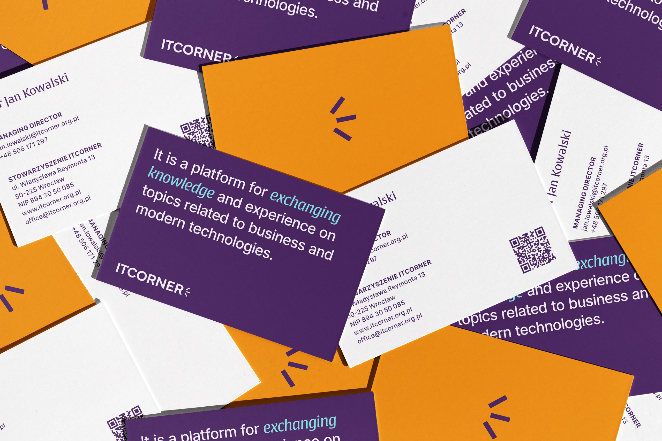
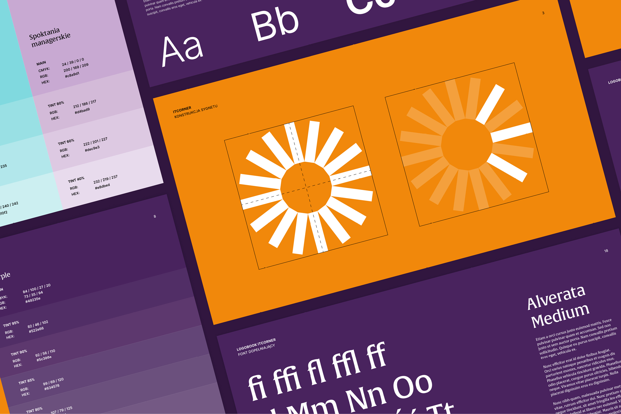
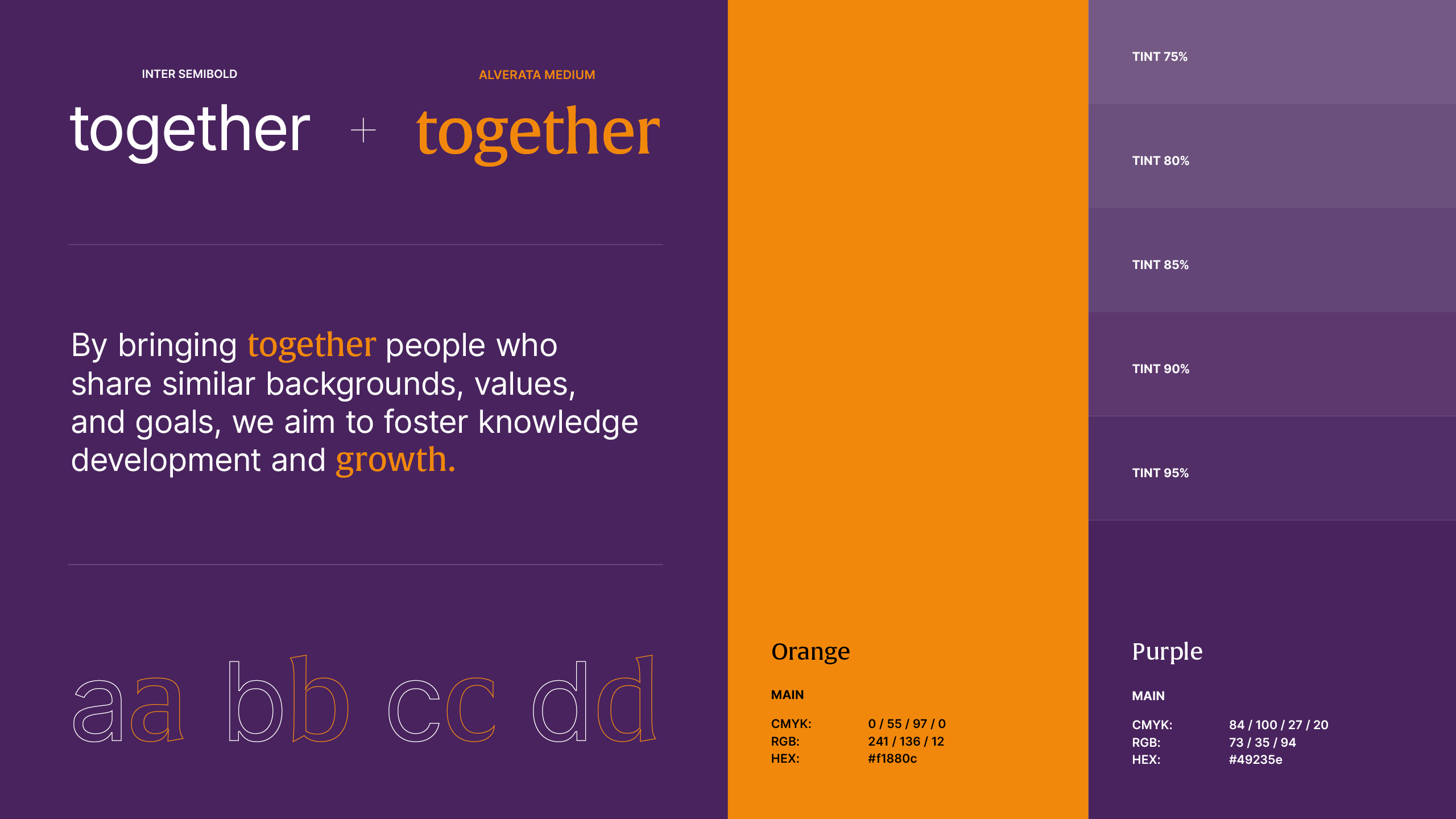
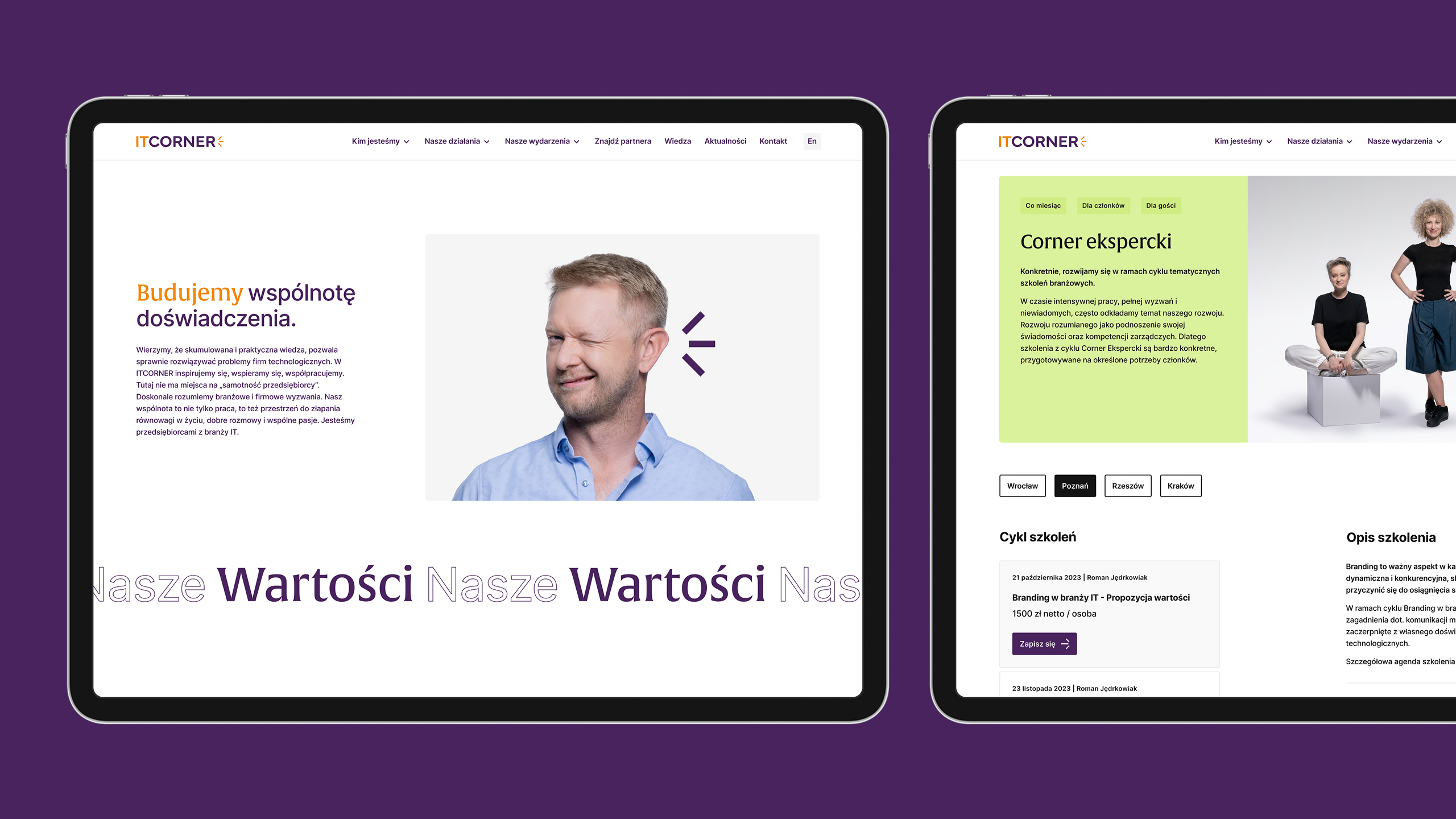
The same language carries through the website, key visual, Culturebook, animation, infographics, communications for individual initiatives, social media, PowerPoint presentations, stationery, email signatures, and business cards. The brand guidelines define how the symbol, typography, colors, and individual formats should be used.