(01) Project Definition
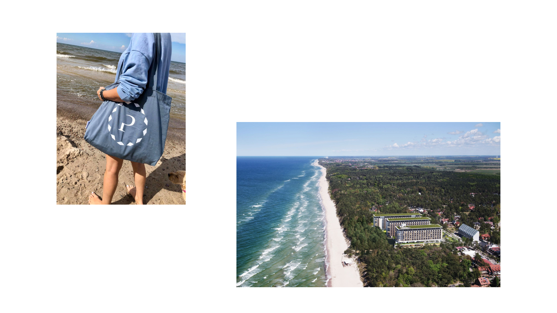
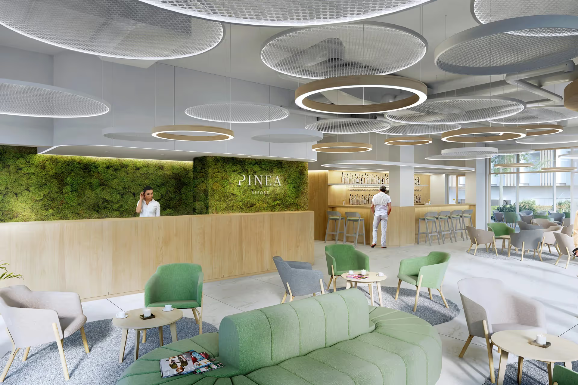
PINEA Resort & Apartments is a year-round complex set between a pine forest and the Baltic Sea, combining apartments, a hotel and leisure facilities. The starting point for the brand was the experience of the place: proximity to the beach, sea views, the scent of pine trees and a slower pace that encourages rest and renewal.
(02) Big Idea
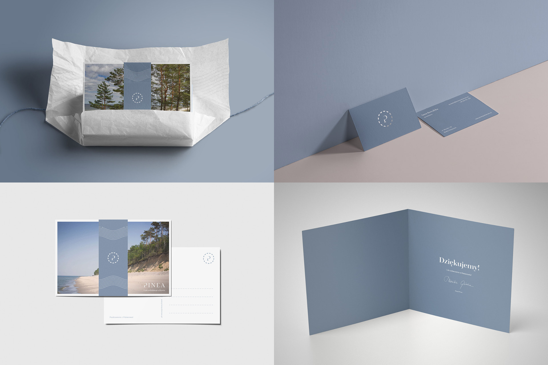
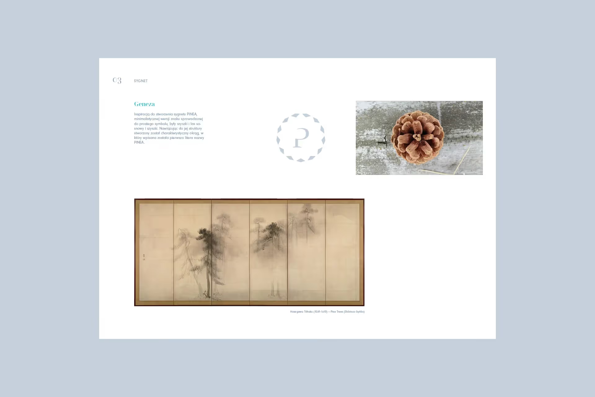
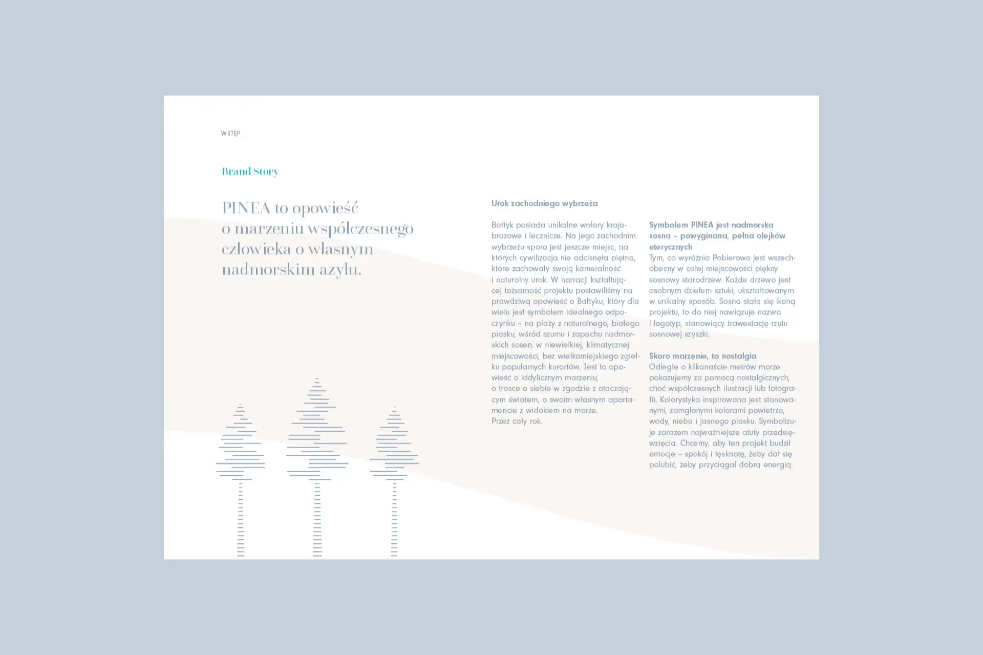
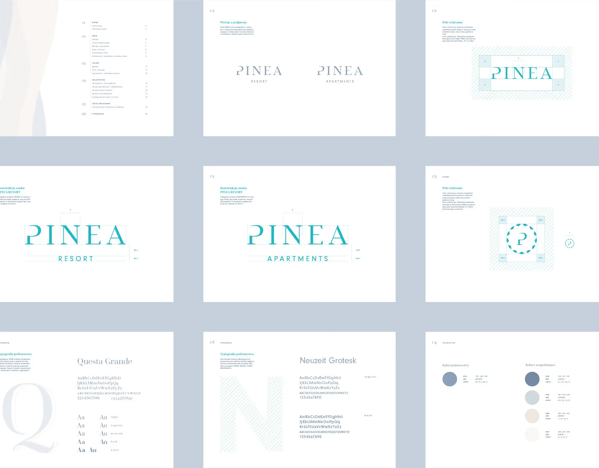
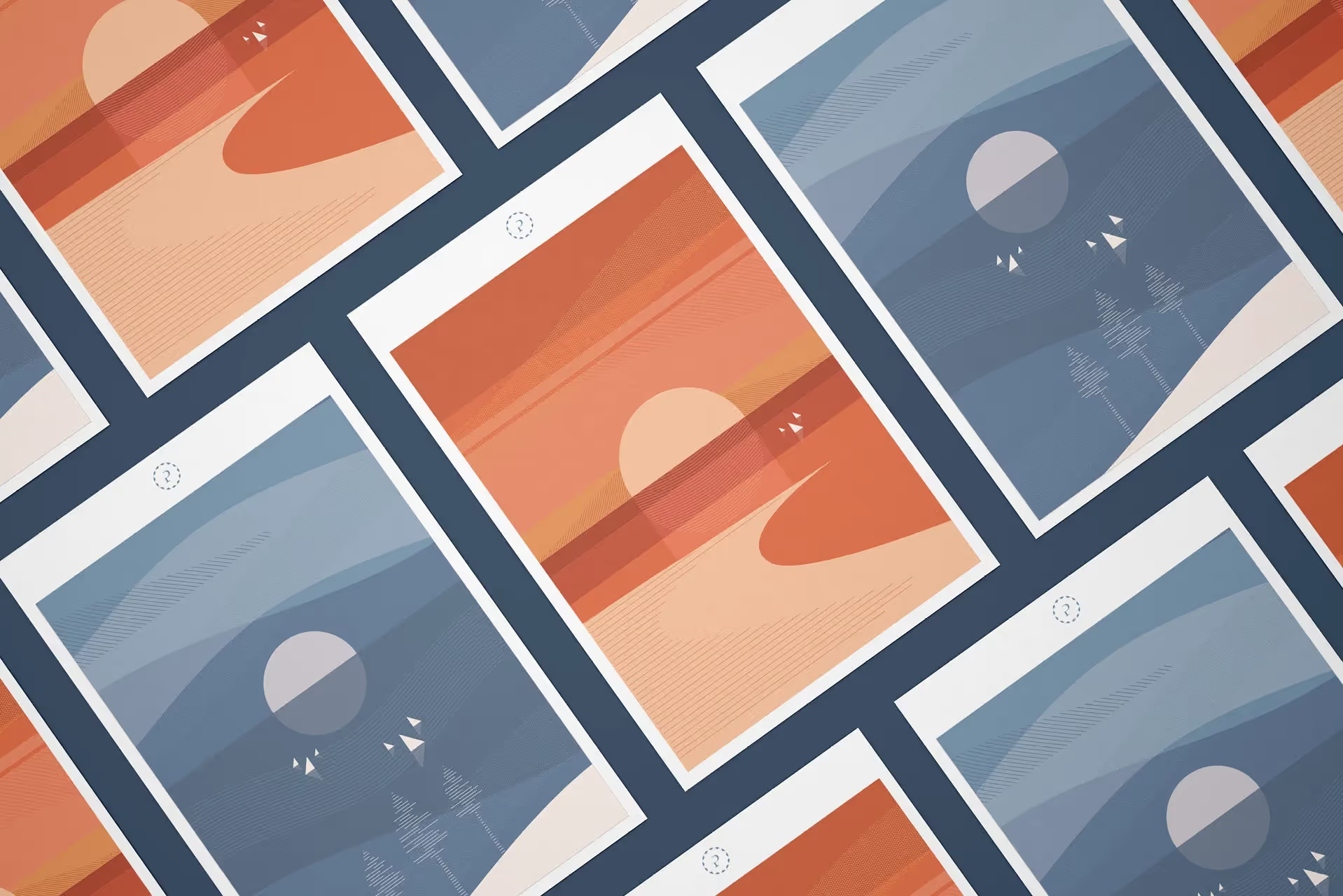
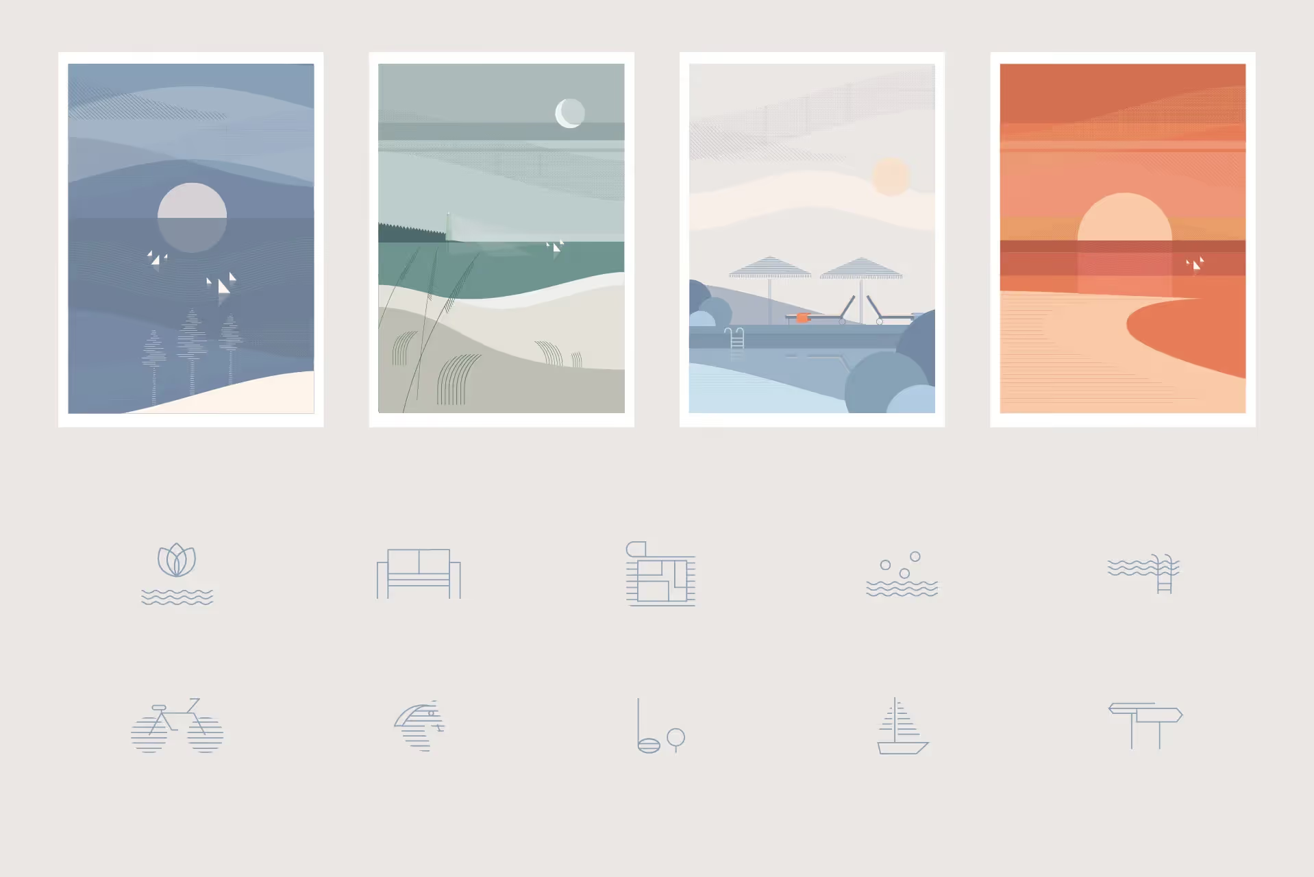
The name and identity refer to the coastal pine – one of the most distinctive elements of Pobierowo’s landscape. The symbol was built from a simplified pine cone structure incorporating the letter P. A restrained colour palette and motifs of waves, the horizon and sails extend the coastal context.
(03) Visual Mechanism
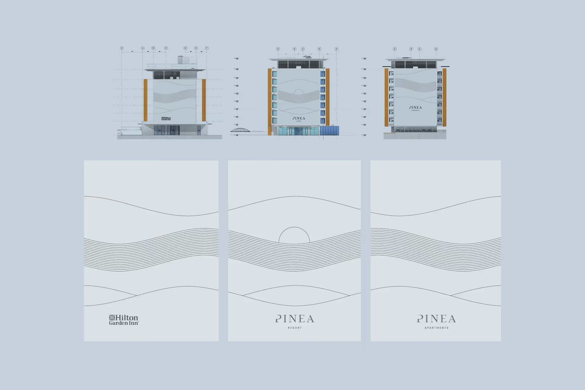
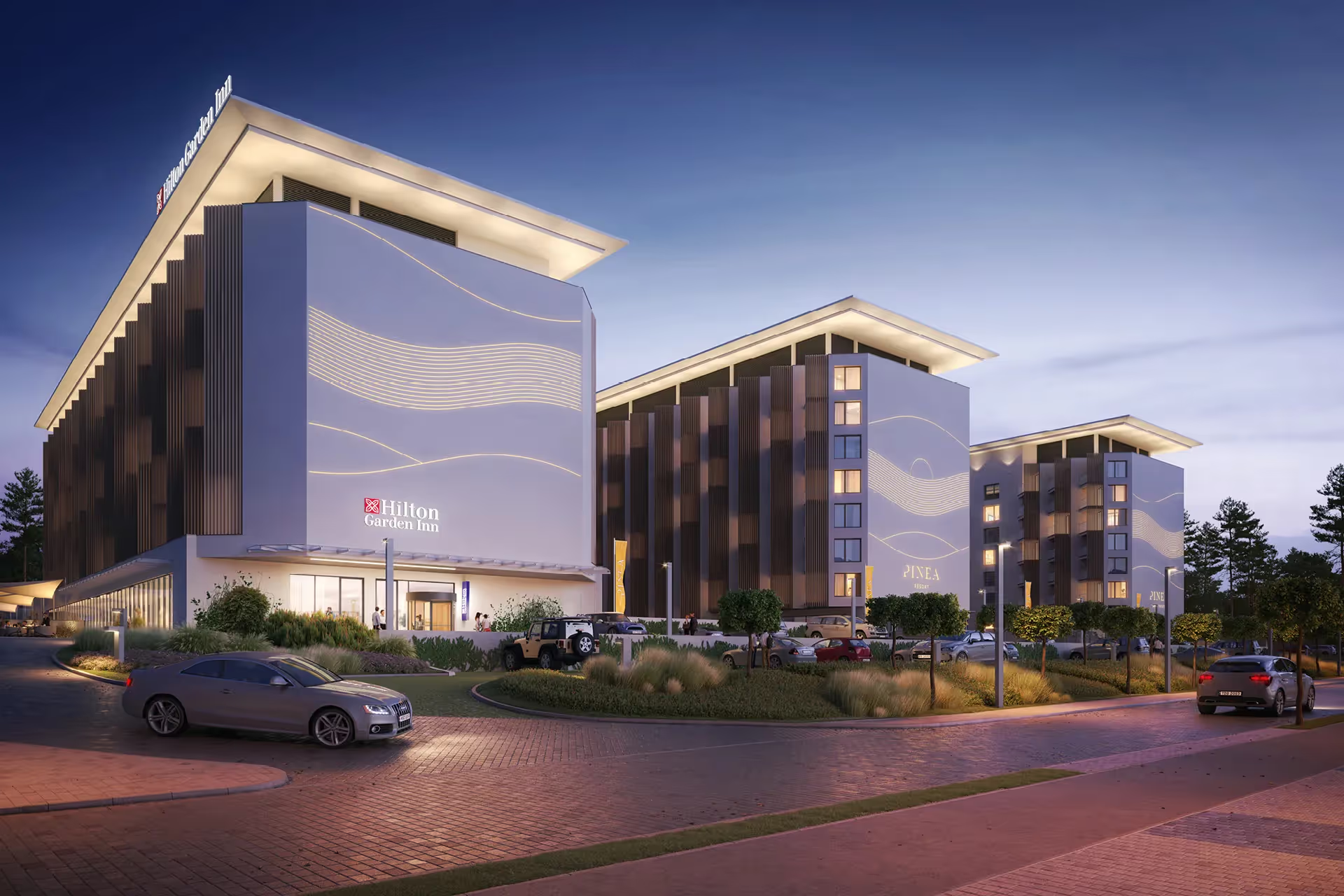
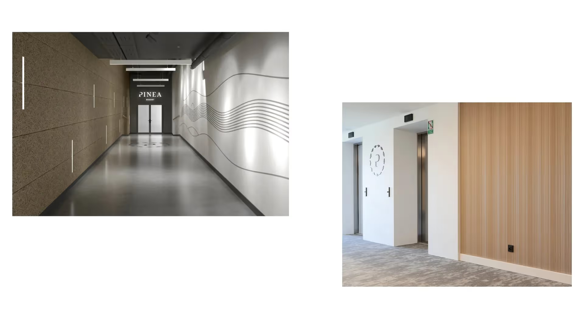
We based the visual language on soft lines, recurring rhythms and organic compositions. We developed it across illustrations, iconography and sales materials. The motif was also transferred to the building façades – on a large scale, visible after dark thanks to illumination.
(04) Activation
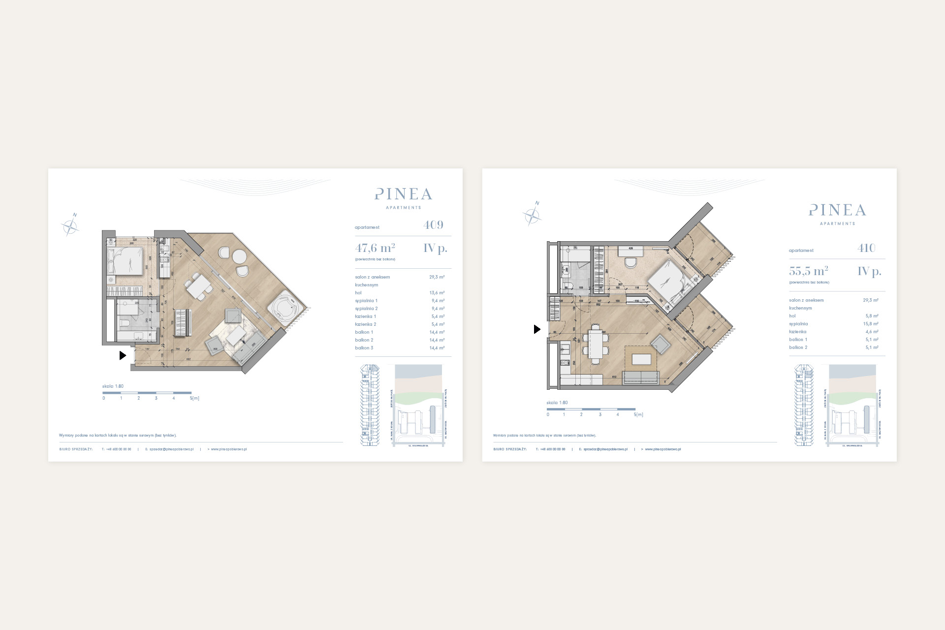
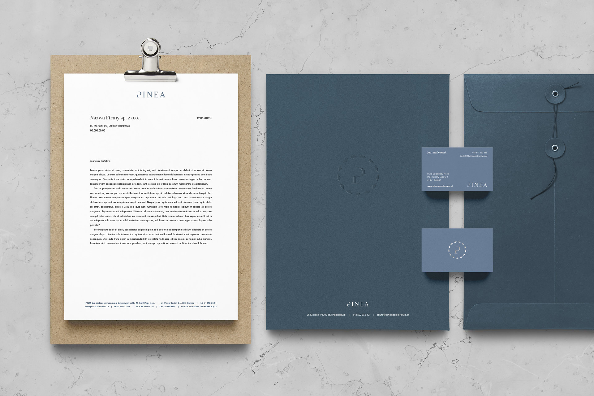
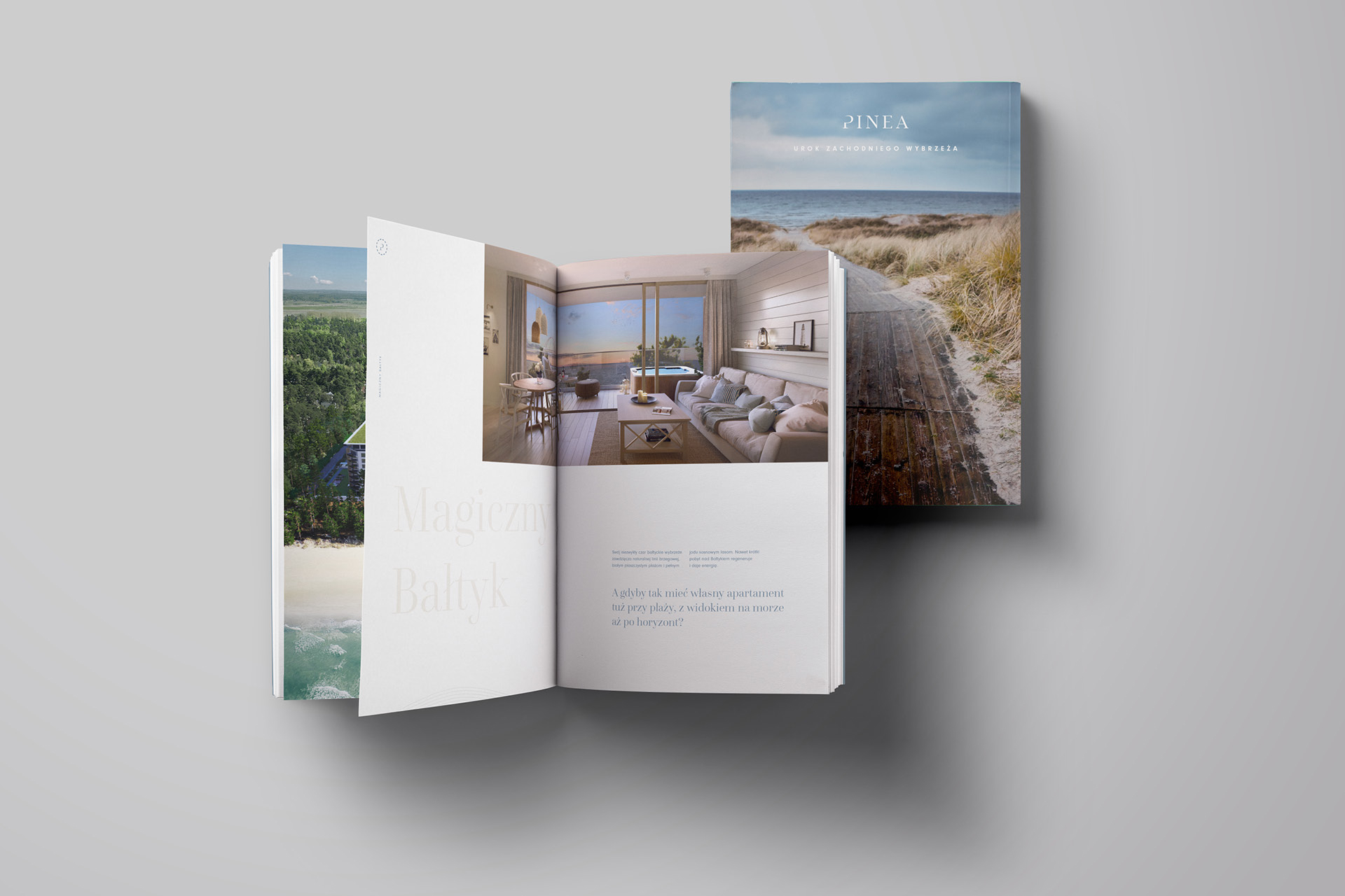
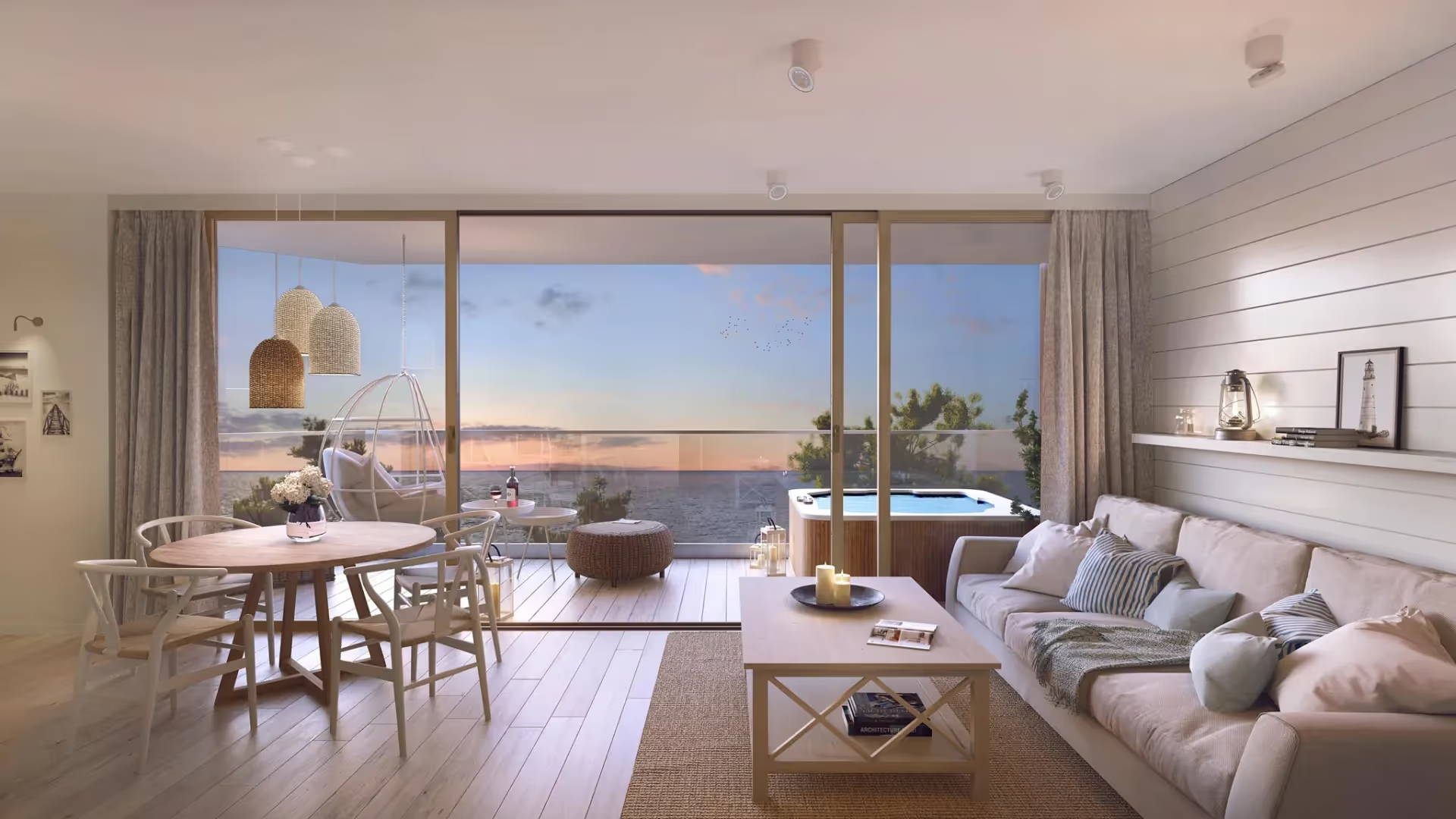
The visual identity for the hotel and apartments included the website, sales brochure, printed materials, merchandise and digital communication. Across these applications, the same experiences associated with a stay on the Baltic coast return: slowing down, taking a breath and connecting with the landscape.