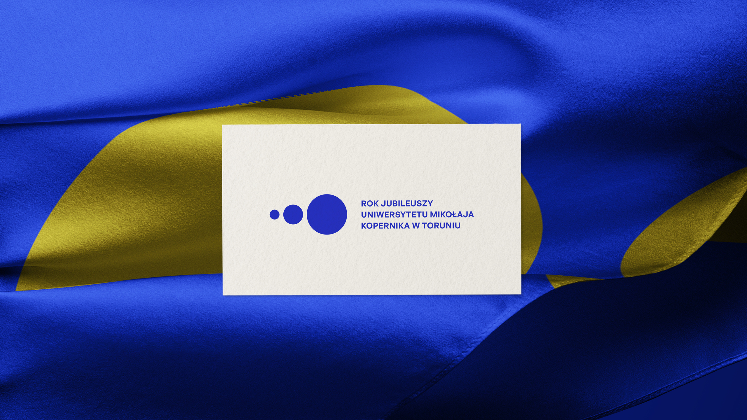
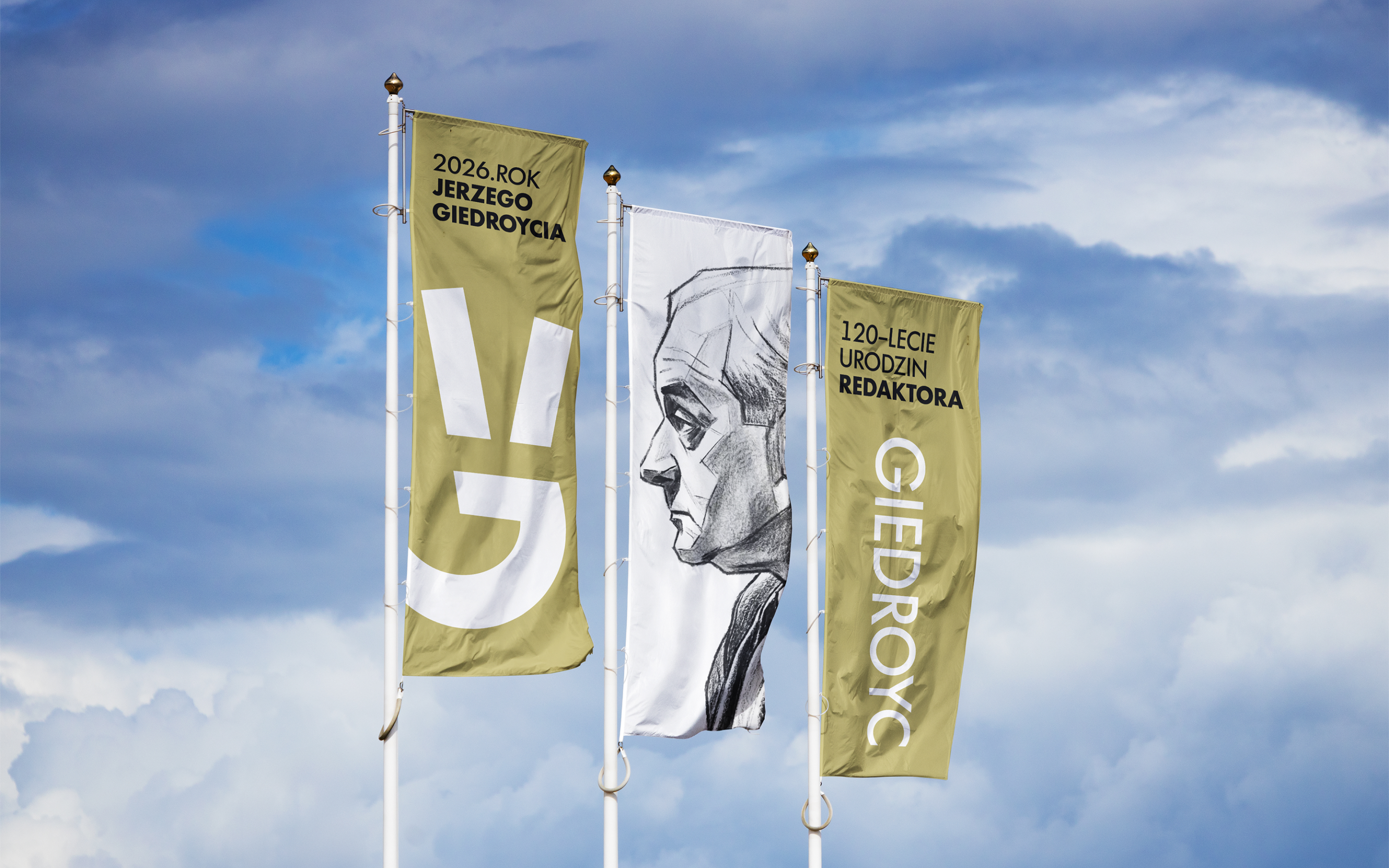
During the 2024/25 academic year, Nicolaus Copernicus University celebrated three anniversaries: the University’s 80th anniversary, the 40th anniversary of the establishment of the Medical Academy in Bydgoszcz, and the 20th anniversary of the Medical Academy’s merger with NCU and the establishment of Collegium Medicum. The programme included scientific, cultural and sporting events in Toruń and Bydgoszcz. Our design won the competition for the visual identity of NCU’s Year of Jubilees.
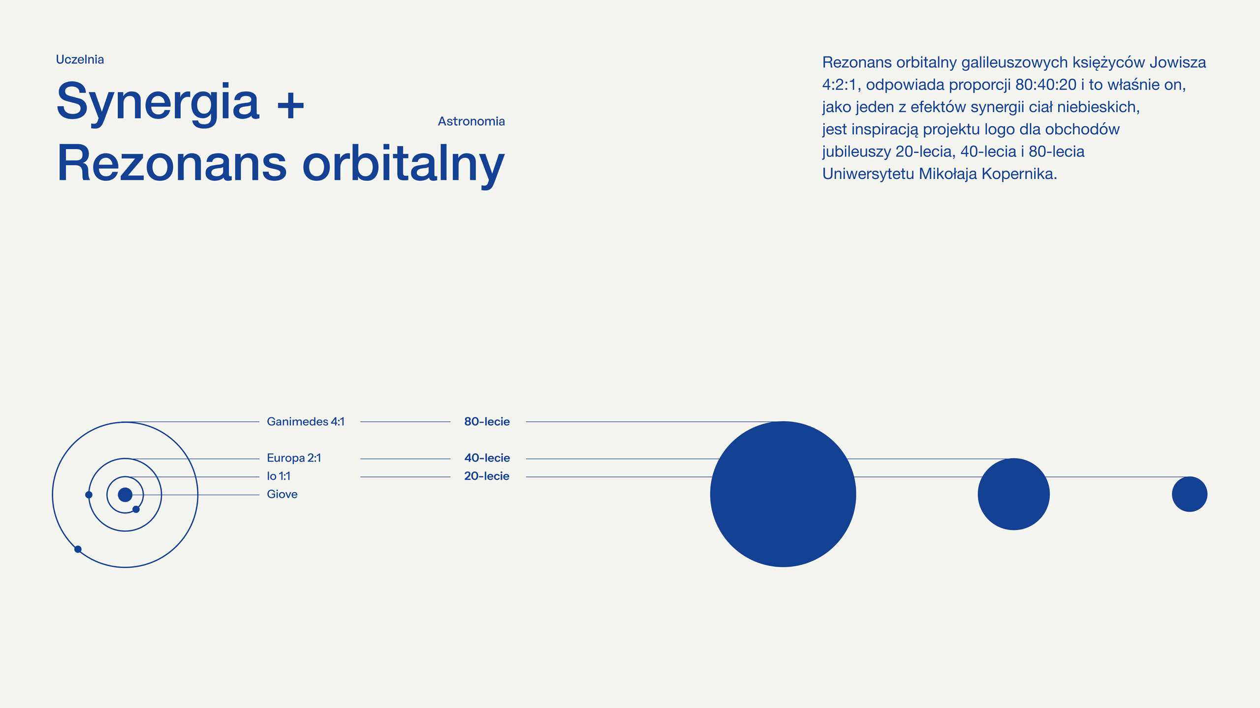
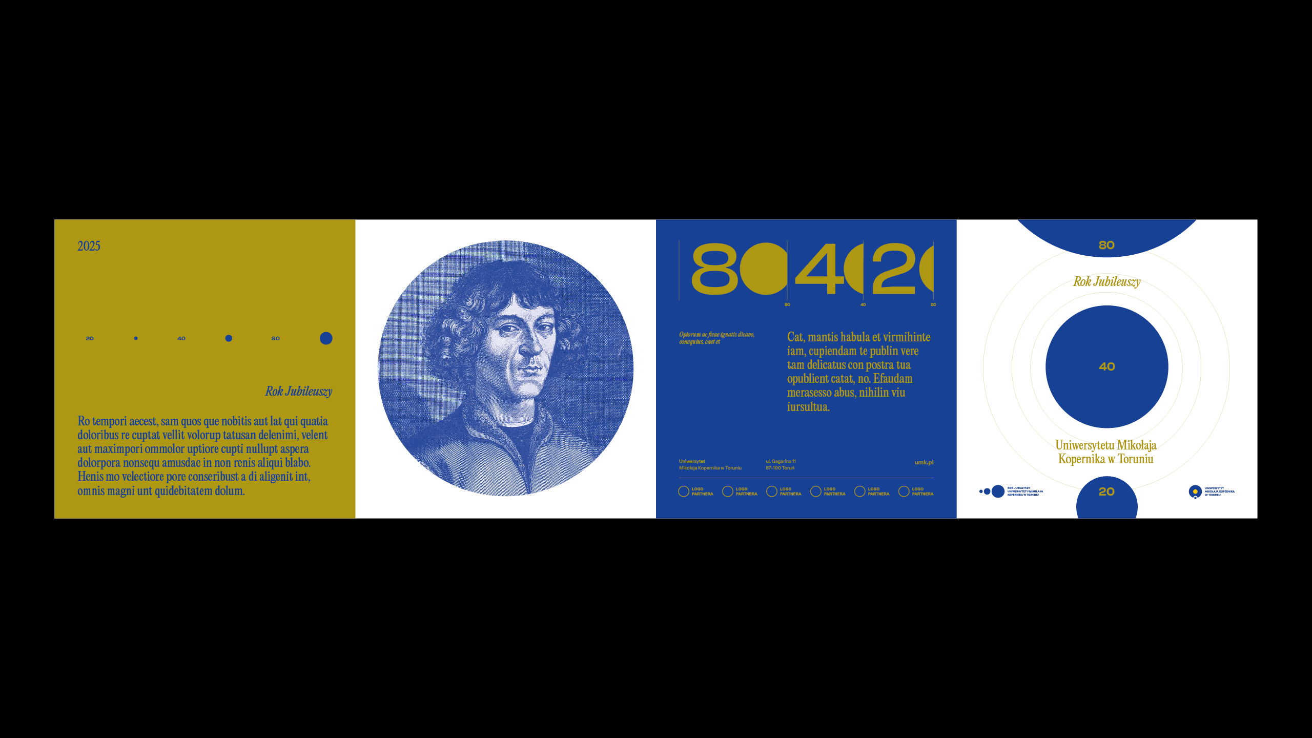
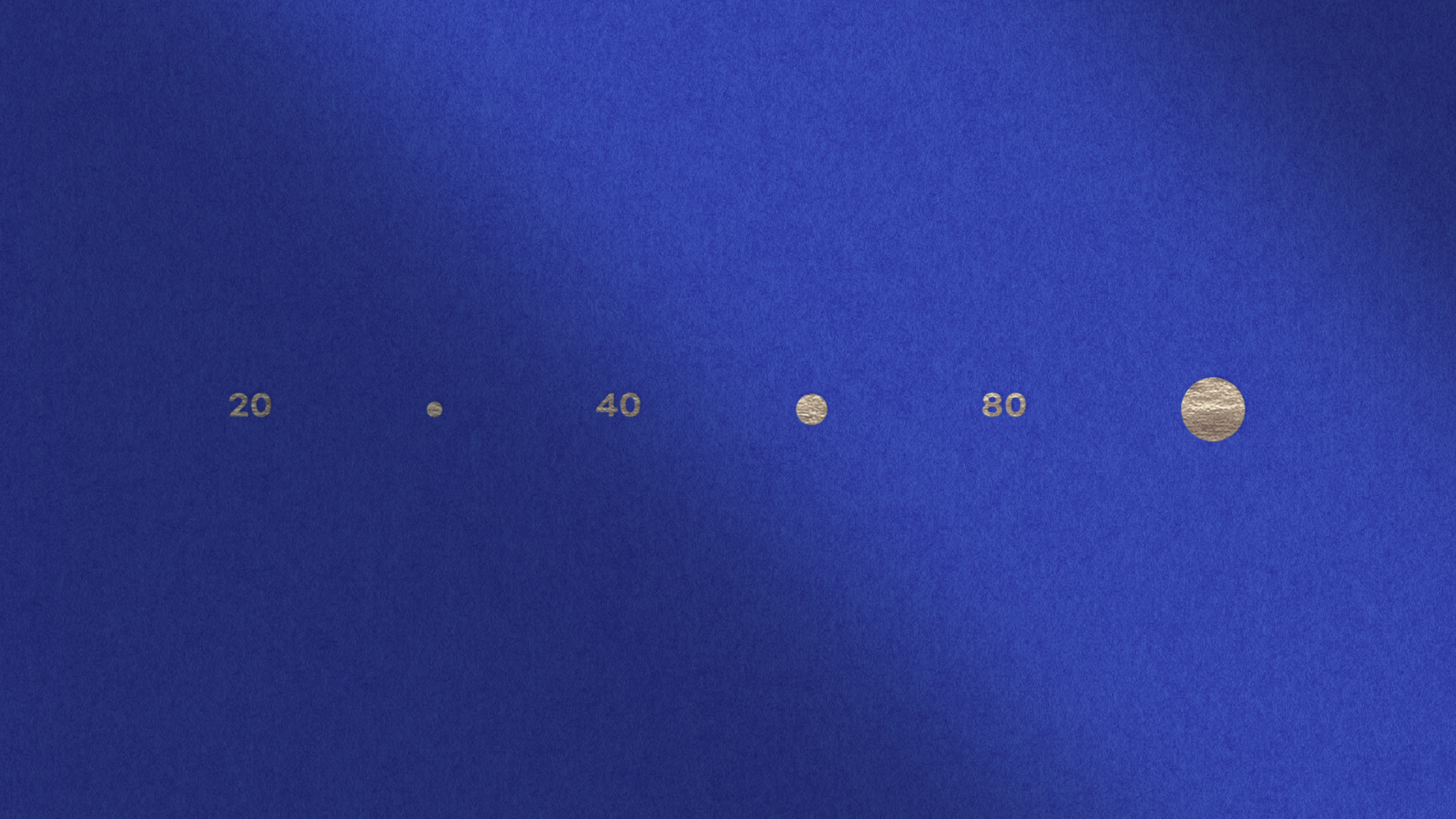
The three anniversaries differed in scale and history but needed a common symbol. We found the relationship between them in the numbers 80:40:20, which simplify to 4:2:1. The same ratio appears in the orbital resonance of Io, Europa and Ganymede – three moons of Jupiter whose separate orbits remain precisely synchronised. This astronomical principle linked the three anniversaries to NCU’s Copernican identity.
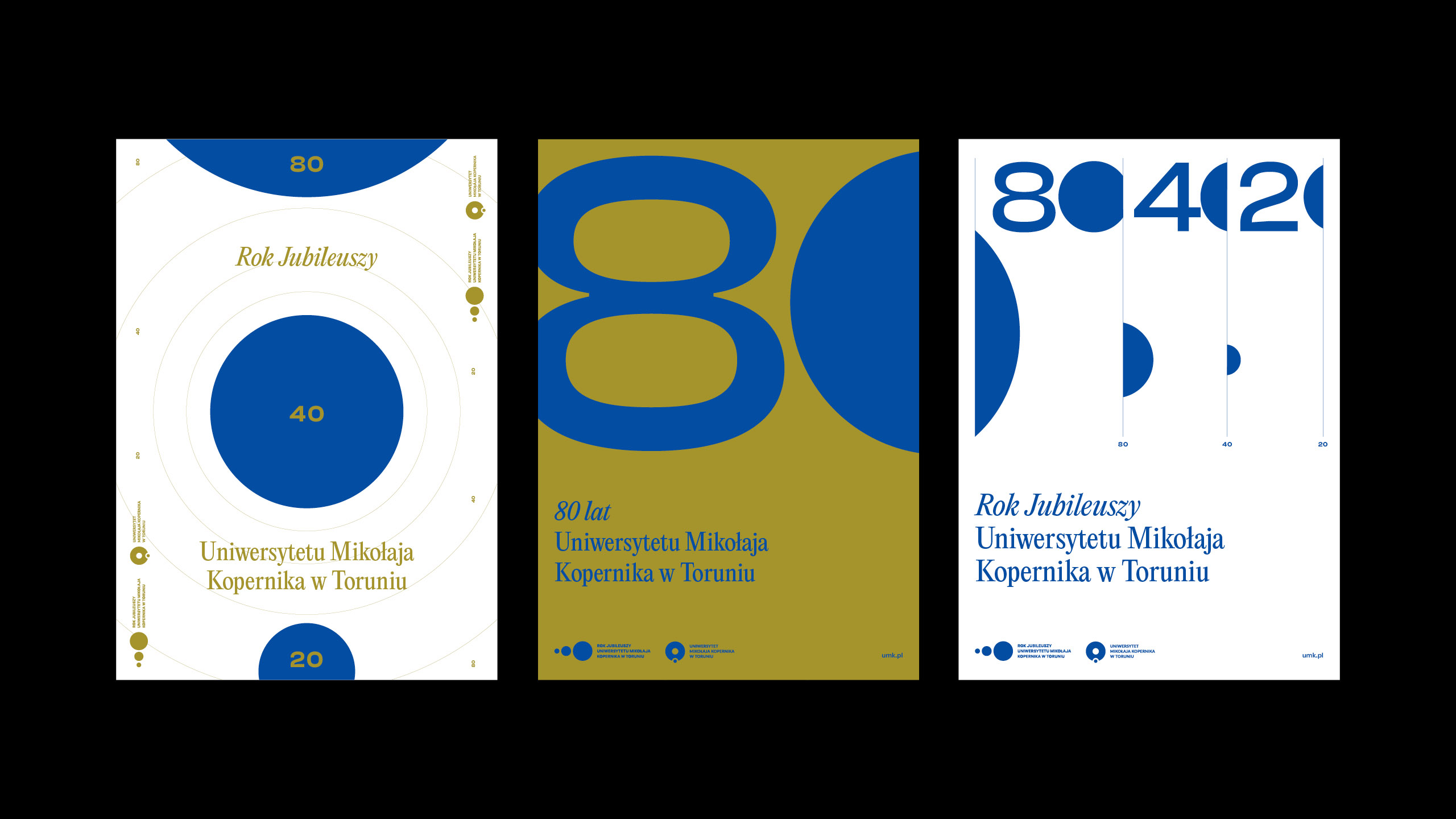
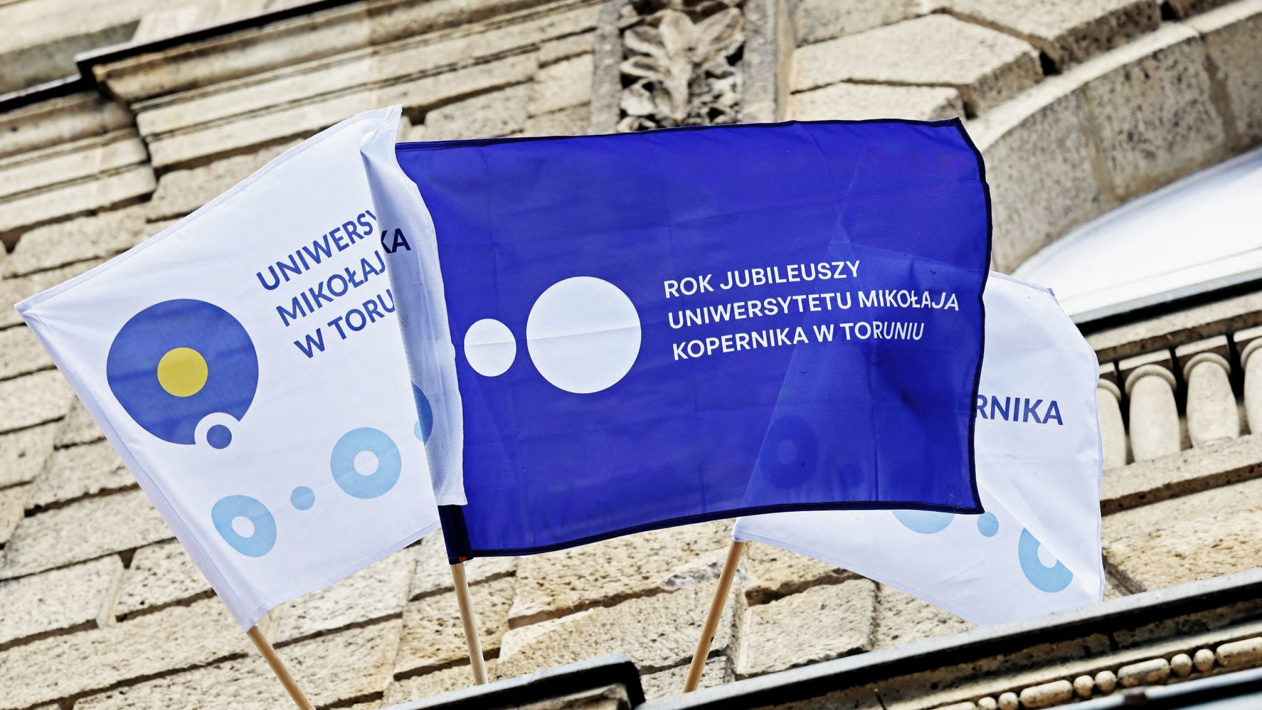
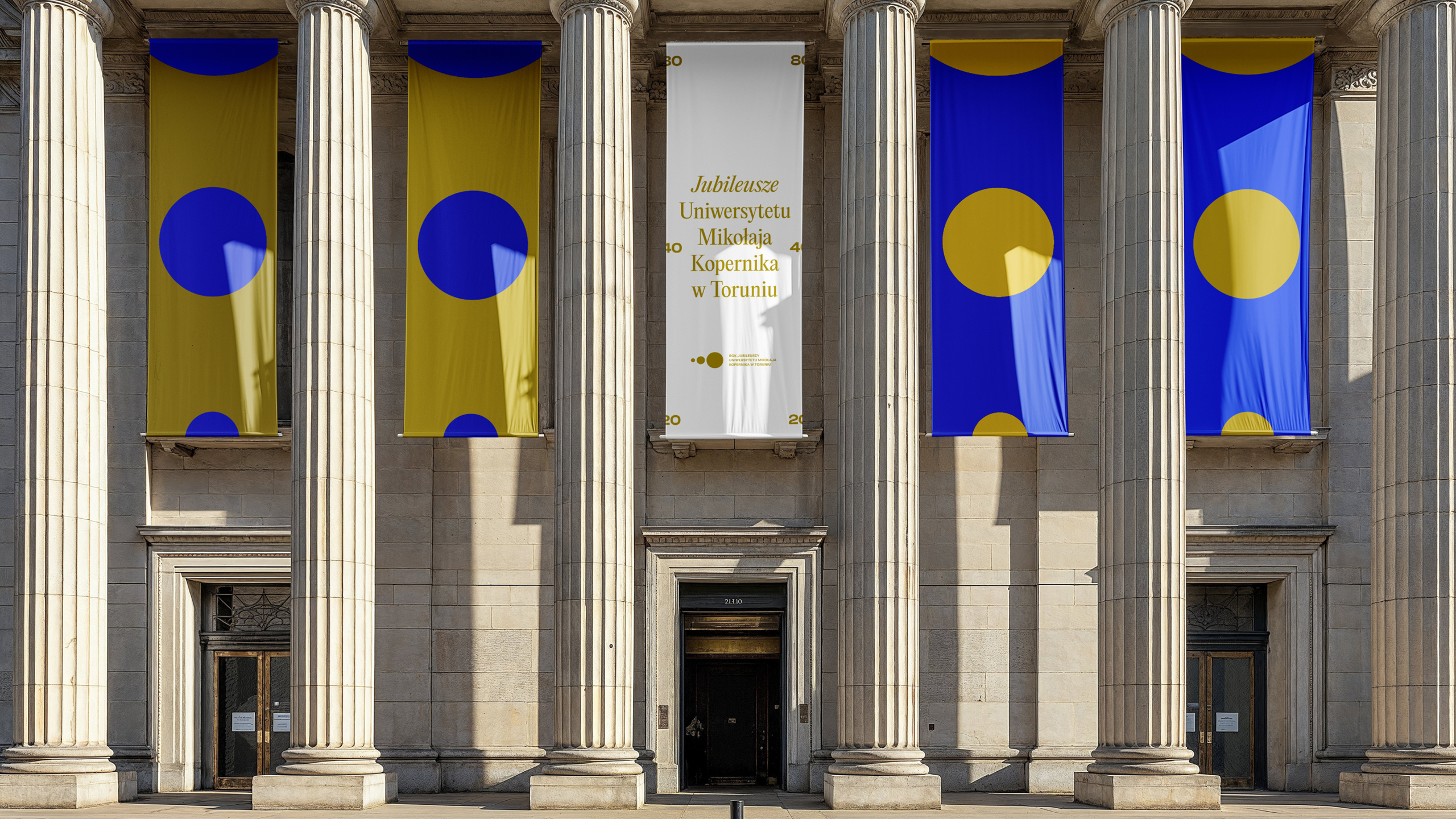
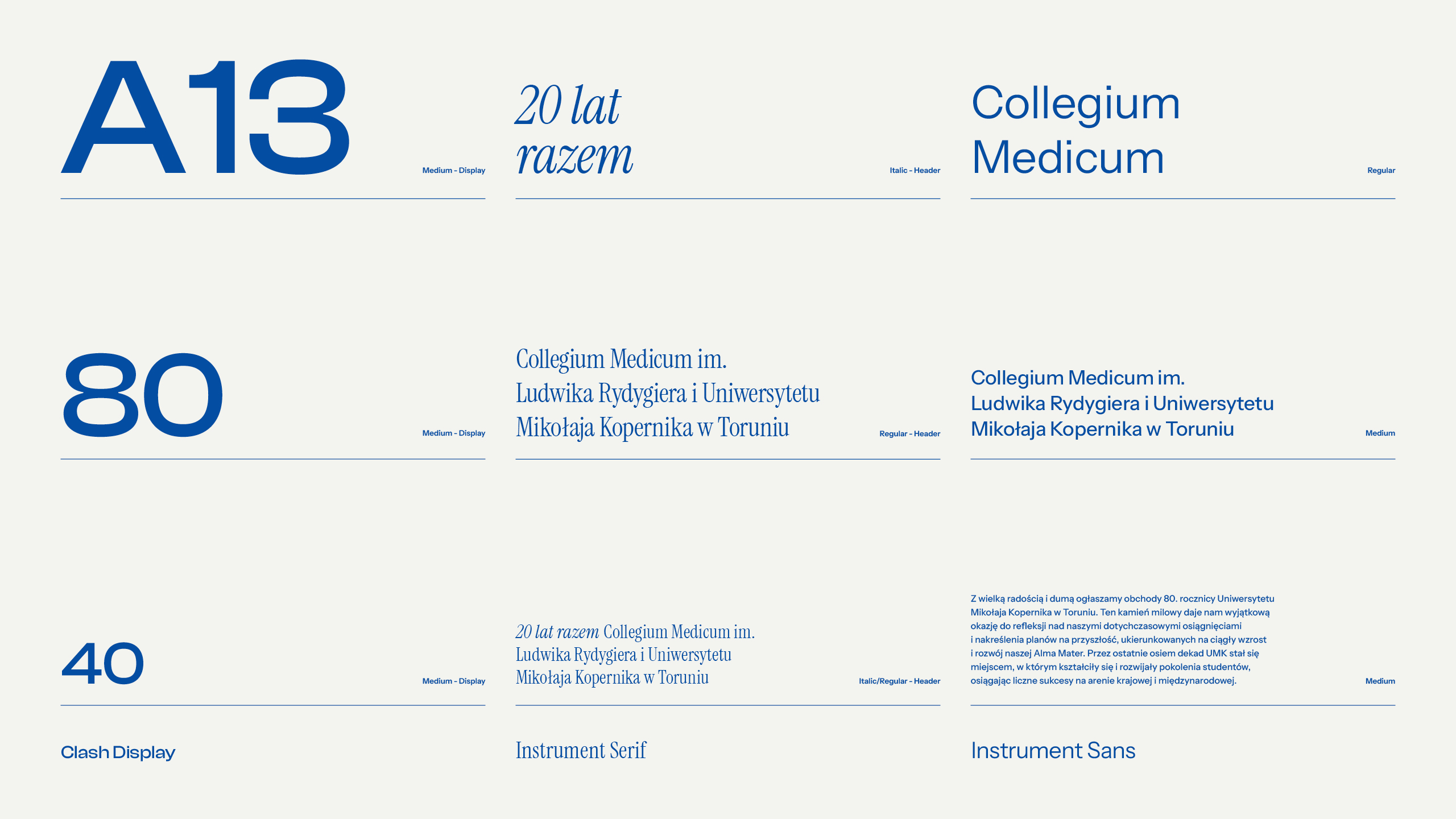
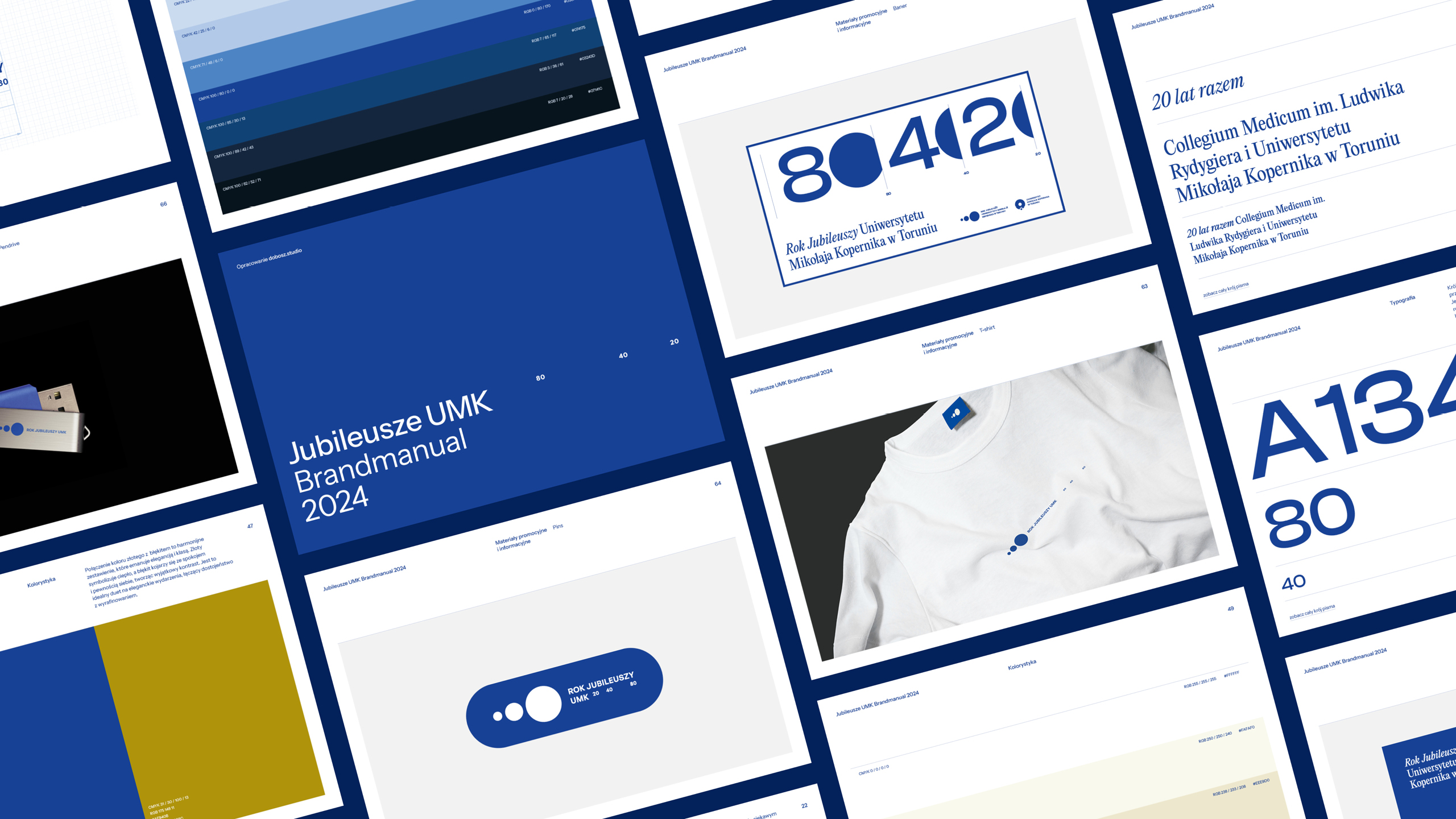
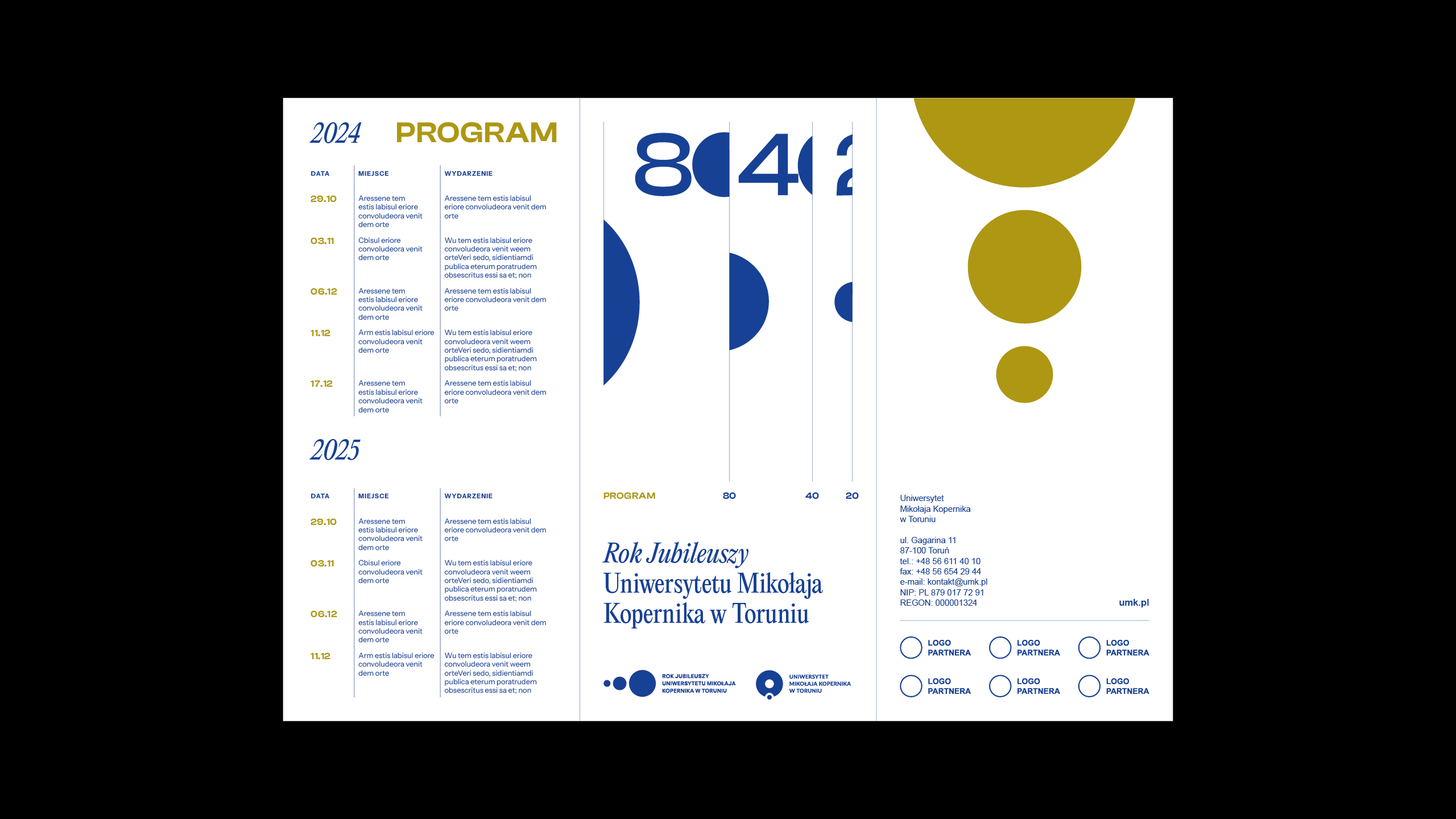
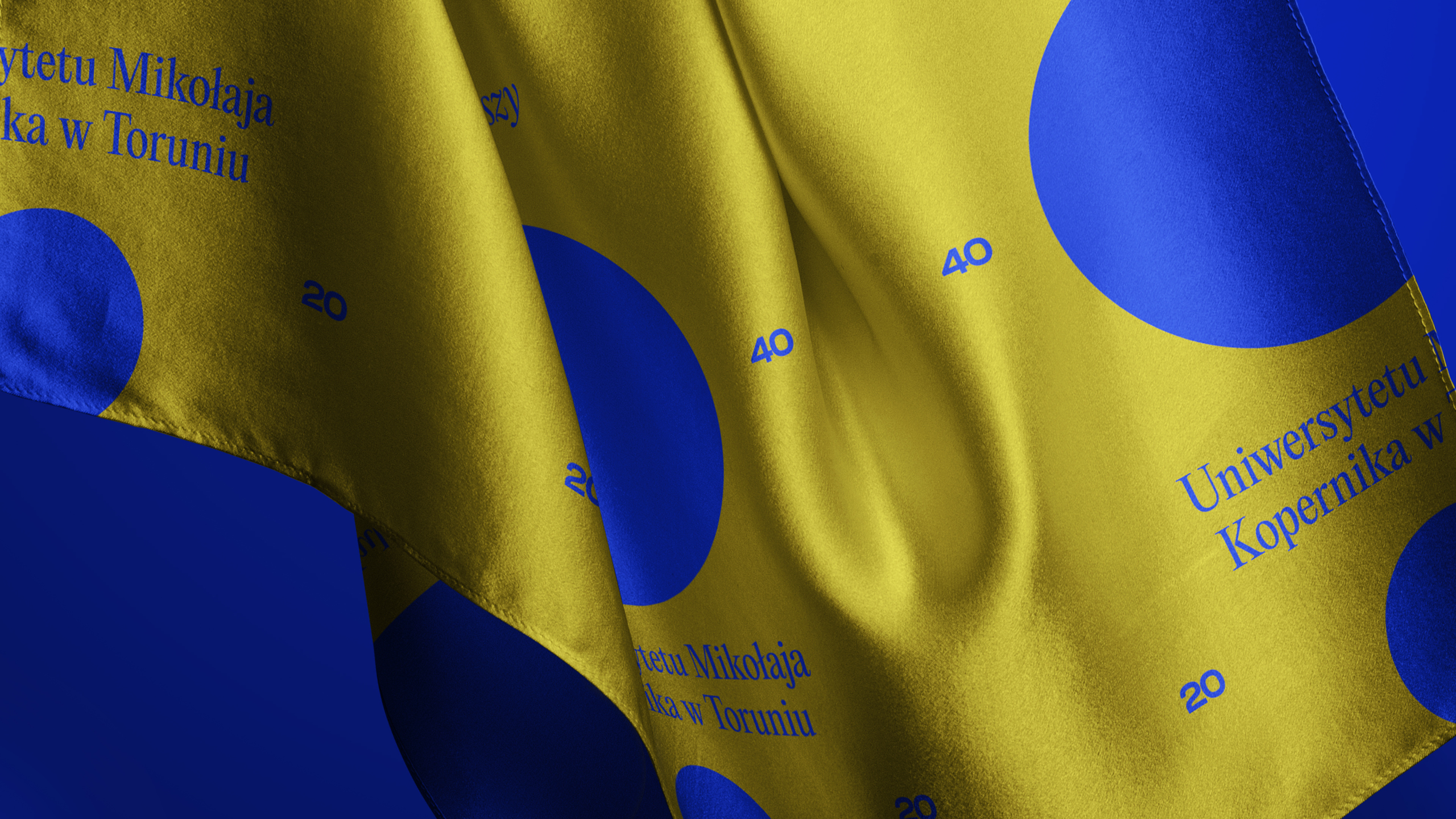
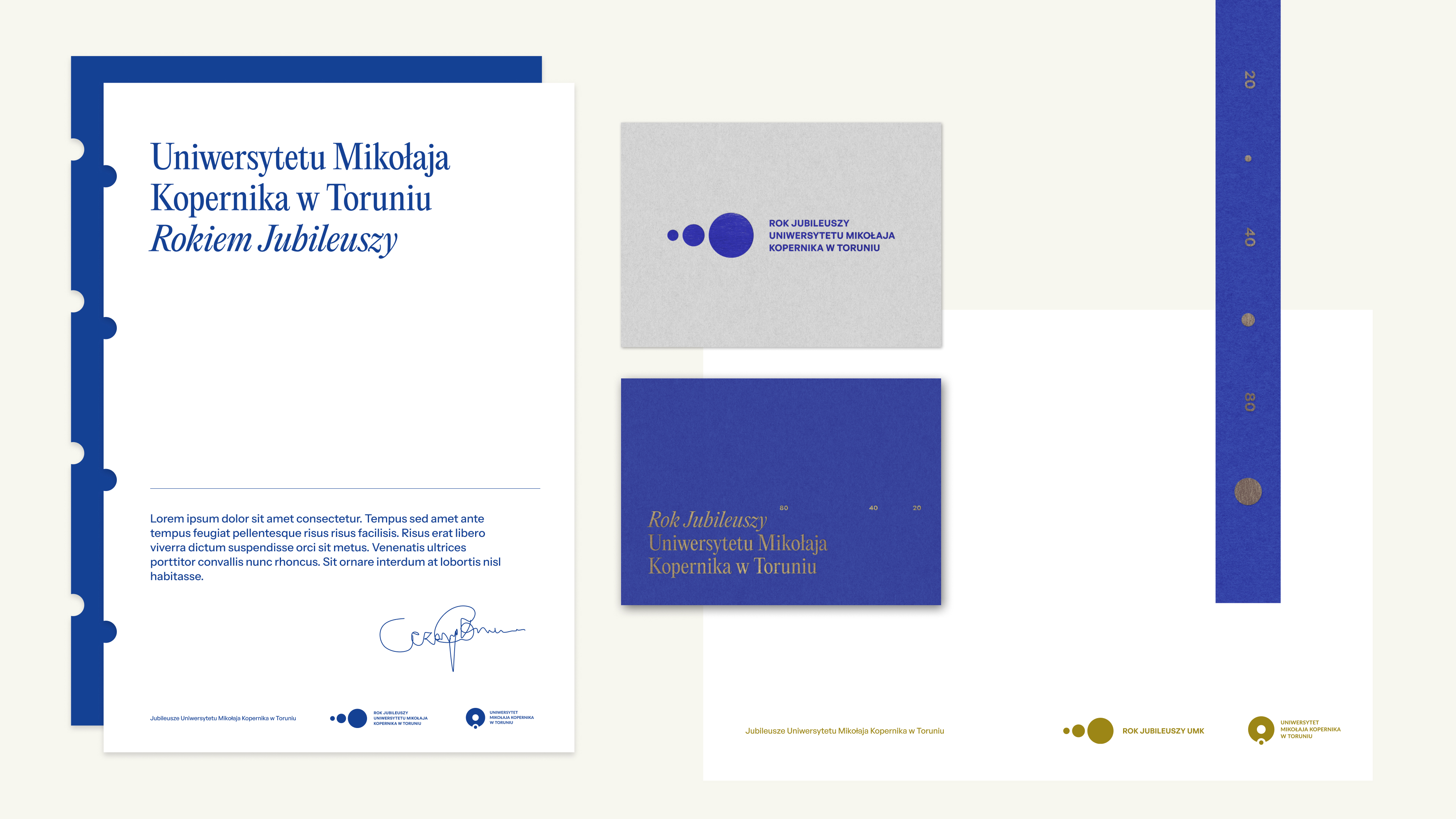
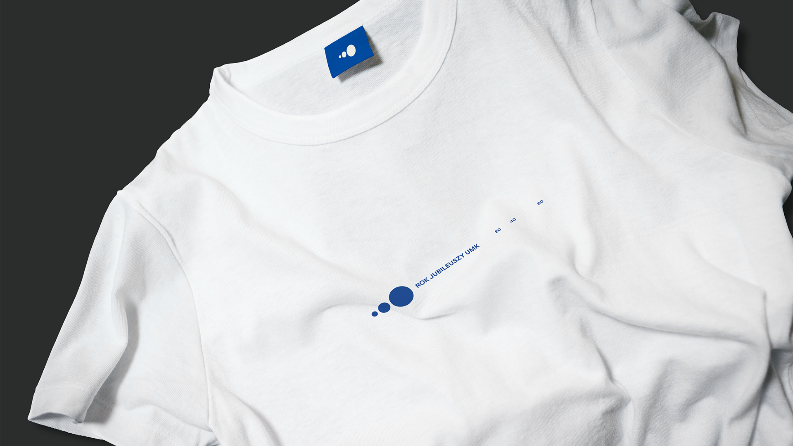
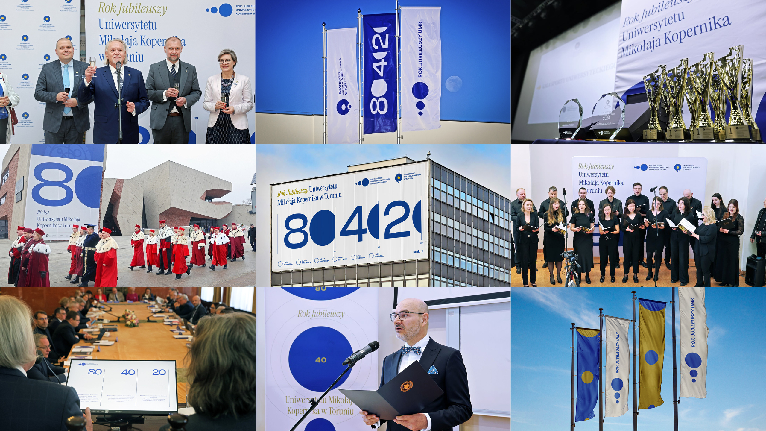
The 4:2:1 ratio defined the construction of the logo, key visual and the entire identity system. Three circles represent the individual anniversaries, while their scale and arrangement organise subsequent formats. We developed the system across the website’s visual design, social media post templates, posters, invitations, programmes, badges, lanyards, conference materials and other event materials.
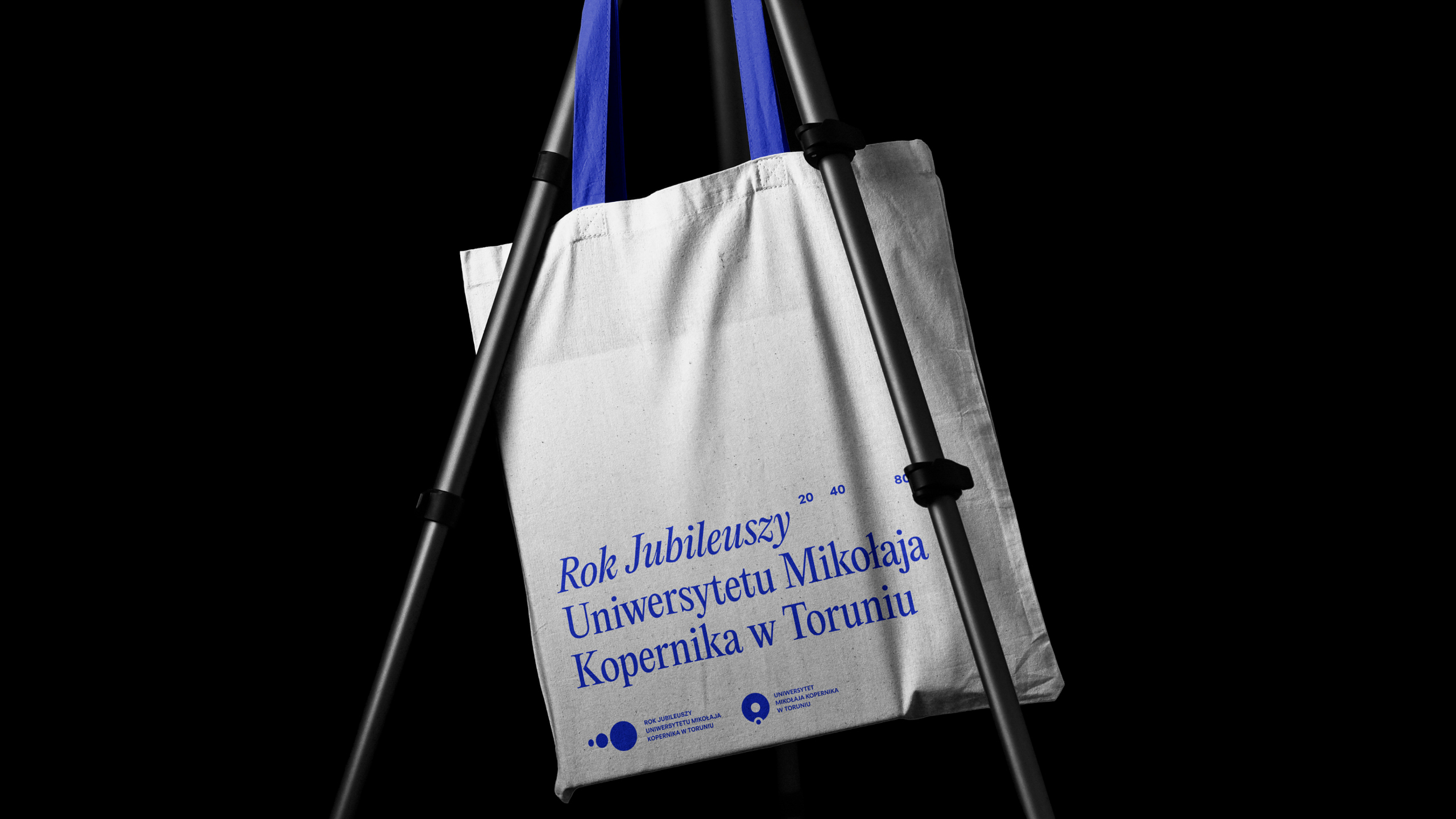
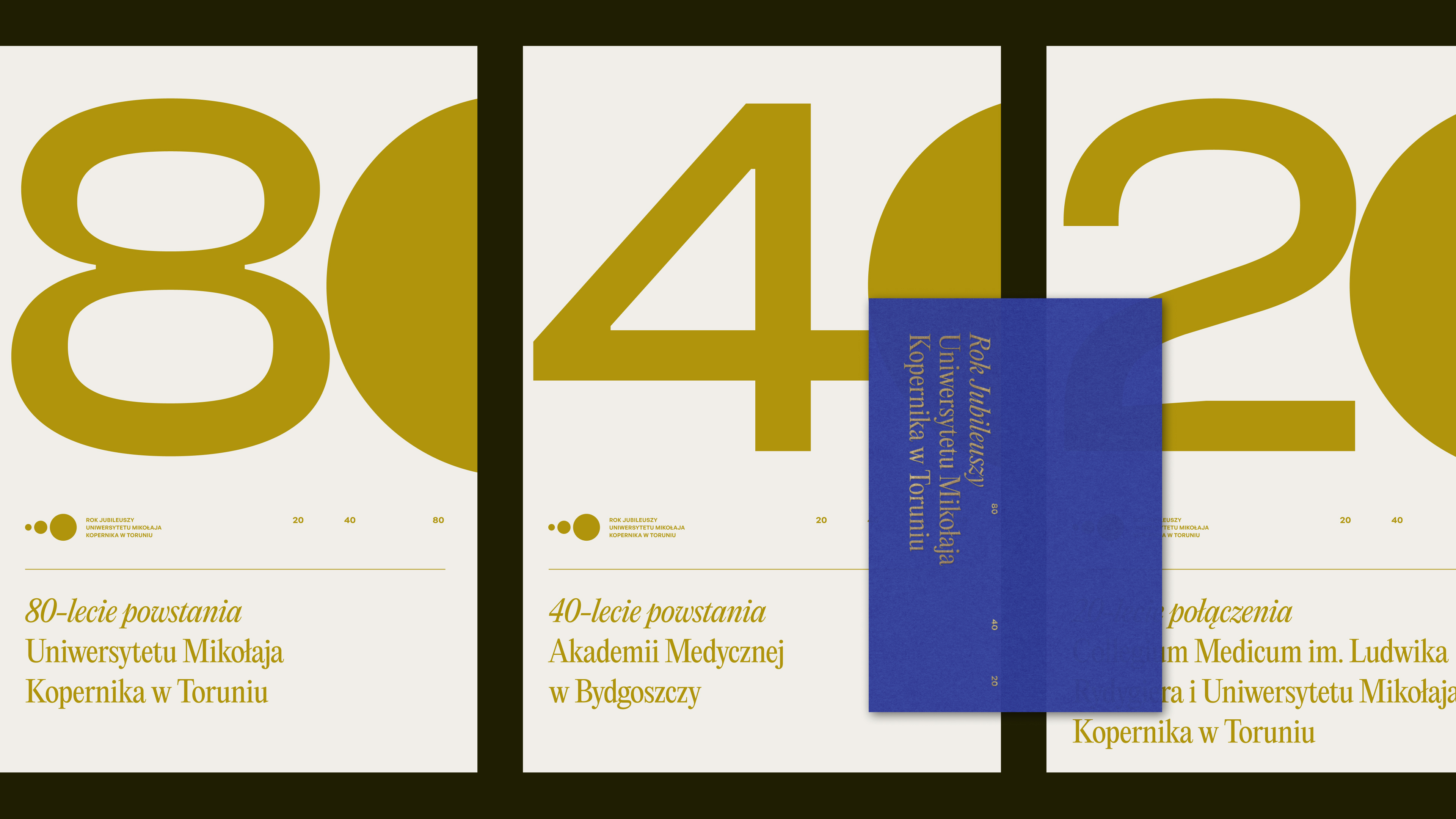

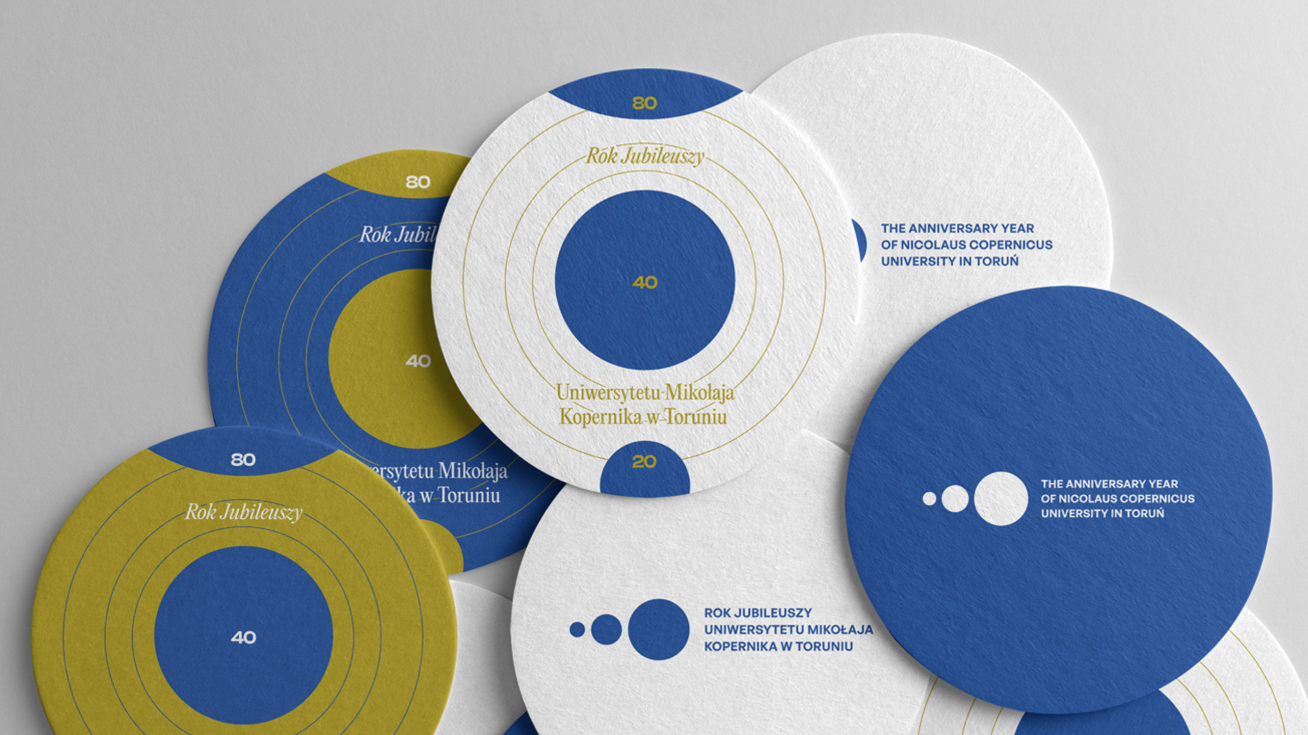

Nicolaus Copernicus University in Toruń recommends dobosz.studio for comprehensive visual identities marking the 550th anniversary of Nicolaus Copernicus’ birth (2023) and NCU’s 2024/2025 Year of Jubilees (80 years of NCU, 40 years of the Medical Academy, 20 years since the merger). Both projects won competitions. The team showed creativity, attention to detail and a strong grasp of context. Collaboration was timely and dialogue-based.