THE PACK brings together the capabilities needed to create imagery – from post-production and VFX to animation, gaming, VR, development and real-time technologies. The brand needed a language that would present these specialisations as parts of one system while allowing each to retain its own name and role.
We based the identity on the image-first principle – image is the foundation of THE PACK’s work and remains its key communication element. The logo combines an open box, a film clapperboard and a “play” symbol, referring to bringing capabilities together, starting production and bringing an image to life. It reflects the studio’s model: selecting the specialisations a project needs and combining them around a shared task.
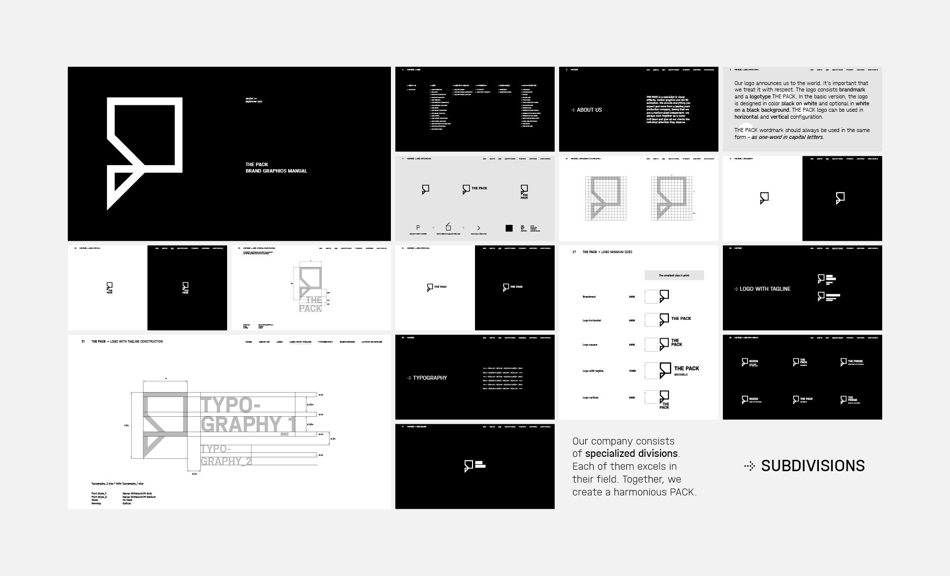
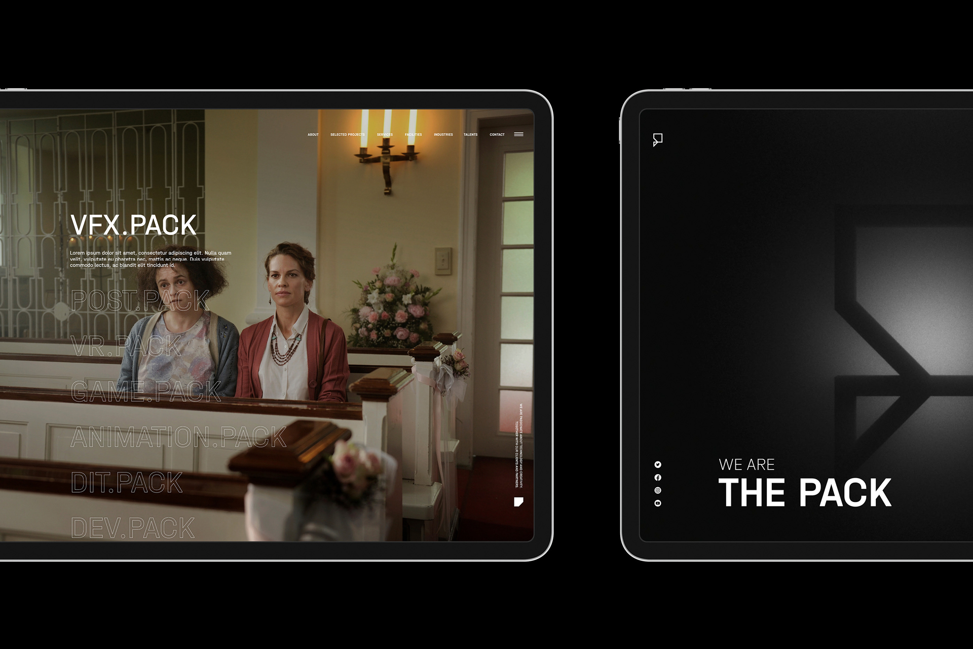
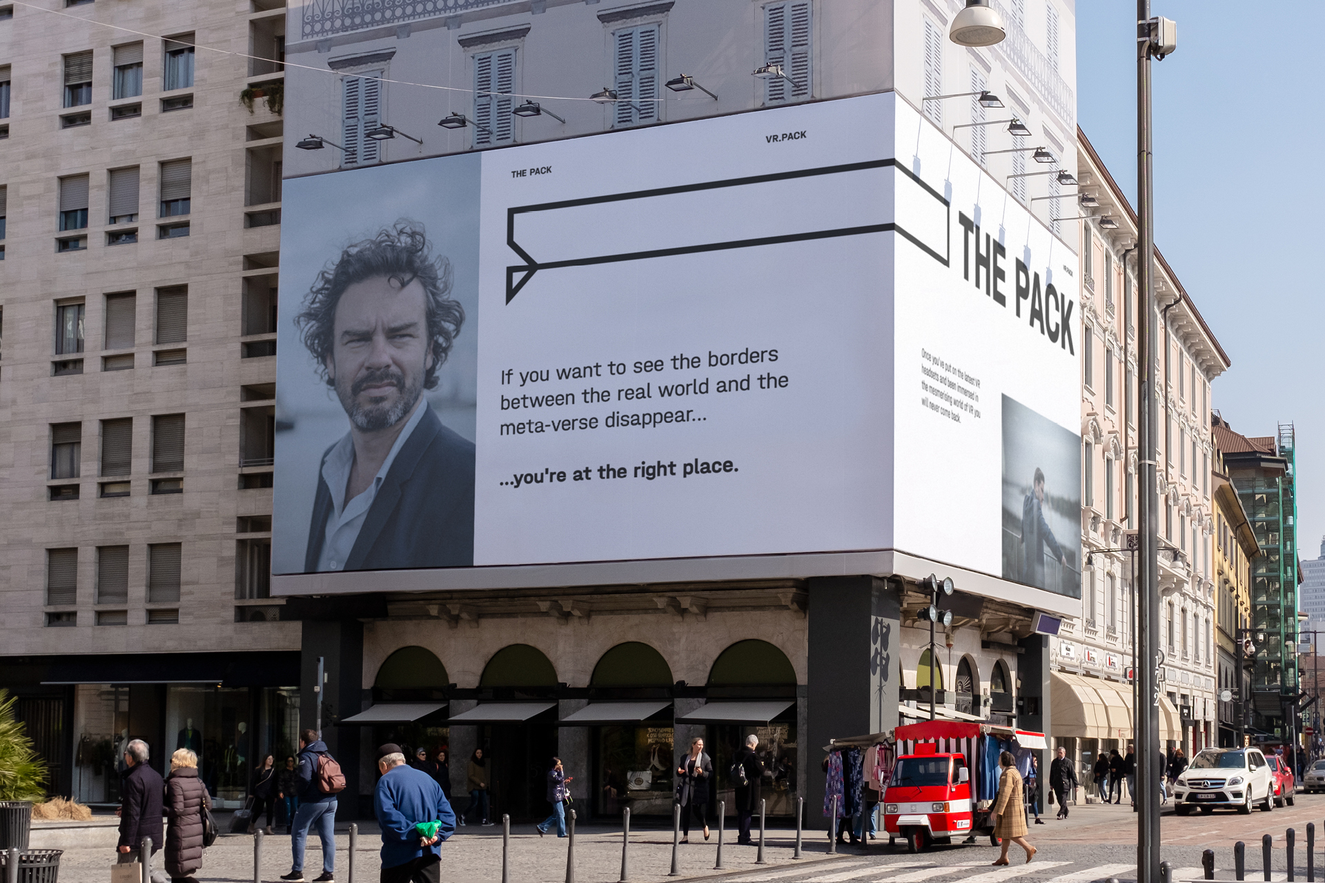
The name became the organising principle for the offer. POST.PACK, VR.PACK, DEV.PACK and future extensions create distinct areas of expertise while remaining part of one brand. The system can expand as new capabilities emerge without creating a separate identity for each one.
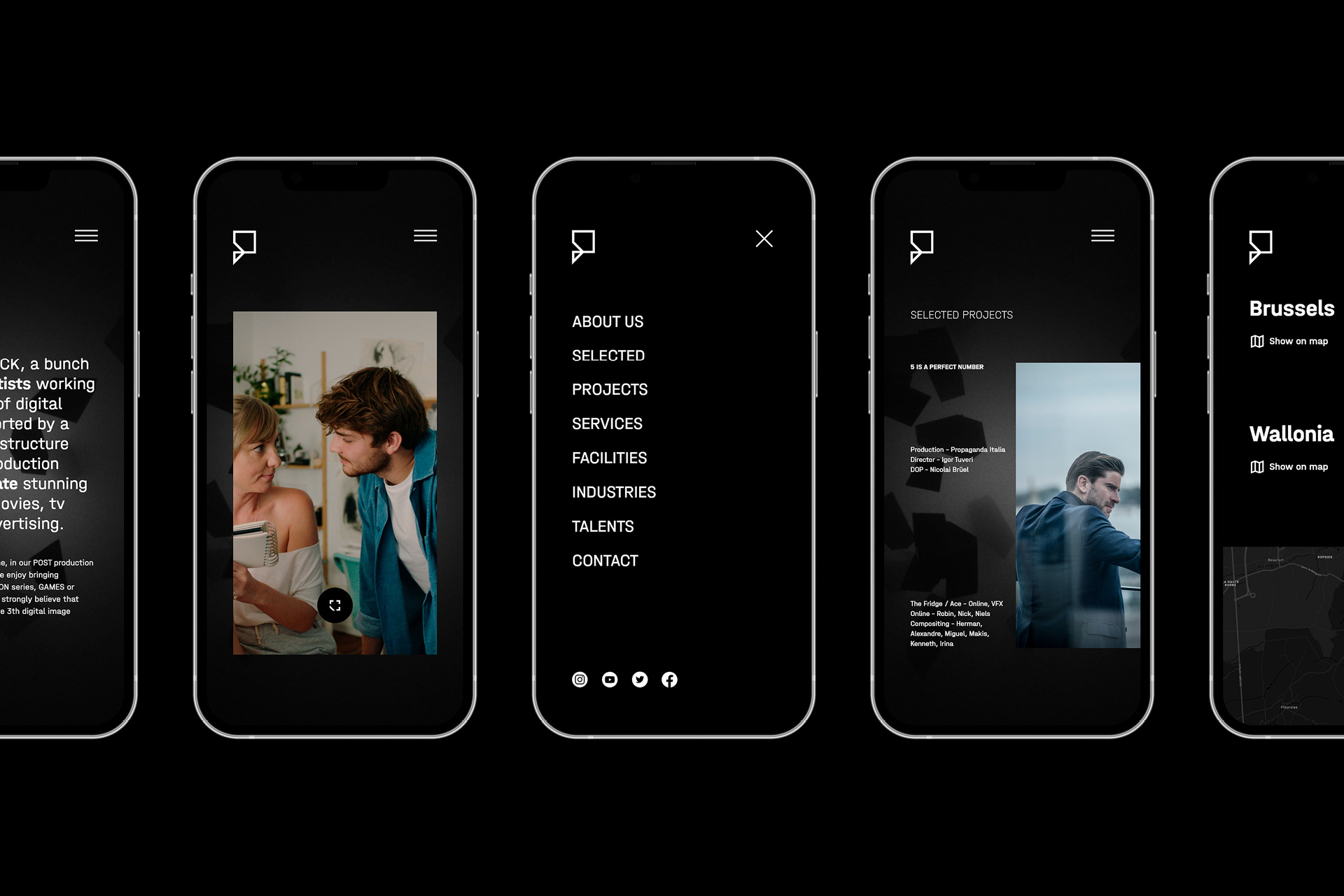
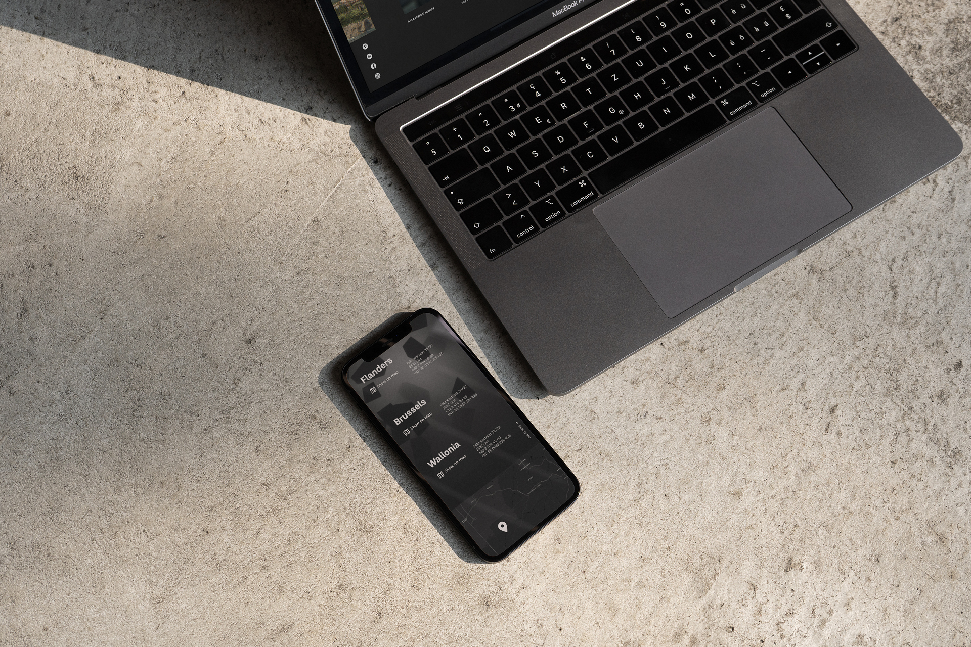
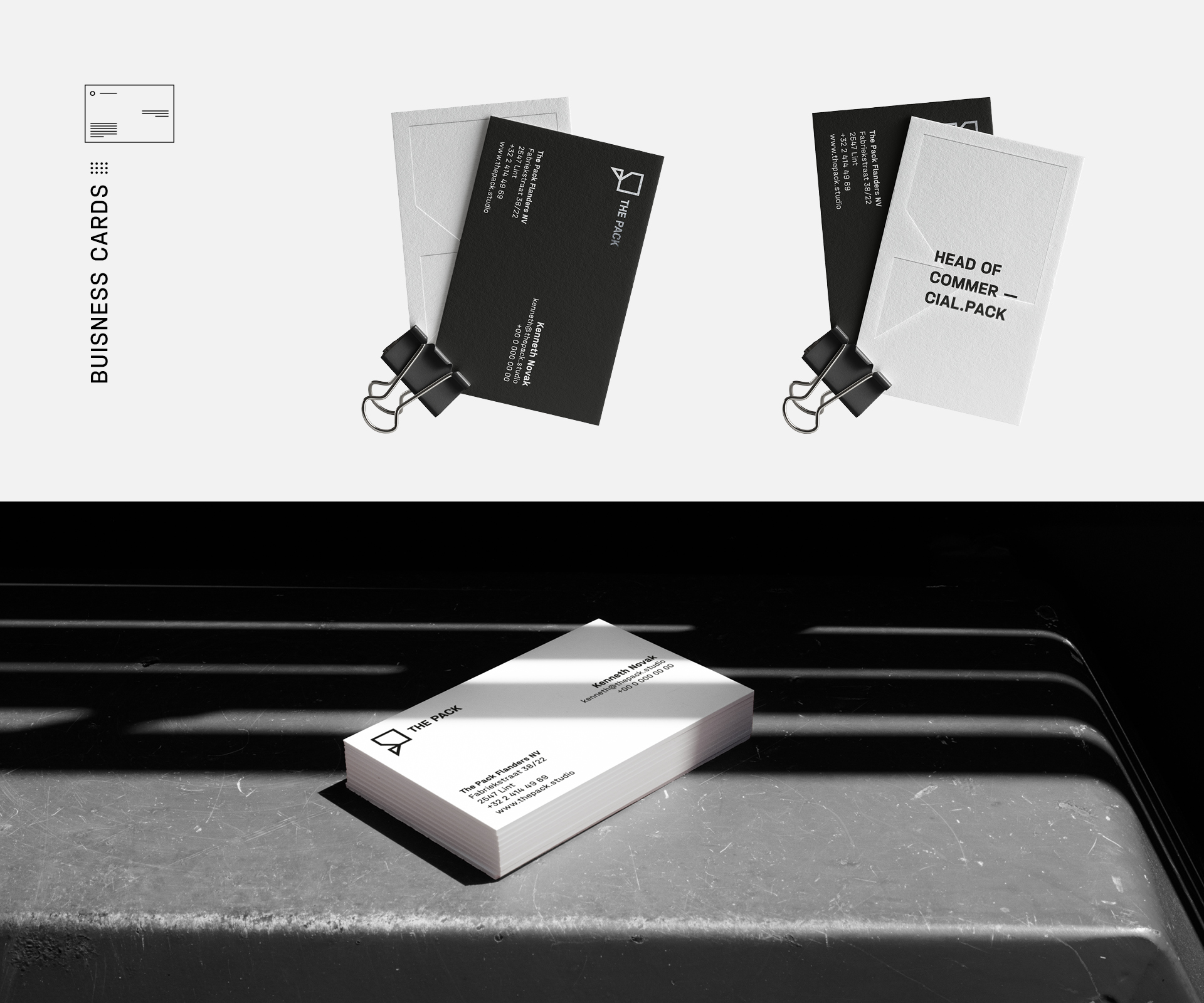
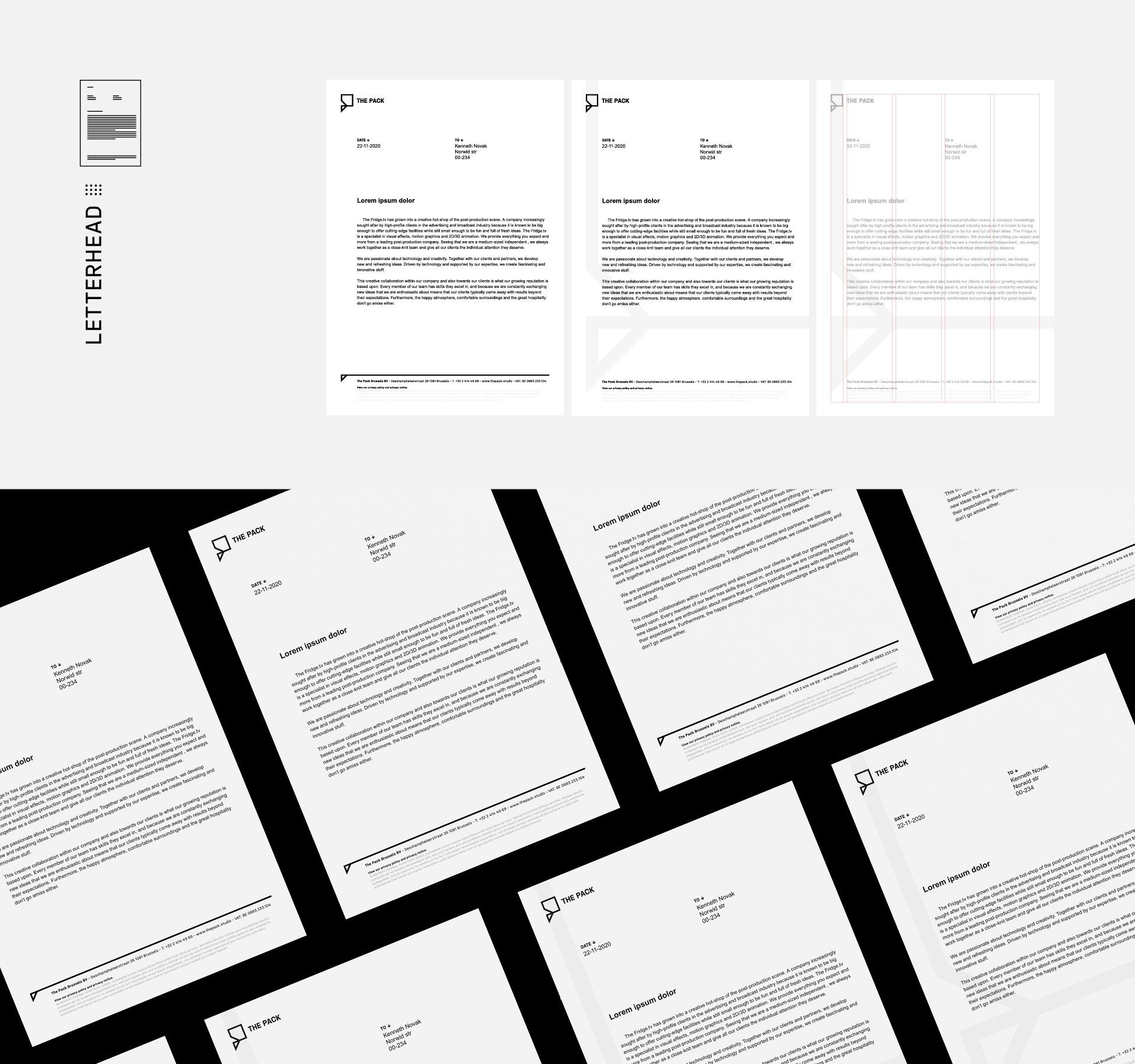
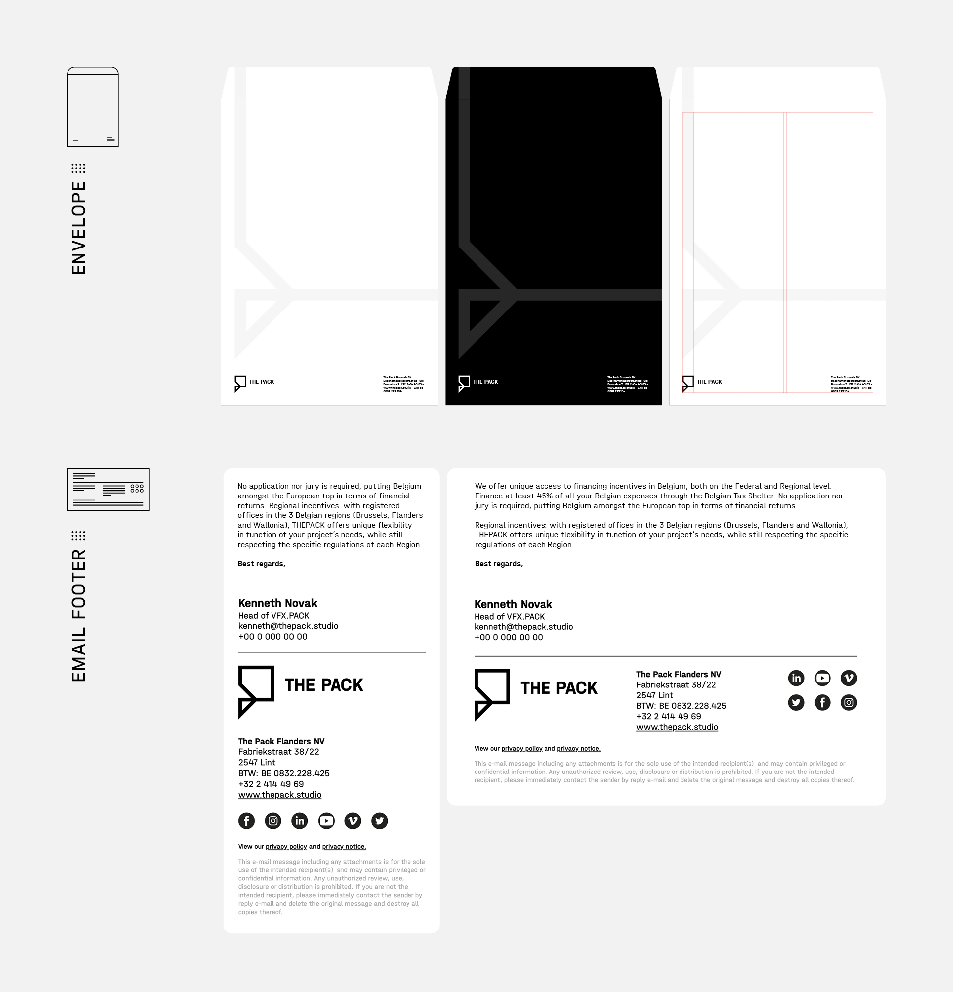
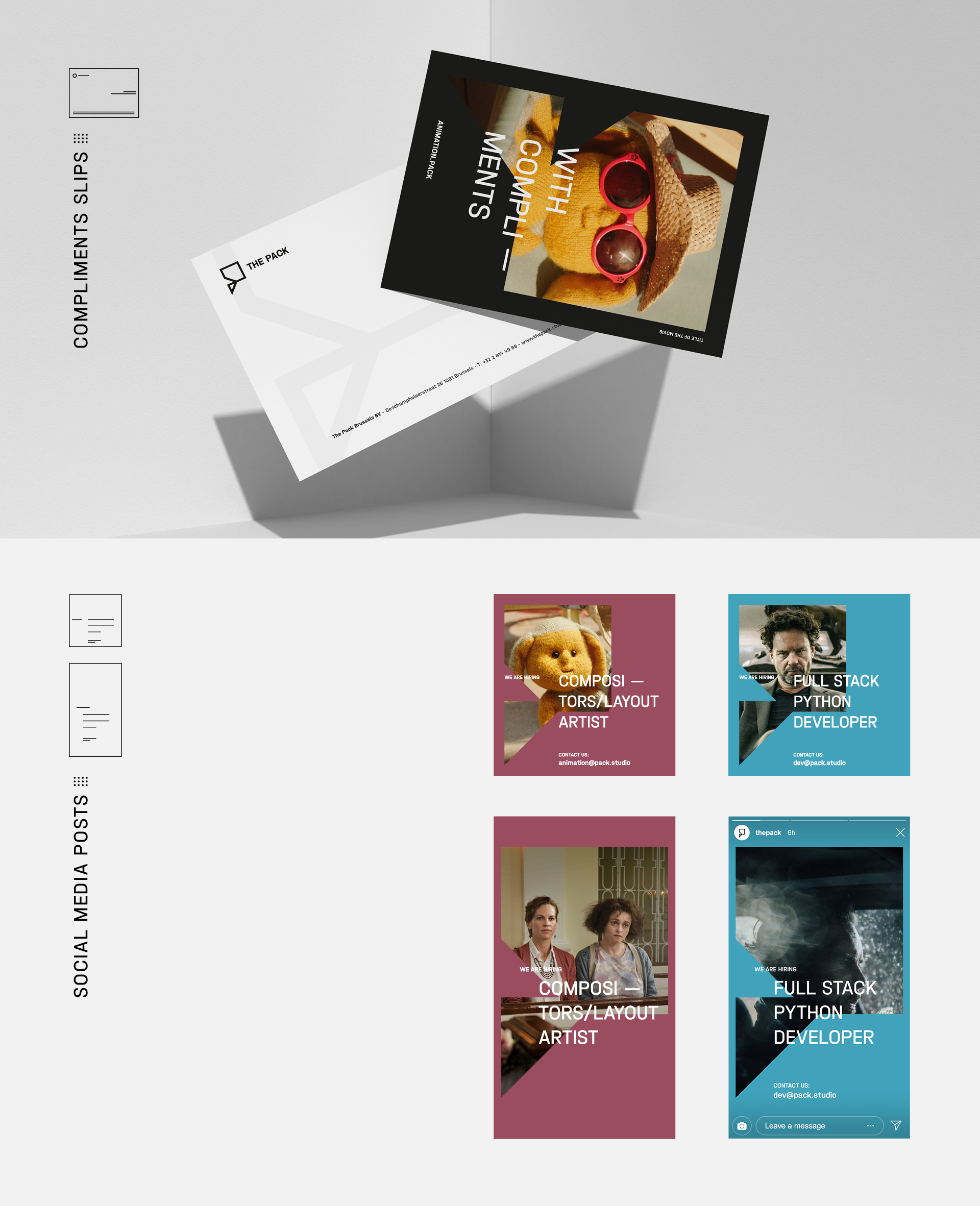
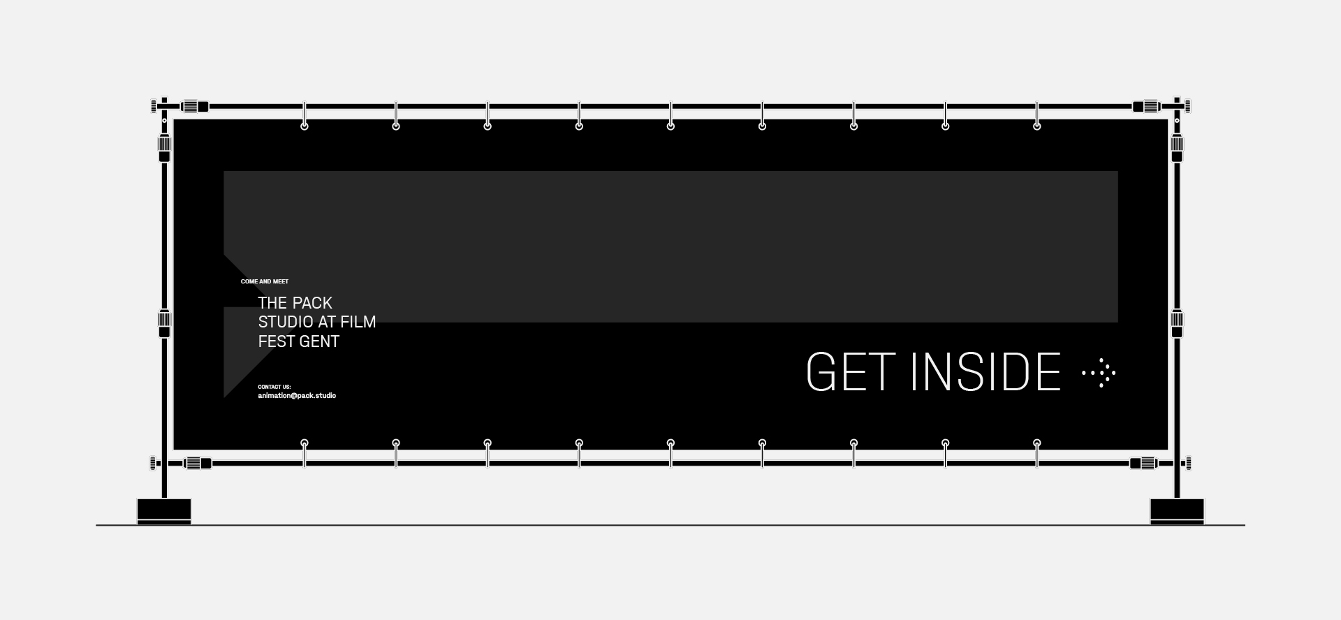
The visual identity for THE PACK included the logo, naming system and service labels, typography, logo animation, corporate materials and website design. We also created brand and sales presentation templates that extend the same brand language into B2B communication. The system allows the studio to add new areas of expertise without creating separate identities for them.