(01) Project Definition
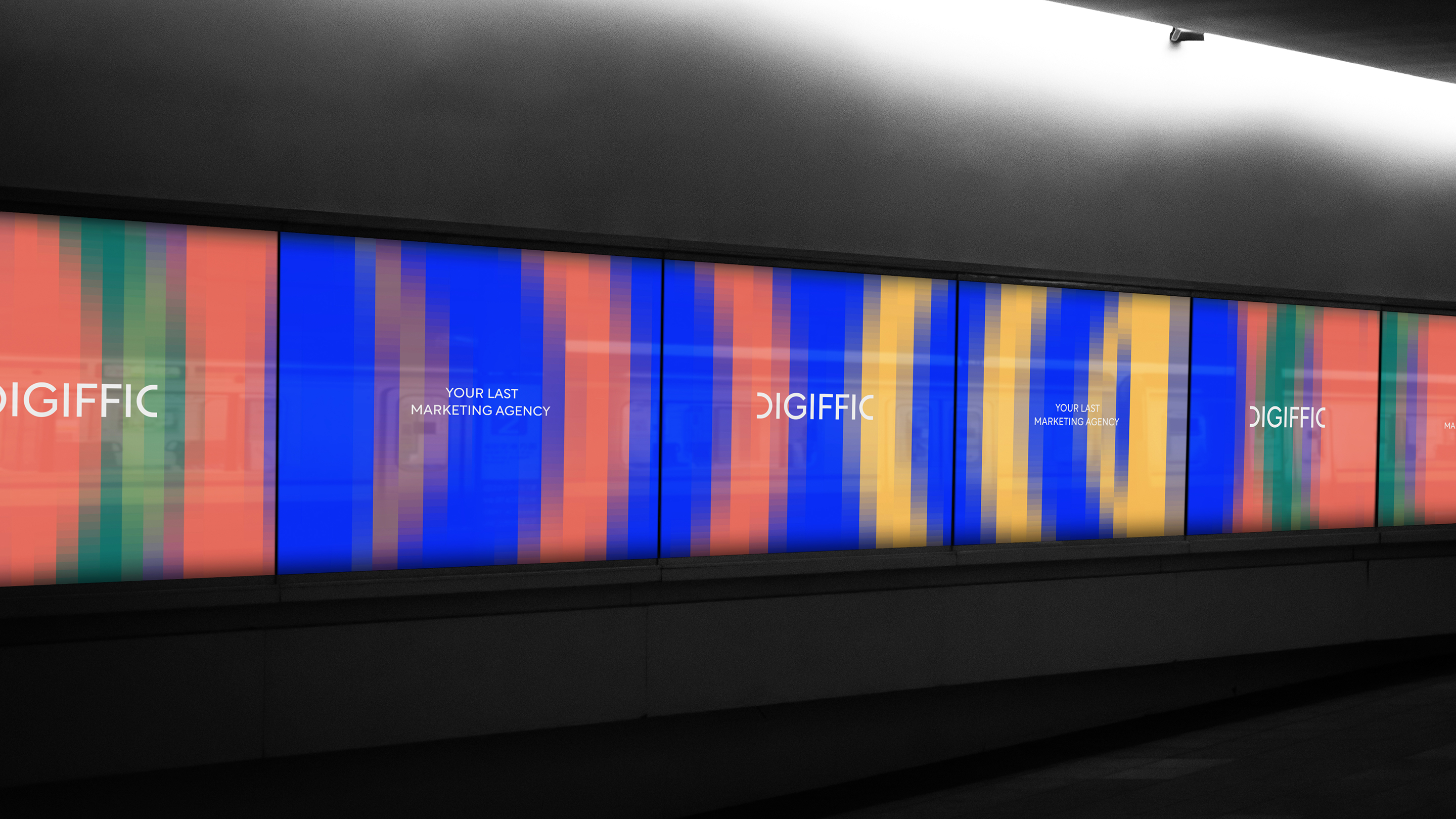
DIGIFFIC works across SEO, PPC, content marketing, and growth marketing. As the team and offering evolved, the existing identity no longer communicated the agency’s way of working. The rebrand covered strategy, logo design, visual identity, and the tools needed for everyday brand communication.
(02) Tactical Analysis
DIGIFFIC offered multiple areas of expertise, but its real value came from orchestrating them around a client’s objectives. Instead of building the identity around individual services, we looked for a principle that could communicate how these different capabilities work together.

(03) Strategy
The starting point was two existing communication statements: “Your Last Marketing Agency”, “Name it. We’re on it.” Both pointed to the same promise: a partner who takes responsibility for choosing the right moves to reach the goal.
(04) Big Idea
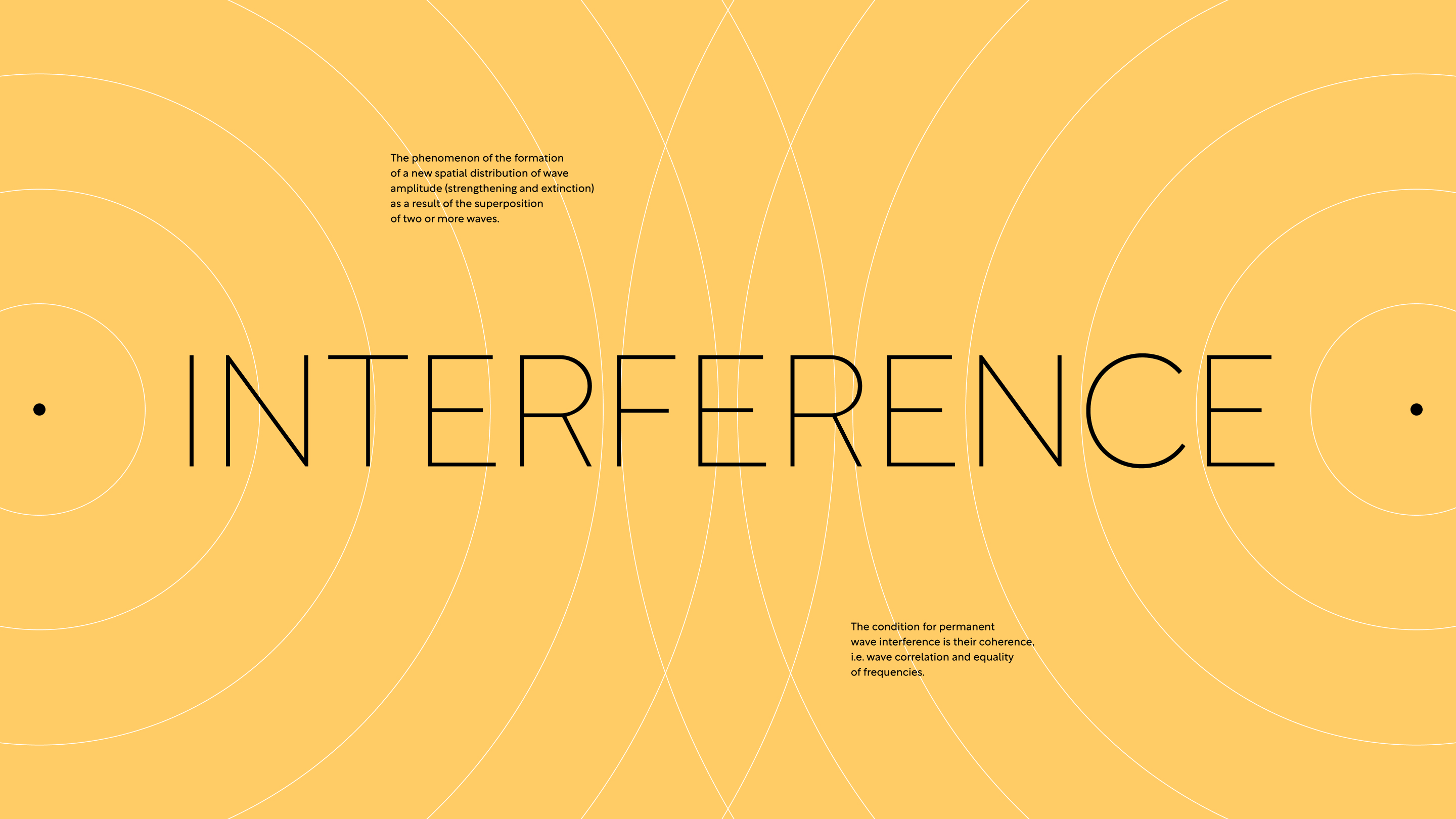
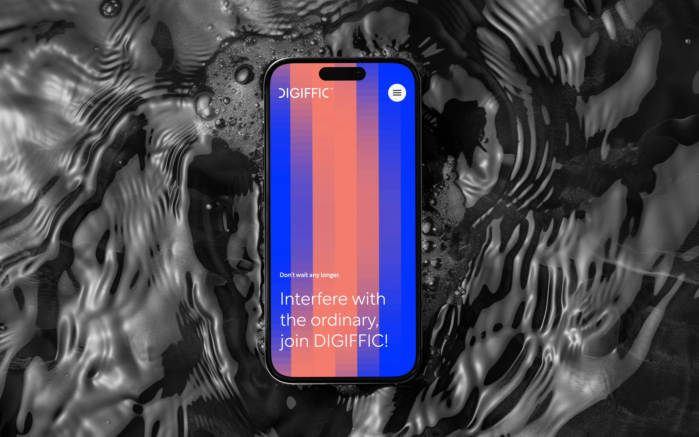
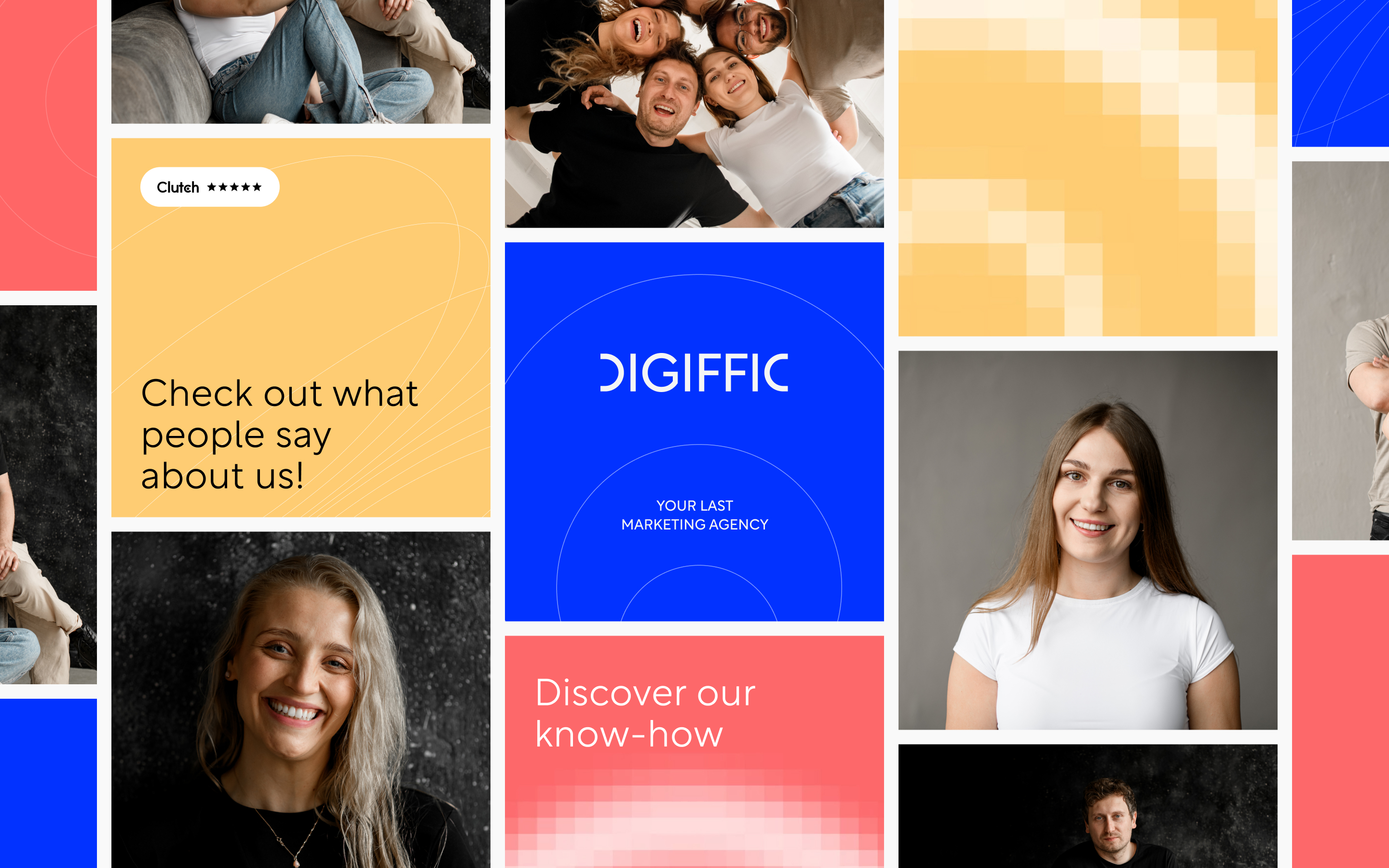
The identity is based on constructive interference - a phenomenon in which overlapping waves amplify their combined effect. It became a metaphor for making different marketing capabilities and activities work as one. The letters D and C form a symbol built from two mirrored shapes. The same principle was extended into the avatar and the social media content categories: DIGI(TIP), DIGI(TEAM), DIGI(CASE), DIGI(CLIENT), DIGI(BLOG).
(05) Activation
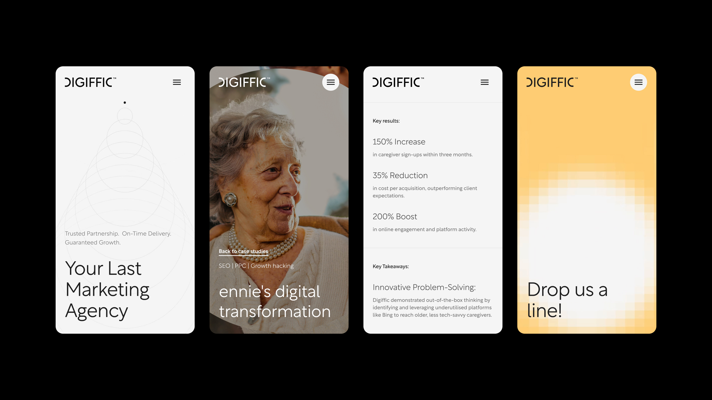
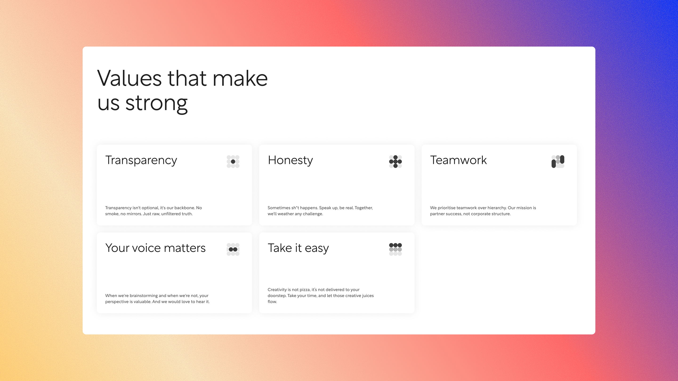
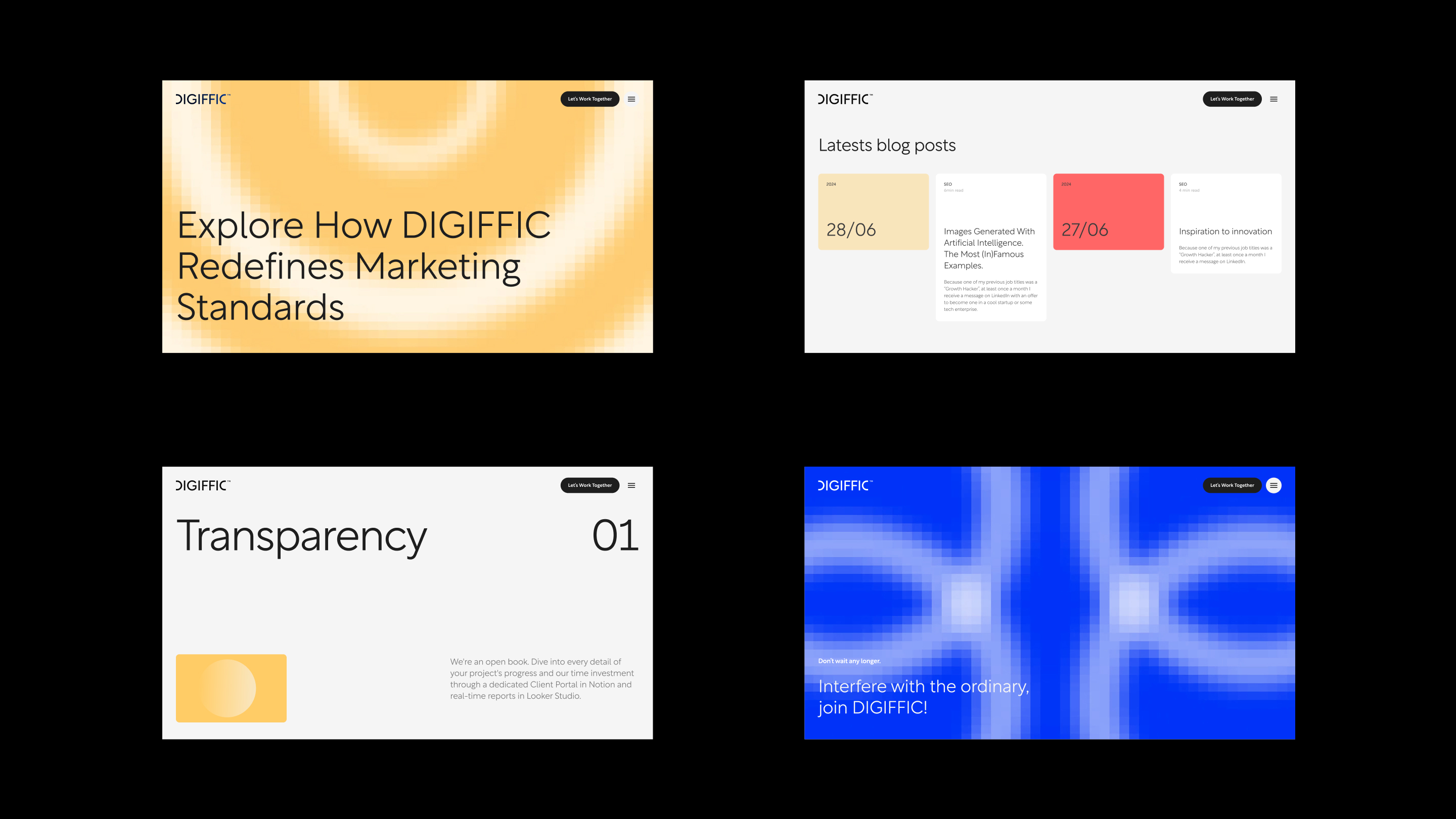
The idea now shapes the website, brand guidelines, social media templates, a company presentation, LinkedIn, email signatures, and business cards. Colors were assigned specific roles: Tech Blue is used for technology-focused communication, Coral Red for people-related content, and Hello Yellow as an accent.