(02) Challenge
Content was organised according to different rules, while individual units used different layouts, navigation patterns and ways of presenting information. The extensive collection of existing pages had to remain part of the website. The task was therefore not a complete rebuild, but to improve how users access information – particularly from the main views – while reducing unnecessary content and links competing for attention.

(03) Tactical Analysis
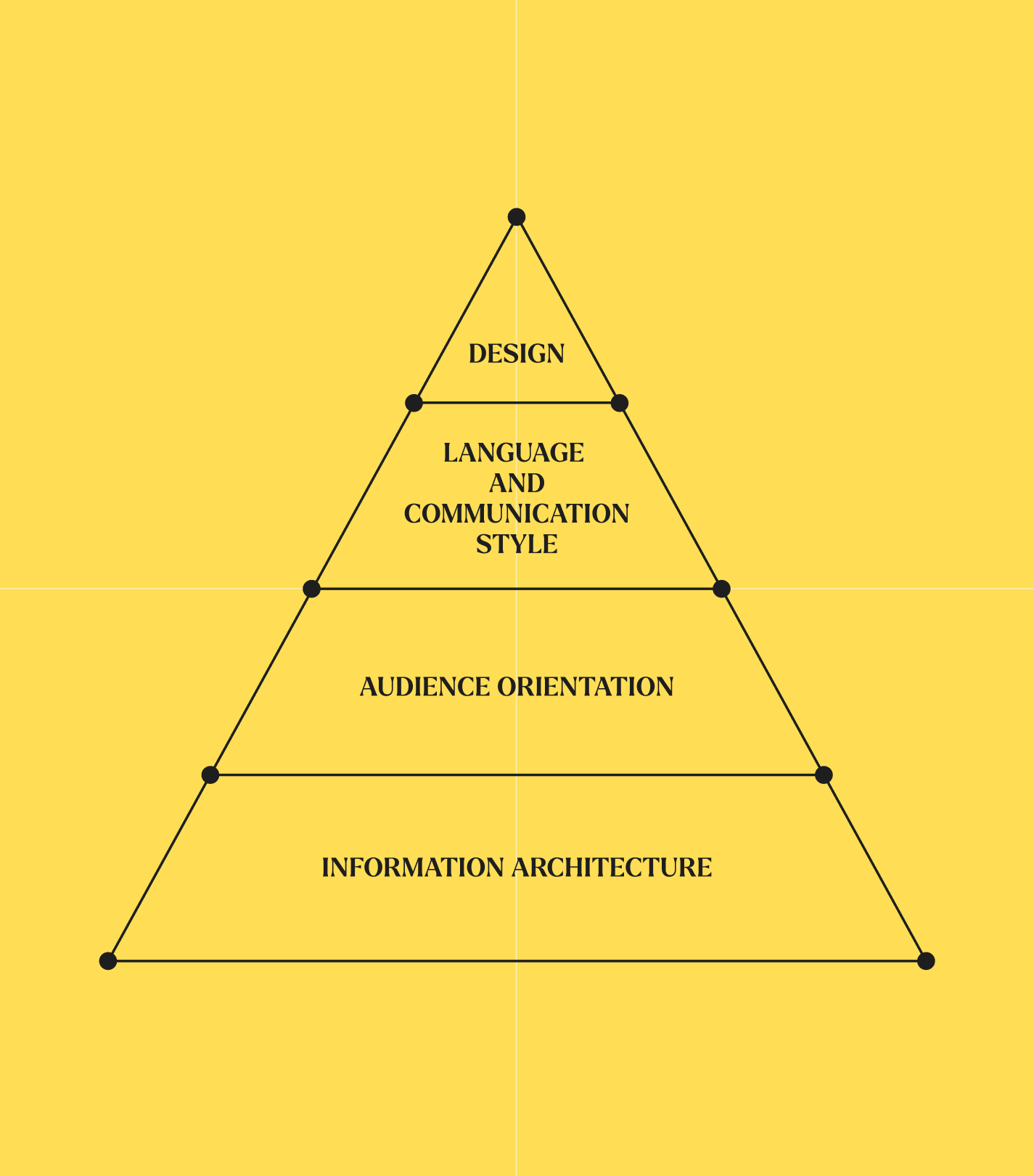
We analysed four interconnected areas: information architecture, user journeys, the language used in communication and the design of subsequent pages. Based on this, we reorganised the information hierarchy in key views and defined the main paths to existing content. These decisions established the principles for navigation, components and layouts.
(04) Strategy
We based the work on four priorities: reorganising the information architecture without rebuilding the existing set of pages, creating paths adapted to different user groups, establishing a consistent way of naming and presenting content, and developing a visual layer that supports the website structure. This logic organises pages created by different units and intended for different audiences.
(05) Solution
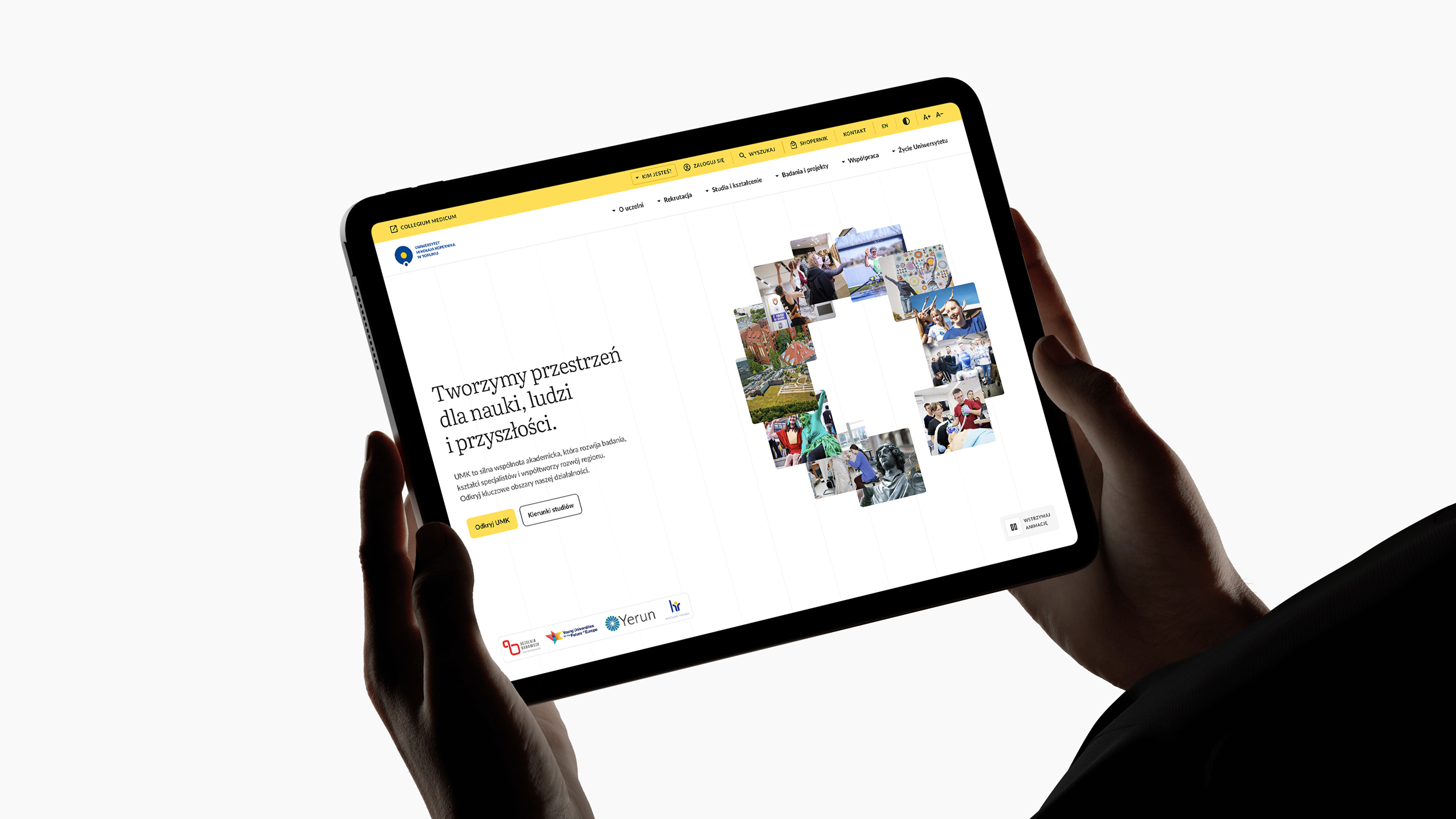
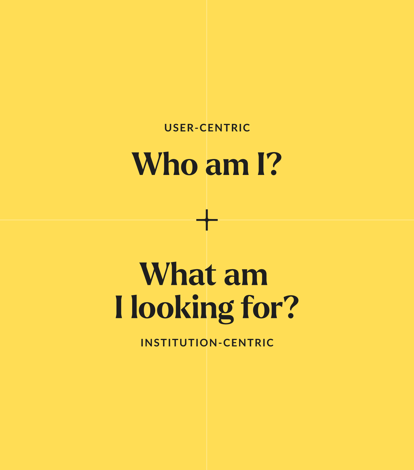
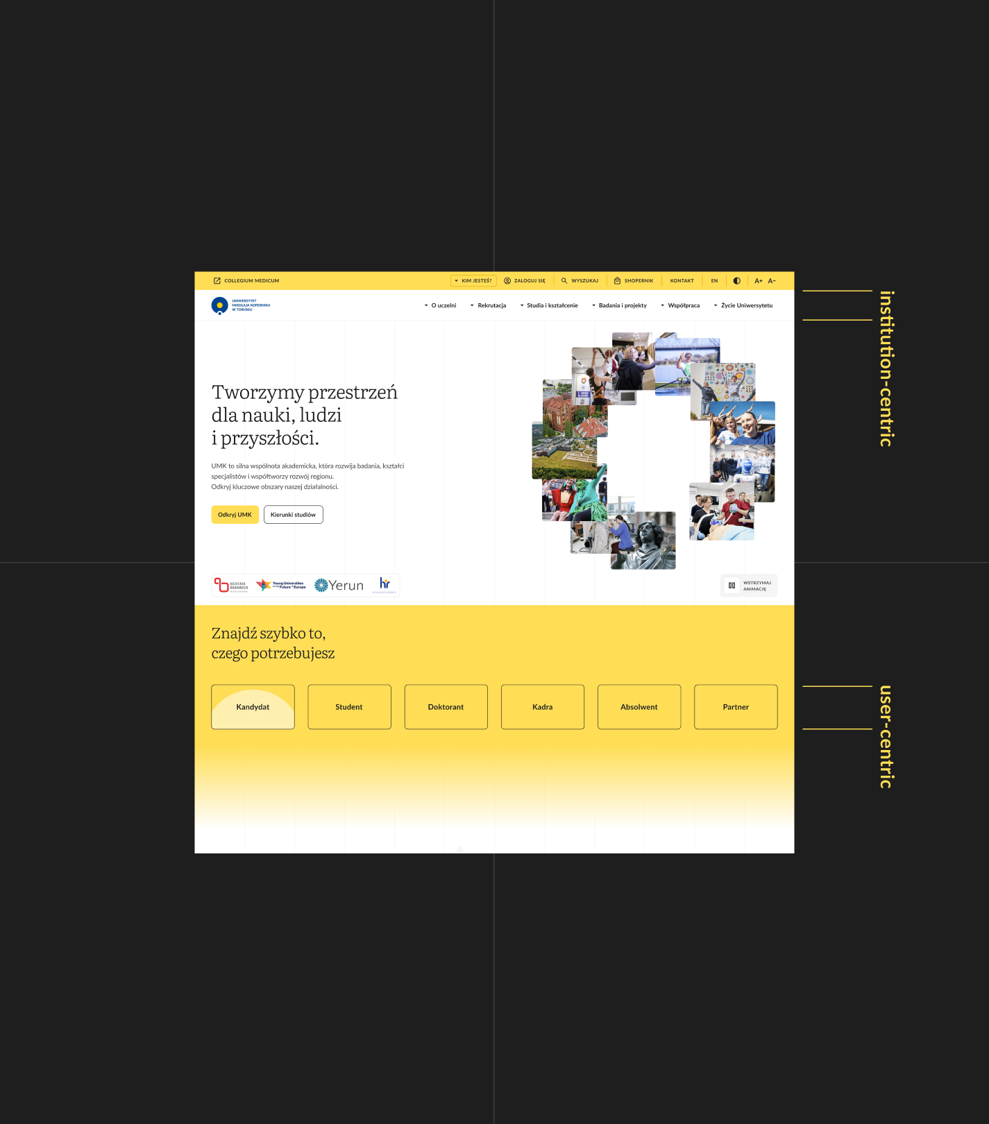
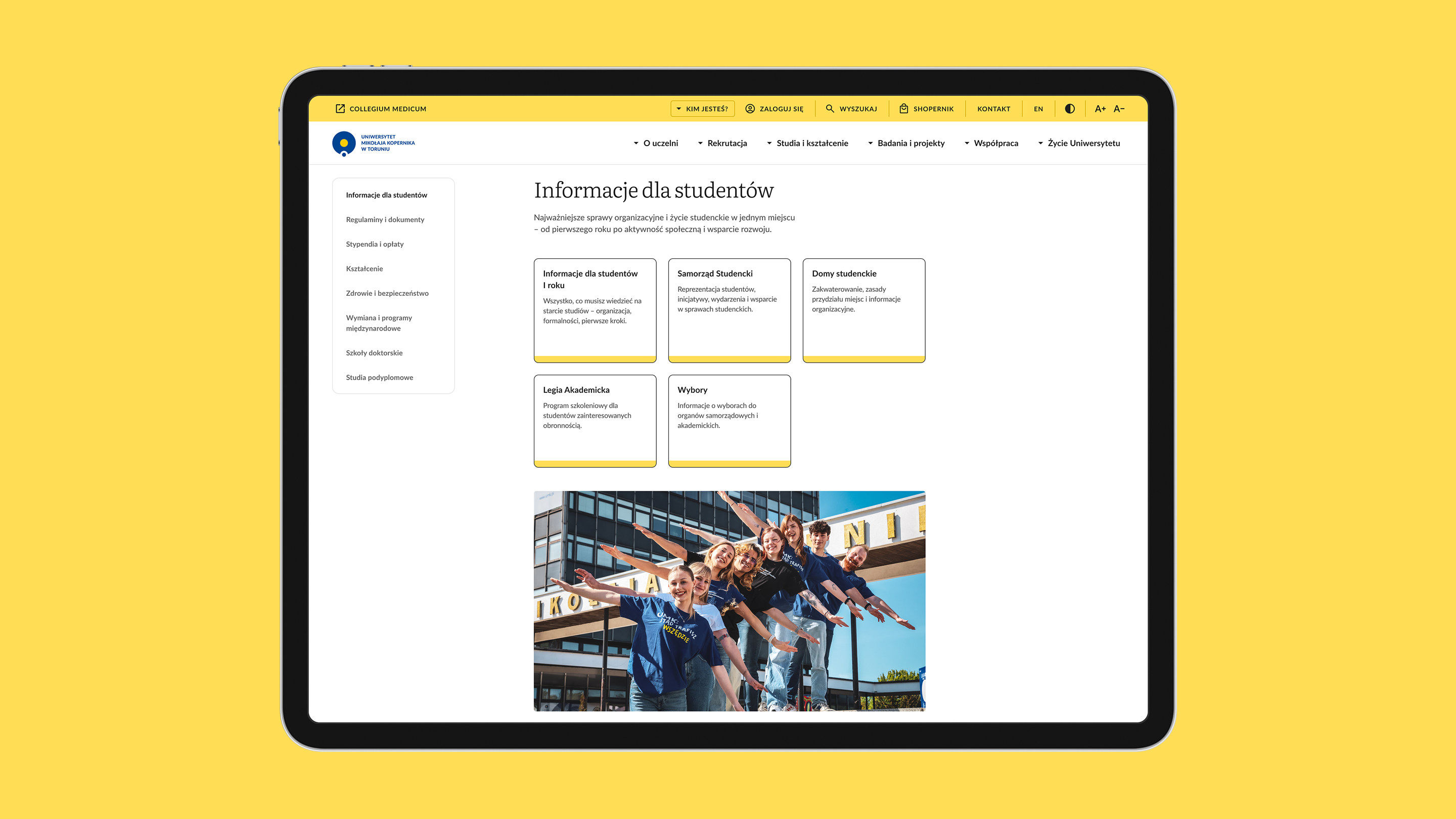
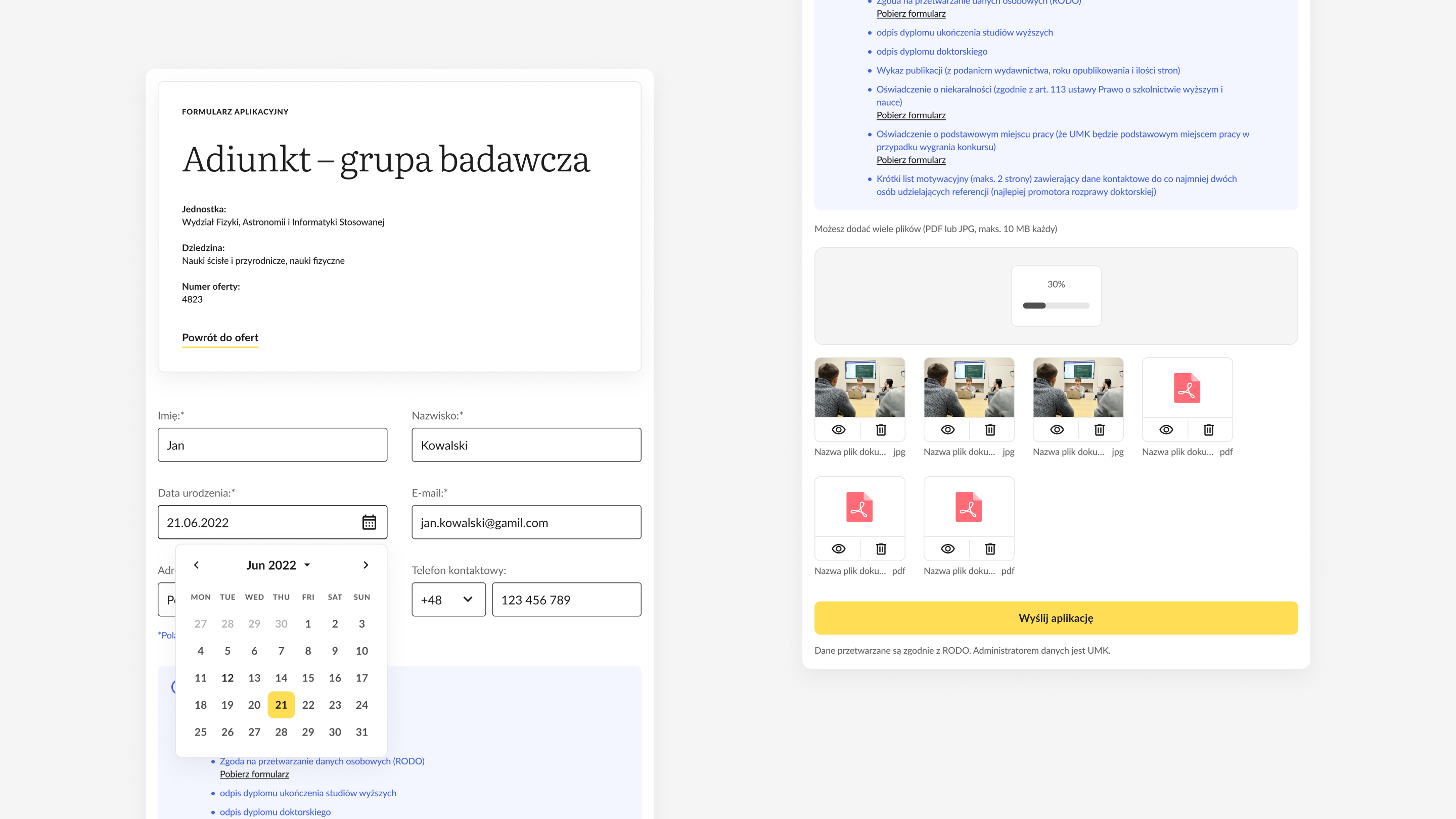
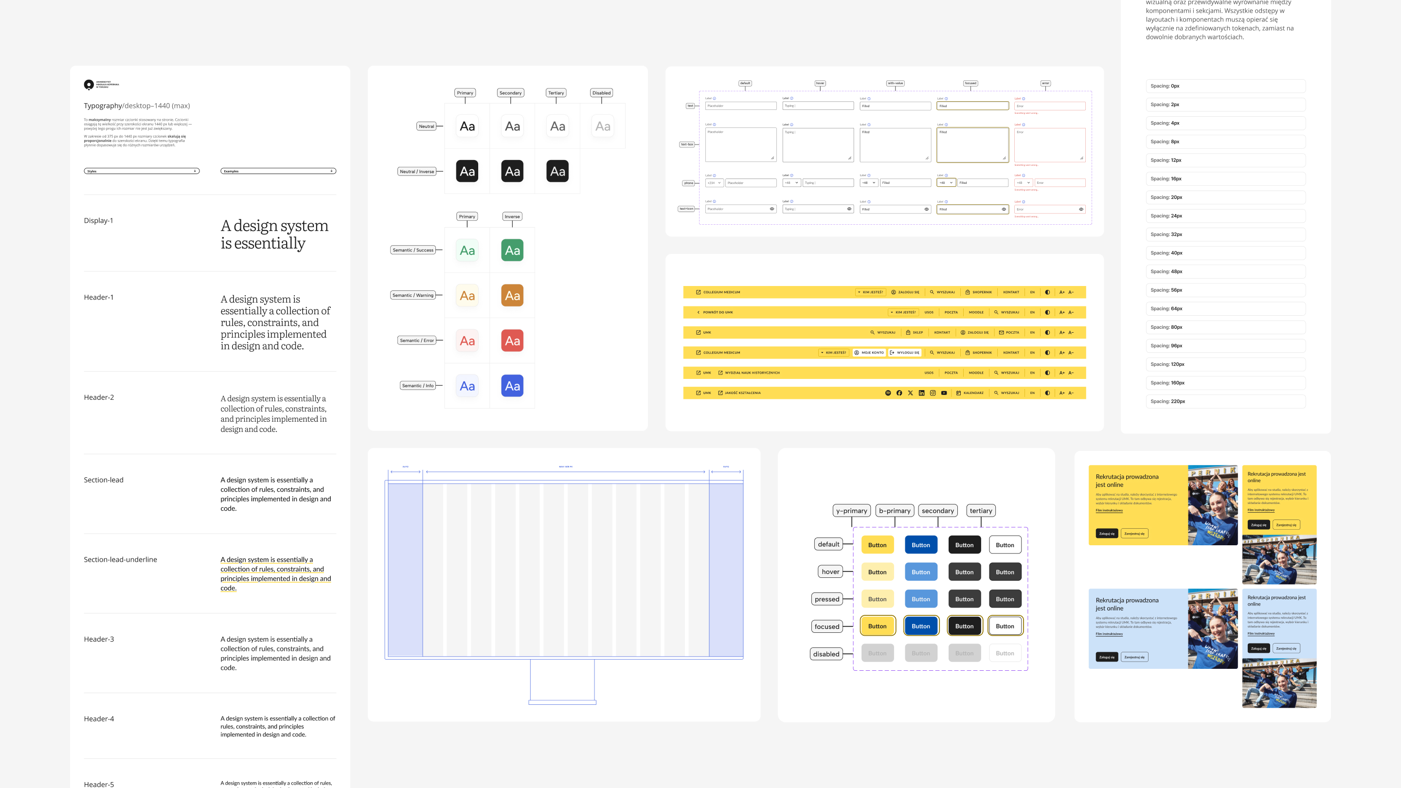
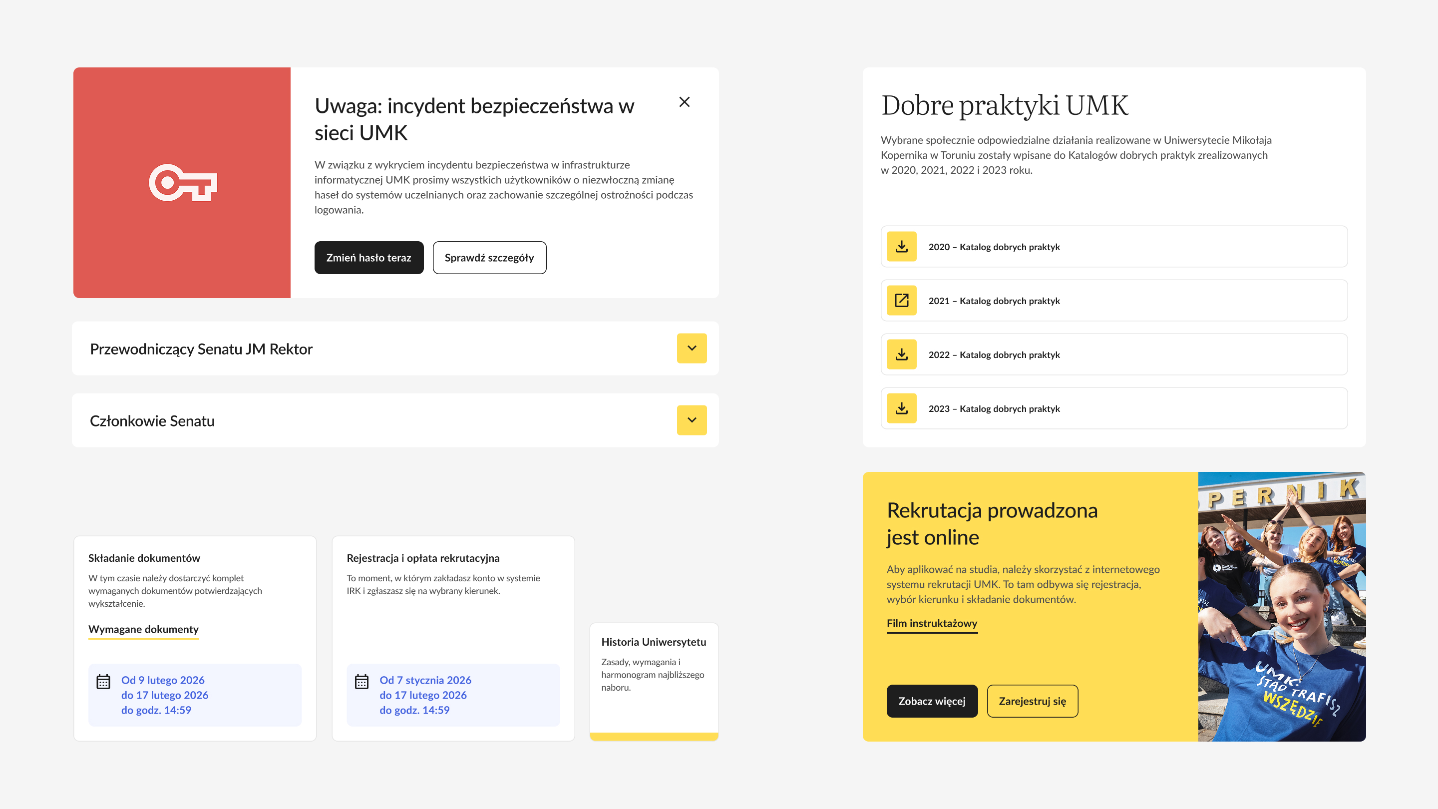
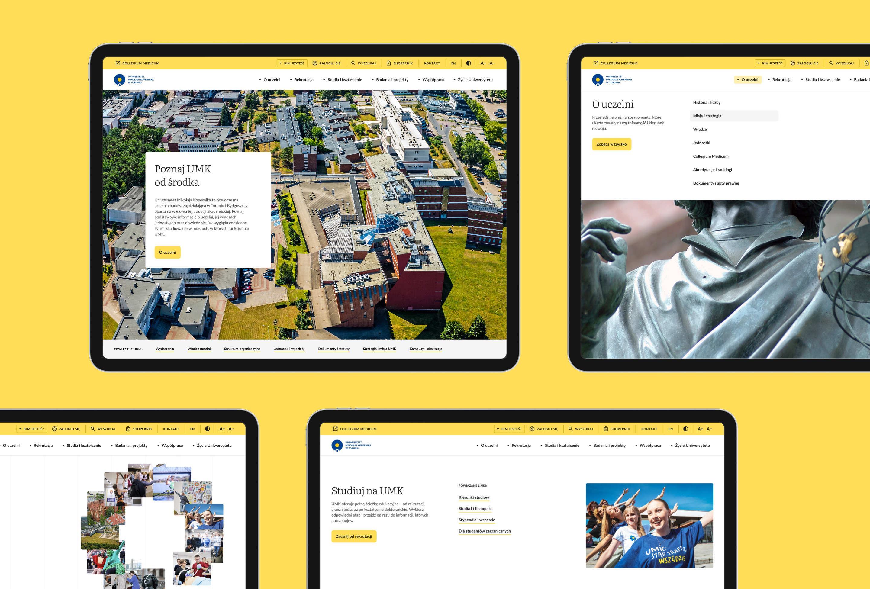
We designed two parallel levels of navigation: by user group and by topic. We created reusable page structures and a component library covering forms, tables, navigation elements and mobile variants. The design system defines the rules for layout, typography, interface and the development of subsequent website sections. The components meet WCAG 2.1 AA accessibility requirements.
(06) System Scalability
The layouts and components provide a foundation for subsequent pages and new types of content. Shared rules for hierarchy, navigation and component behaviour make it possible to develop the website without disrupting the core logic of the interface.
(01) Project Definition
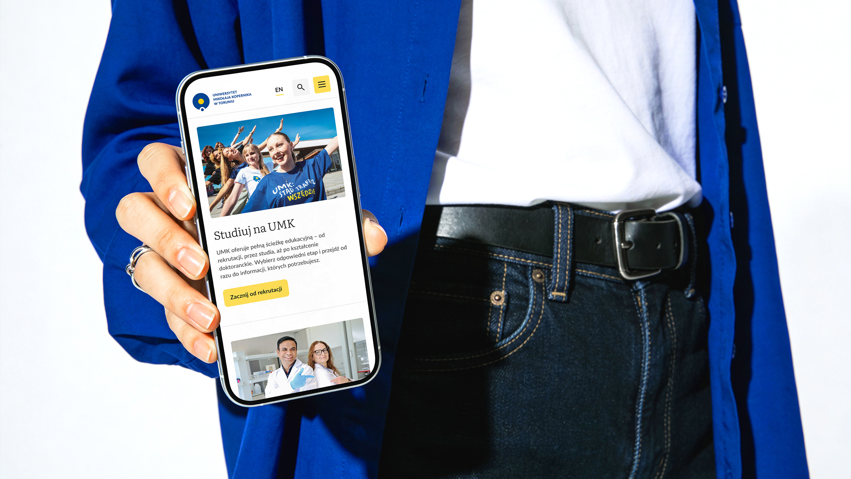
The digital ecosystem of Nicolaus Copernicus University encompasses numerous faculties, units, topics and user groups. While retaining the structure of the extensive website, we reorganised the information architecture across its key areas. We designed two levels of navigation, reusable page layouts, forms and a component library. The result is a modern website aligned with the university’s existing visual identity and documented through a design system prepared for further development.